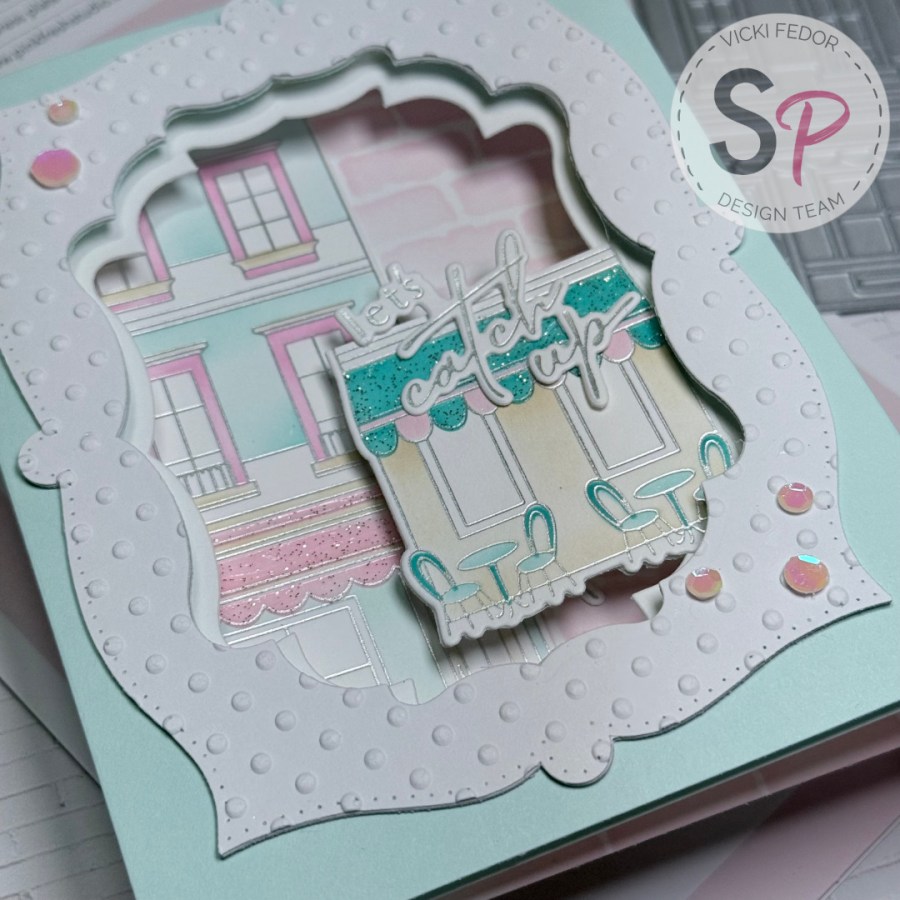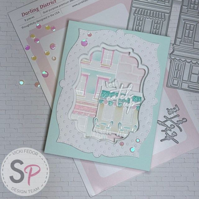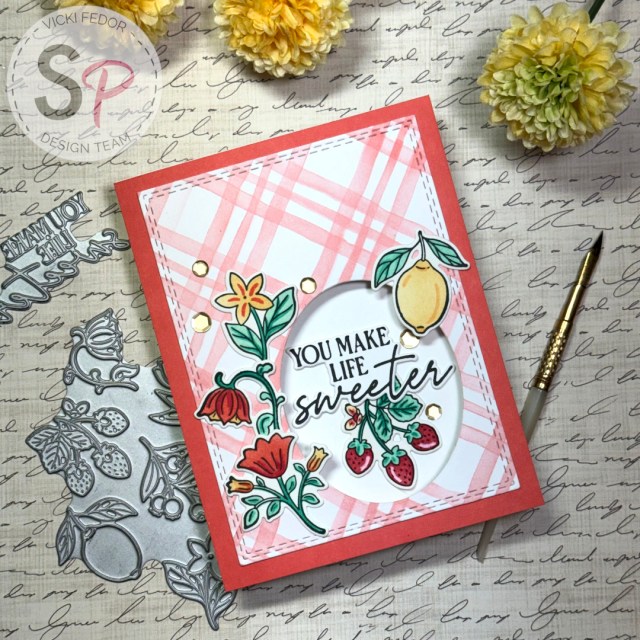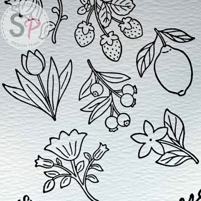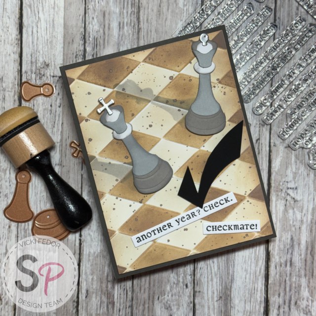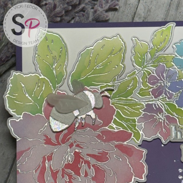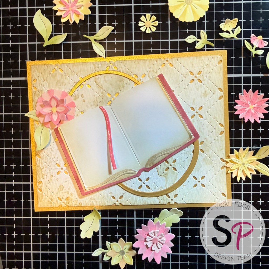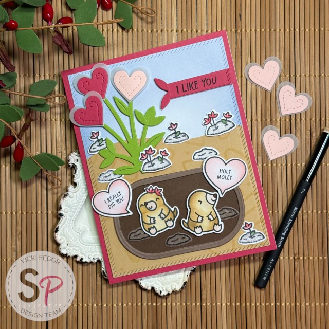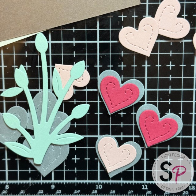
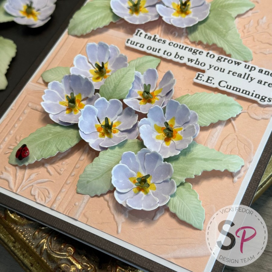
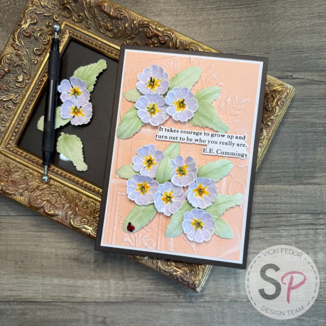
Hello ScrapbookPal friends! Garden… nature… poetry… serenity! Spellbinders captured all of it in their new Serenity Garden Collection, now available at ScrapbookPal. I was able to choose my favorites to work with on this project. I think I chose everything! I absolutely love the mounds of primrose this time of year, so I first chose the Spellbinders – Serenity Garden Collection – Dies – Primrose. A little flower die set at a little price point! The magic comes when you make a bunch of them, and cluster them together on your card. If I were to suggest one other must-have from this collection, it’s the Spellbinders – Serenity Garden Collection – 3D Embossing Folder – Ode to a Poet. Try any embossing folder technique to bring out the design, add a quote or a sentiment from Spellbinders – The Poet’s Garden Collection – Press Plate & Dies – The Poet’s Garden Sentiments, and you’re done! Totally optional, but you’ll be happy you got the Spellbinders – Serenity Garden Collection – Dies – Tassel Flower and Ladybugs, if not just for the ladybug that can be added to any floral card!

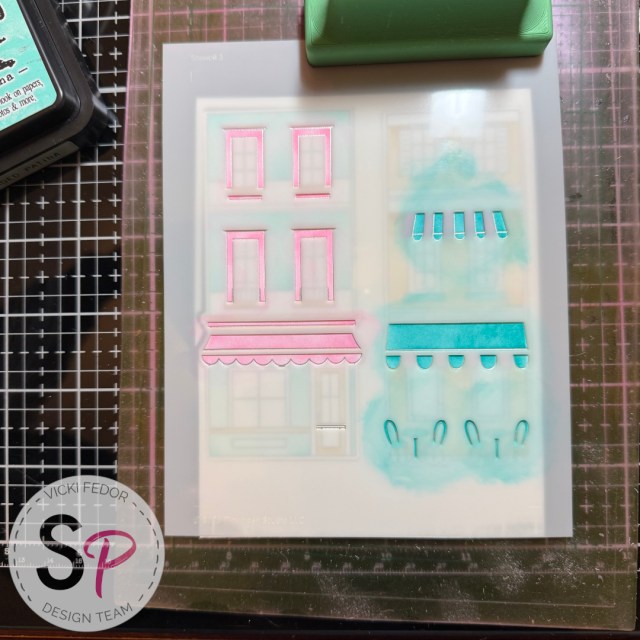
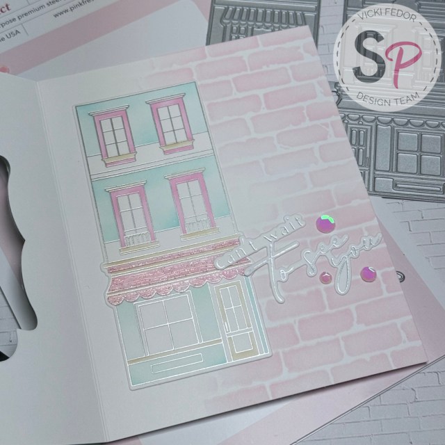
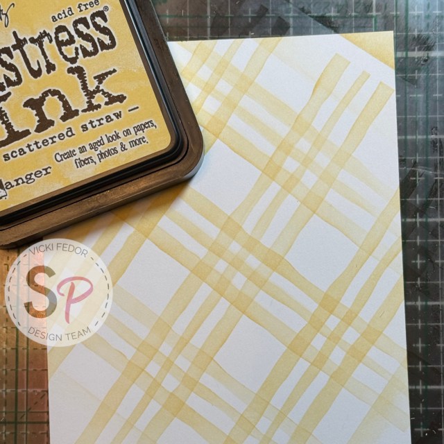
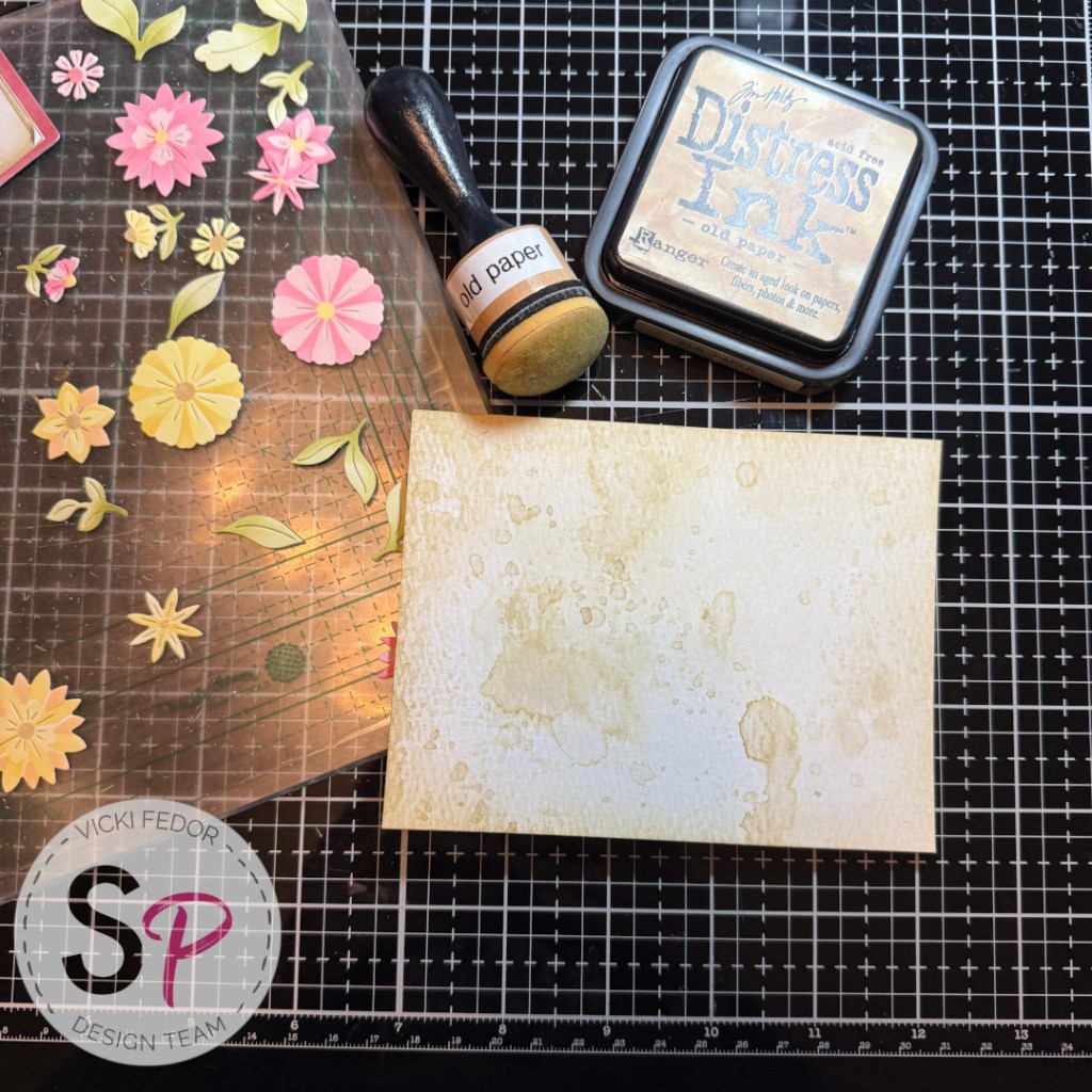
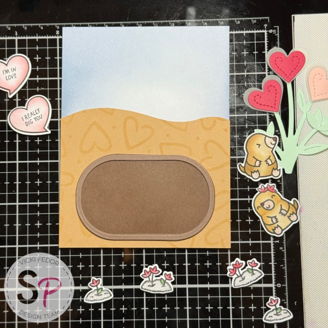
I started with this gorgeous embossing folder. My first idea was to use white paper and to ink the inside of the folder before I ran it through my BigShot. It came out fine, but I decided it was too… bold and busy… for this project. I wanted something softer and simpler, while still accentuating the details of this beauty. Next I embossed a piece of “nectar” colored paper and ran a Gina K. Designs – Pigment Ink Pad – White very lightly over the embossed high points. This was much more of what I was looking for. This is also when I decided to make a 5×7 card. The folder is so nicely composed, I wanted to use as much as possible on the card.
I did stop at this point to watch the videos on the Spellbinders Paper Arts website made by the designer, Susan Tierney-Cockburn. Fascinatingly detailed! I have patience with details, but… not that much! I used a couple ideas and skipped a couple steps so I wouldn’t drive myself crazy! I wanted a card that I would be able to share and reproduce. Susan’s work is fine art compared to what I did!
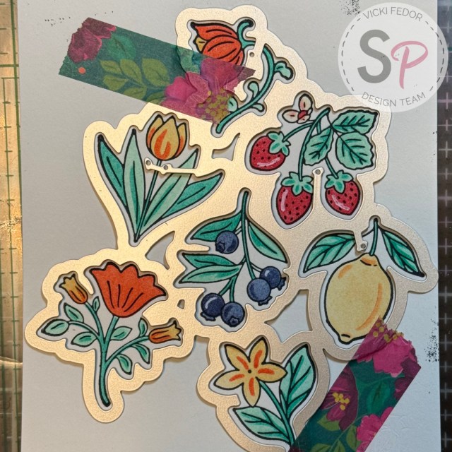
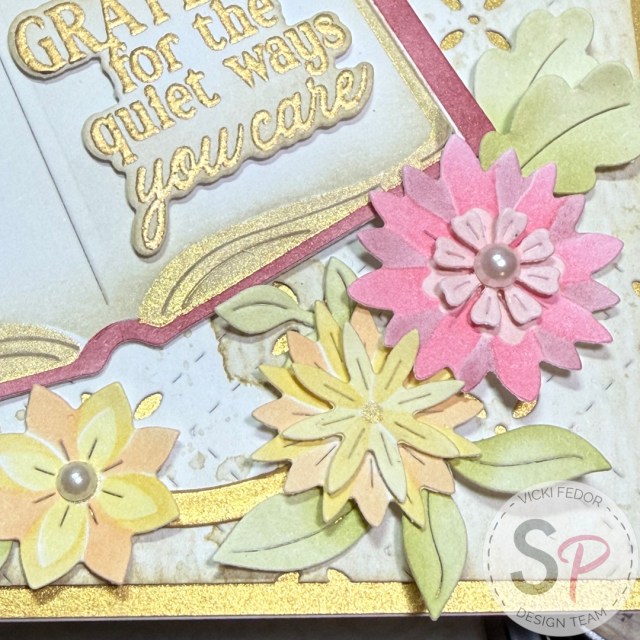
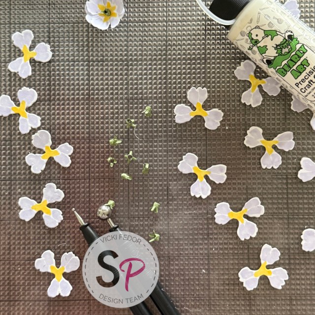
I selected a Copic Sketch marker, Mauve Shadow (BV00) for my petals. For the centers I used Cadmium Yellow (Y15). The petals are so small, I kept the coloring simple. After I assembled the flowers, I went in with a little Chrome Orange (YR04) because I felt the flowers were missing something.
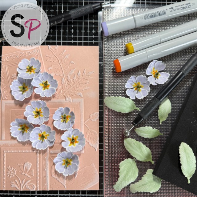
The leaves were colored with Copic Sketch Pale Moss (YG61) all over, then I added some lowlights with Pea Green (YG63). For the tiny center, I used some scrap green paper. As Susan said in her video, that isn’t quite correct for the centers of Primrose, but I decided not to overthink, and followed her directions here with rolling up the teeny diecut and gluing it closed.
I used a shaping tool on the petals and leaves. I did not see a shaping tool set currently available on the ScrapbookPal website, but I know they have had different brands available in the past. If you don’t have a shaping tool, you can use the rounded end of a marker or pen, or just your fingers. or skip this step. If you’re going to be sending this card through the mail, it will get squished anyways. This will be a hand-delivered card for me.
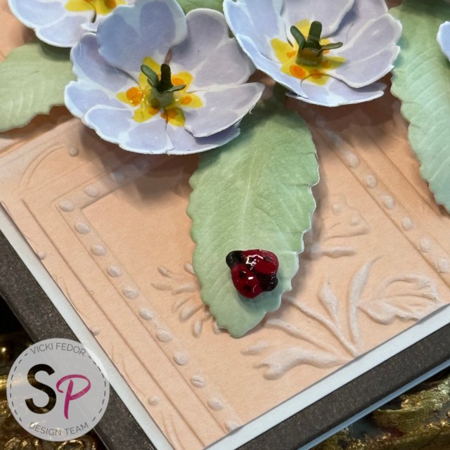
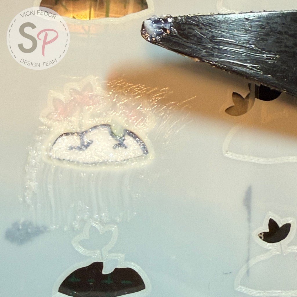
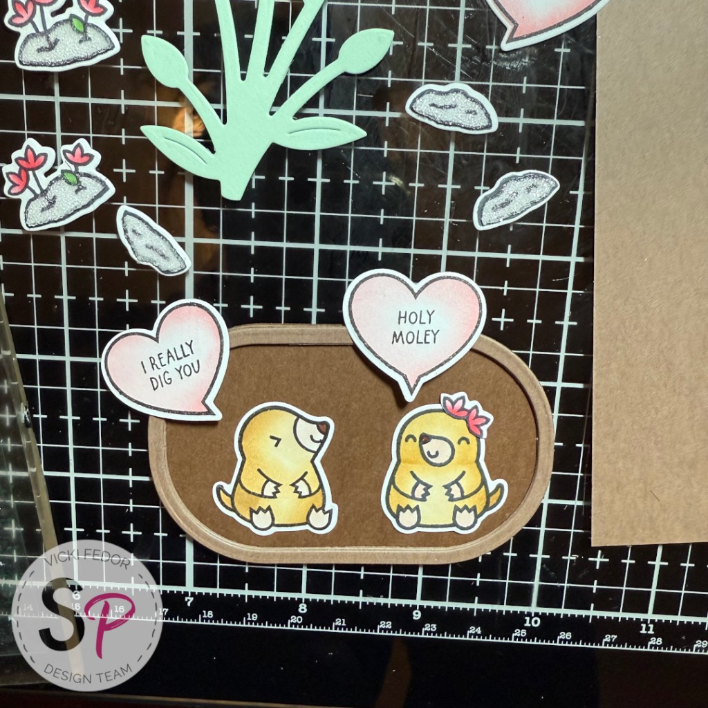
As I mentioned above, I bought the Tassel Flower and Ladybugs die set just to get the Ladybug, and added it here. It was made with a scrap of red paper, Copic Sketch Black 100, and a dot of Ranger Ink – Glossy Accents.
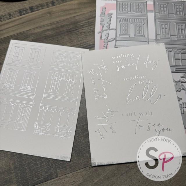
To frame my design, I used a 5×7 piece of black cardstock and a smaller piece of white cardstock. The sentiment is from the Spellbinders – The Poet’s Garden Collection – Press Plate & Dies – The Poet’s Garden Sentiments. This plate can be used with either the BetterPress system and ink (which I did), or the Spellbinders Glimmer Foil system. There are 3 quotes, as well as a Thank You and “Happy Gotcha Day”, something I haven’t seen anywhere else.
The Ladybug, sentiment, and flowers were attached to the card with 3L – Scrapbook Adhesives – 3D Foam Squares – White – Variety Pack – Thin. I used Bearly Art Precision Craft Glue – The Bundle for the leaves, background, and frames.
Thank you for viewing my design. My supplies are listed below, and available at ScrapbookPal.com!
Products used in this project, available at ScrapbookPal.com:
Spellbinders – Serenity Garden Collection – Dies – Primrose
Spellbinders – Serenity Garden Collection – 3D Embossing Folder – Ode to a Poet
Spellbinders – The Poet’s Garden Collection – Press Plate & Dies – The Poet’s Garden Sentiments
Spellbinders – Serenity Garden Collection – Dies – Tassel Flower and Ladybugs,
Tsukineko – VersaFine Ink Pad – Onyx Black
Gina K. Designs – Pigment Ink Pad – White
Copic Sketch Markers BV00, Y15, YR04, YG61, YG63
3L – Scrapbook Adhesives – 3D Foam Squares – White – Variety Pack – Thin
Bearly Art Precision Craft Glue – The Bundle
Ranger Ink – Glossy Accents, 0.5 oz.