Hello creative friends! Today I’m sharing a card that I made after participating in Altenew Academy’s Elements of Floral Composition online course, instructed by Jaycee Gaspar. I took this class as part of my Altenew Academy Level 3 certification. This was an excellent course, and I learned a lot about the different aspects of composition in art. Jaycee is an excellent instructor, and I highly recommend following him on social media and taking some of his classes.
The inspiration for this card came from the beautiful coordinating set of stamps, dies and stencil that I treated myself to from Altenew before the holidays – Linear Life Poinsettias. I loved the modern design of the stamps. I thought the stencil, with it’s offset design, would surely stretch my comfort zone! Although I started with the Poinsettia set for this card, I had no idea what I was going to do as a design until I participated in this class with Jaycee.
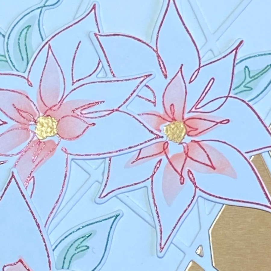
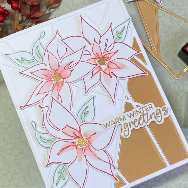
I just love how this class is divided into lessons with each one focusing on a different element of composition: Color, Value, Line, Shape, Form, Texture, and Space. The real inspiration for this card came from Jaycee. I used his 60-30-10 Color “rule”, striving for about 60% gold, 30% red, and 10% green. To add color Value, I used two coordinating red shades of ink (Vineyard Berry and Pink Pearl from the Tea Party mini ink cube set), and then softly blended a gradient of ink through the stencil to get more Value differentiation. I used a triangle Shape to arrange my flowers, and I also used the grid of thirds that he explained, for both the flower placement and the sentiment placement. I used dimensional foam tape to add Form, and the String Panel Cover die to add a layer of Texture to the background. Texture was also added with clear embossing powder for the outline of the flowers and leaves.
I started by stamping the poinsettias in Vineyard Berry ink on 80 lb white cardstock, applying clear embossing powder, and then melting the powder with a heat gun. The ink didn’t stay wet as long as I wanted it to (it’s winter and the air in the house is very dry), so the embossing powder didn’t stick as much as I wanted it to. It still gave the look I wanted, so I decided it would be fine. I stamped the leaf outline in Eucalyptus, and embossed in clear powder as well. I then used the stencil to apply color to the flowers and leaves, using Pink Pearl and Silver Sage. These are lighter colors in the same mini ink cube sets. I used a small blending brush, and tried to get more ink at the center of the flowers as a component of Value.
After my flowers and leaves were colored, I cut them out using the coordinating dies. This is when I started playing around with the placement, using my “rule of thirds” grid, and keeping a triangle shape. I then thought about adding the sentiment. The color gold would compliment the red and green nicely, so I stamped a sentiment from the set with VersaMark ink, and embossed in gold embossing powder.
I considered adding texture with texture paste through a stencil, but this seemed like a “cleaner” card to me, and I wasn’t feeling texture paste was the way to go. Looking through my supplies, I found the String Panel Cover Die. If I cut this out of white and used it for the background, I felt it would add a subtle, modern, clean element of texture. After cutting it out, I saw that there were several triangle shapes within the strings. That gave me the idea to focus on one of the triangles by filling in part of the cover die with gold cardstock. It’s very easy to do this, just by die cutting another piece in gold, and inlaying the pieces you want.
Originally I was thinking of my three colors being 60% red, 30% green, and 10% gold. I planned to use gold for the sentiment and some embellishments, like thread and sequins. After I pieced in the gold cardstock rectangle, I convinced myself I still had about the right proportions of color if I used gold as the predominant color, followed by red and then green. To carry the gold into the flowers and create a more balanced look to the card, I used an embossing pen to color in the flower centers, then applied and heat set gold embossing powder.
You can see that this gold paper has a brushed finish to it, adding another touch of texture. To add the element of form, I used two different thicknesses of dimensional foam squares for the flowers and sentiment, and liquid glue to attach the leaves to the card front.
Thank you for stopping by my blog – I appreciate you! Give yourself permission to take care of yourself today and spend time doing what fills your heart!
Altenew products used: Altenew Linear Life: Poinsettias Outline Stamp Set Altenew Linear Life: Poinsettias Die Set Altenew Linear Life: Poinsettias Simple Coloring Stencil Altenew String Panel Cover Die Altenew Crisp Dye Ink mini cube set – Tea Party (Vineyard Berry and Pink Pearl) Altenew Fresh Dye Ink mini cube set – Frosted Foliage (Eucalyptus and Silver Sage)
Hello crafty friends! I have been participating in the Altenew Educator Certification program this past year. You may have seen some of my posts as I worked through the Level 1 and 2 programs. After completing the Level 1 and Level 2 programs, I am given a final challenge. I recently completed all of the online classes that make up the Level 2 program, and so I was given my Final Challege: Create four “Masculine cards” (using the themes Birthday, Thinking of You, Anniversary, and Encouragement) and one altered item/upcycled project. I also needed to use techniques covered in three of the classes that I took for Level 1 or Level 2 (my choice). I chose to focus on the Beautiful Details, Color Your Day, and Magical Marker classes
Before I started anything, I settled on some colors that I would try to stick to for all of my projects, so that there would be some kind of uniform theme to my challenge. I mainly used the three primary colors of red, yellow and blue, and then added orange, green, and teal as accents. I really like the fact that Altenew groups their inks into coordinating sets, so it makes color selection very easy, and always beautiful.
I was pretty excited to get challenged to make “masculine” cards, because I already had a set in mind that I wanted to purchase. I was very excited about the Wooden Rowboat dies, and the coordinating Boat Adventures stamps and dies. I also would have to get the Dotted Waves stencil or embossing cover die, or both! Off I went to order my new treasures (I mean, neccessary supplies). While I impatiently awaited their arrival, I decided to get started on one of the cards that I had in mind that wouldn’t use the Wooden Rowboat.
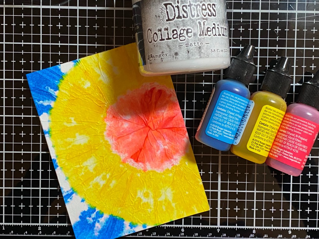
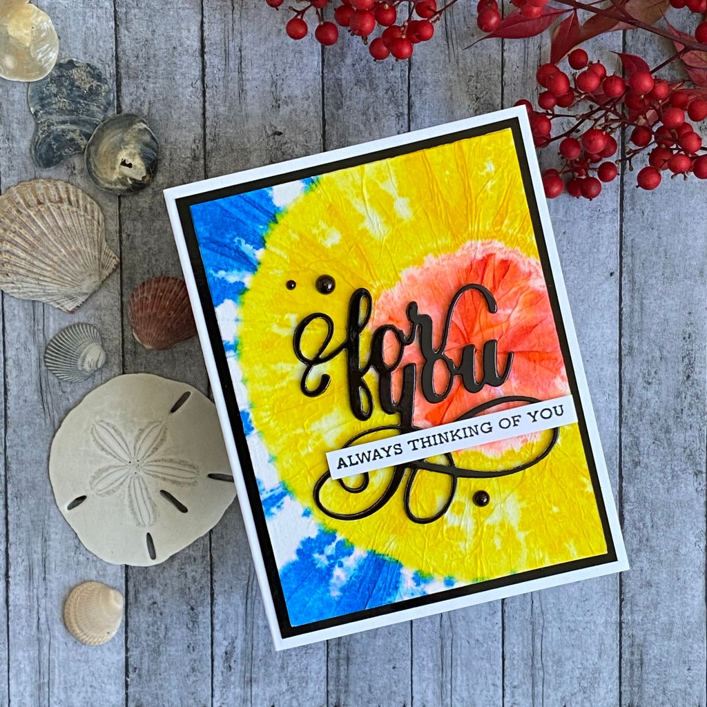
I started with my Thinking of You themed card. I’m not sure why, but when I think “masculine”, I often think of tie-dye. I had made a tie-dye card a few years back, using a coffee filter, and alcohol ink. I folded a round coffee filter in half, and then rolled it up into a tight cone. I tied it using a couple rubber bands, and then carefully painted 3 different colors of alcohol ink. It’s not true tie-dye, but it looks close enough, and it was fun. After my coffee filter dried, I used collage medium to adhere it to a card panel. The tie-dyed filter has some wrinkles and texture in it, so I chose a glossy black cardstock for the sentiment as a contrast. I also cut the Fancy For You sentiment two more times out of black watercolor paper to stack up and give the sentiment some dimension. The sub-sentiment is from the Sentiment Strips 3 stamp set. I used a black Copic sketch marker to color a few half circle embellishments black, and added them to the card as well. I layered the front panel on another piece of shiny black cardstock before attaching it to my A2 card base. The main class that I referenced to help create this card was the Color Your Day class. I love the instructor’s suggestion of thinking about colors in the 70-20-10 portions – 70% of the main color, 20% of a complimentary color, and 10% of an accent color. I also love that she said it was “about” those proportions. Noone is going to call you out for 68-17-15. There are no color proportion police, at least not where I live. It’s a good starting point for sure. I did hold back on this card, and kept it to 3 colors plus black and white.
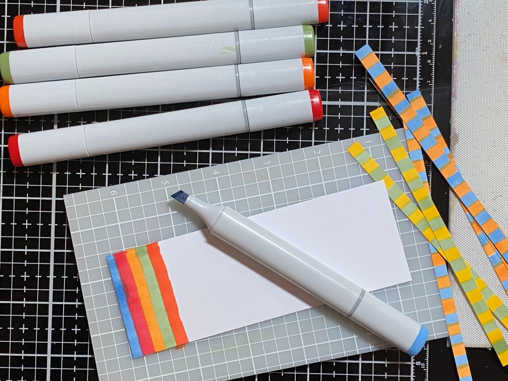
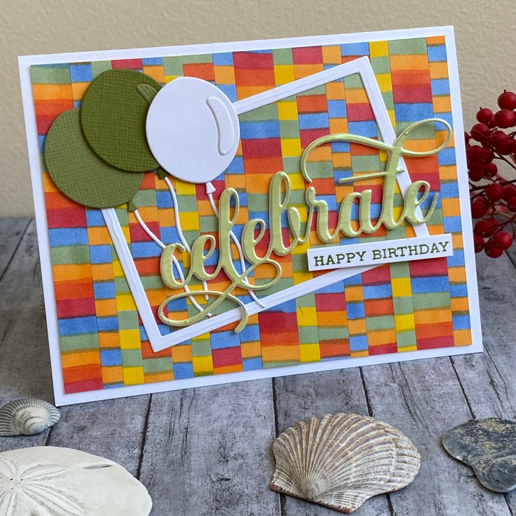
For my Happy Birthday themed card, I was inspired by the Magical Marker Techniques class. I have a bunch of Copic Sketch markers, but I’m not really into coloring stamped images with them. I’m not very good at it. I need to focus on practicing to get better. In the mean time, the Magical Marker class got me thinking about these wonderful tools I have, but never use. I had recently seen another marker technique, where you start by coloring stripes on a piece of cardstock, and then cut that into strips of paper, which you can piece together to make a background. When I think of a guy’s birthday card, I usually think of primary colors and balloons. I wanted my sentiment to stand out, similar to the first card, so I diecut the sentiment, placed it back into the negative image in the paper, and carefully applied a thin layer of light green Solar Paste (crocodile tears). Solar Paste is white, and has a shine when the light hits it. Since I also wanted the paste to have a light green color, I mixed in a small amount of Moss ink. To do this, press your ink pad on a craft mat, squeezing out a bit of ink. Then add a dollop of texture paste to it with a palette knife, and blend.
I stamped Happy Birthday for a sub-sentiment from the Sentiment Strips 3 set, using Altenew Moss ink. The balloon die cuts were from an older Tim Holtz set that I have (Circle Play). I just used a few coordinating colors of cardstock from my scrap bin. I cut a thin white frame with rectangular nesting dies, to add a little more interest. It turned out to be a fun card, with lots of dimension and textures!
Finally! My beautiful Altenew padded envelope (they do have the prettiest packaging) had arrived! Actually, it was only a couple of days, but you know how it is when you’re waiting! I had all sorts of ideas in my head… I could make an underwater scene with the rowboat upside down and fish swimming around, I could put a dog in a boat, I could make one to look like my rowboat when I was a child (aluminum)… the possibilities were endless! The reality was that I wasn’t even sure how big the die was, how it would fit on a card, or how to put it together yet. So for some of those bright ideas, after trying a couple different things, I realized it just wasn’t going to work. No worries, it’s a gorgeous set, and there are plenty of ways to use it! For me, the best thing to do is just to put it together, and then see where it takes me.
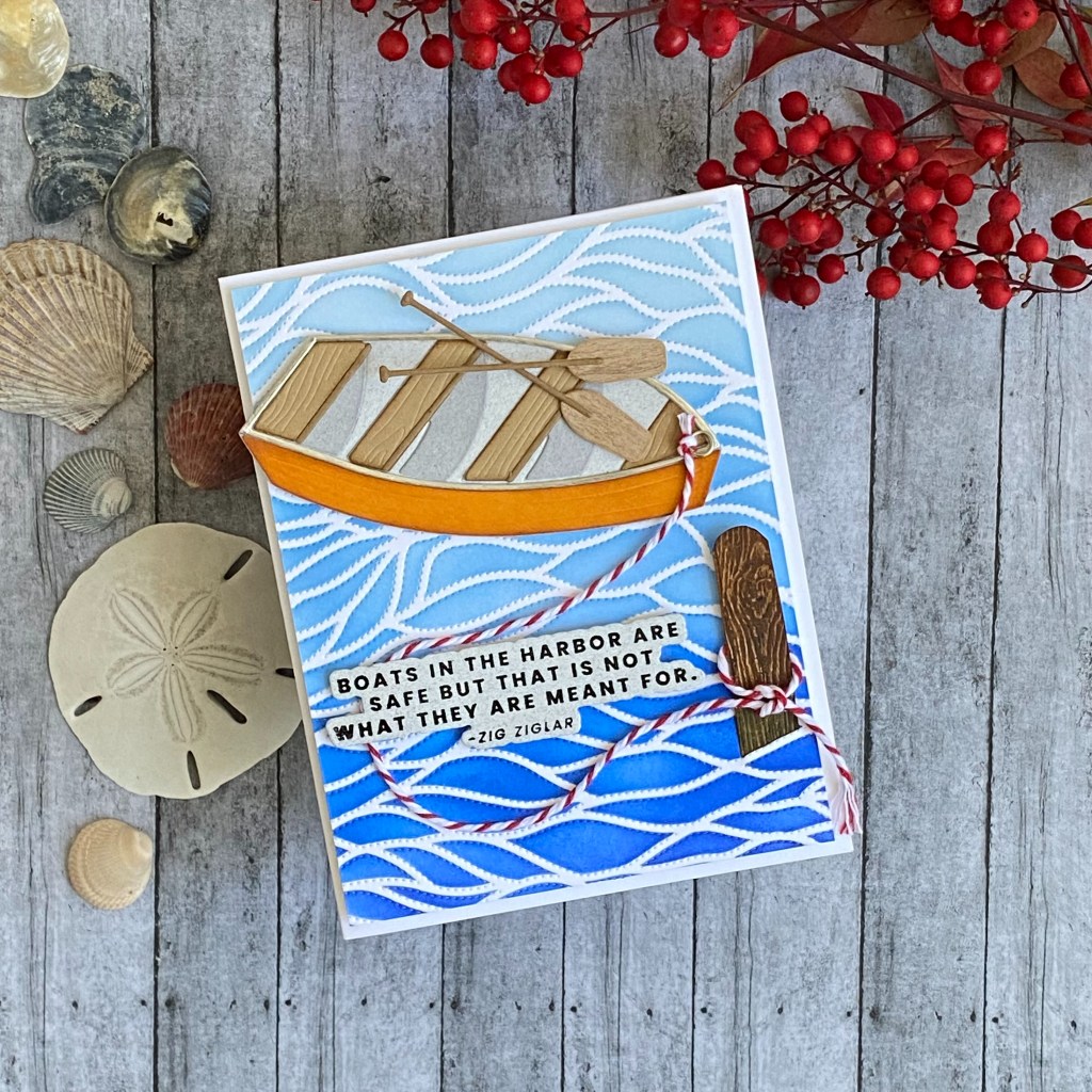
For my Encouragement themed card, I wanted to use the Dotted Waves coverplate die with the matching stencil. I’d probably use blues to color that, so I felt the Wooden Rowboat would look great in contrasting orange. I didn’t have any orange Altenew ink, so I used orange cardstock from my stash. I used a light grey speckled cardstock for the base of the boat which would look like the inside. For the shadows of the seats, I used the same cardstock as the base, but colored it with Distress Lost Shadow Ink. There’s no wondering why it’s named that – it’s perfect for shadows!
After I put the boat together, I ran a piece of 4.25 by 5.5 inch Neenah Solar White 110 lb cardstock through my Sizzix Big Shot, using the Dotted Waves Debossing Cover Die. I had been eyeing these coverplates that create texture by piercing tiny holes in the paper to create patterns. They’re just so beautiful, and so different than anything I’ve ever seen. Better yet, they won’t add any bulk to a card that is intended to be mailed. This waves pattern is so versatile; it doesn’t have to just be used for waves. It adds so much motion and movement, and only takes a minute to transform a plain piece of cardstock. If I can recommend one product out of this entire challenge, this would definitely be it! For just a few dollars more, go ahead and get the coordinating stencil. You’ll be very happy you did!
I used the Lapis Lazuli Crisp Dye mini ink cube set to blend an ombre effect onto the Dotted Waves panel, using the Dotted Waves Stencil. These are probably my favorite blues. When I began focusing on Altenew products and techniques, I purchased the inks in the mini cube sets. Now I know which colors I always reach for, so moving forward, I know which full size ink pads I will begin my collection with.
I have some really cool paper that is actually very thin wood. It’s called wood veneer cardstock. I’m sure several different suppliers make it. If you decide to look for it, make sure it is called cardstock somewhere in the name, so you know you can cut it like cardstock. It doesn’t fall apart as I thought it might, being so thin. I knew it would be perfect for the oars. You can also use ink to color it. For this card, I wanted the details to matter, and I was inspired by the Beautiful Details class. In the class, the instructor used beautiful coloring and painting techniques to add gorgeous details to her cards. That it not really my forte, so I went with what I prefer, which is beautiful details in a mixed media sense. On this card, I used the wood veneer for the oars, I added a jewelry jump ring to appear to hold the red and whiite rope (another beautiful detail) to the bow of the boat, and I made a post out of woodgrain paper cardstock to look like an algae covered aged post in the water, anchoring the boat safely in the harbor. I colored the wooden post with Distress Vintage Photo Ink, then used Distress Crayons to darken the grain and add some green algae at the water level. I cut a small slit in the background to insert the botton of the post into, to make it look like it was coming out of the water. The sentiment is black ink with clear embossing powder on the same speckled grey that I used in the boat. The card panel was attached to an A2 cardbase with dimensional foam tape.
My final card for this challenge is an Anniversary themed card. I used techniques and inspiration from both the Color Your Day and Beautiful Details classes. I was looking through my other dies and stamps, and came across this fishing pole, and the sentiment “You’re the best catch of all”. I thought it would go together great with the rowboat. Wouldn’t it be cute if the fishing pole had caught a heart? That gave me the idea to use red for the heart as well as the color of the rowboat (Heart Beat and Vineyard Berry from the Tea Party ink cube set). I wanted to have a different background than the Dotted Waves. I found this Altenew Patterned Play Diamonds stamp. In one of the classes, the instructor suggested to look at your patterned stamps from different perspectives. Turn it sideways, or just use a portion of it. Stamp or stencil at an angle, not straight up and down. I tried this with the Patterned Play Diamonds stamp, and to me it looked more like a fish net than diamonds, so I thought it would be perfect for this card. I used inspiration from the several different classes that focused on colors. Red and teal would be part of a triad on the color wheel with yellow, but I decided to try red, blue, teal, black, white, and a touch of silver on the fishing pole. I used three of the Sweet Dreams Fresh Dye ink mini cube set for the background – Dew Drops, Aqualicious, and Teal Cave. I pressed (smooshed) the cube on my craft mat, spritzed with water, and picked it up with my watercolor cardstock. I used several layers of colors, drying in between. I wanted to add some spatters, so I used an Altenew Watercolor Marker in Dusk. After I got the background finished, I decided the blue seats in the rowboat were distracting, so I cut another set and colored them with Teal Cave ink. I like the harmony of this card better, sticking with just the red and teal colors. The theme song from the old TV show “Love Boat” popped into my head, so I added some tiny letters from the Sizzix Specimen set to spell “LOVE” on my boat. More Beautiful Details that make a nice card into a special card!
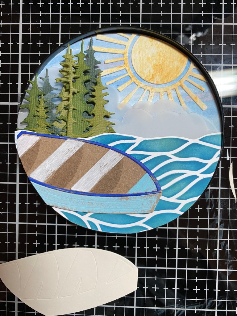
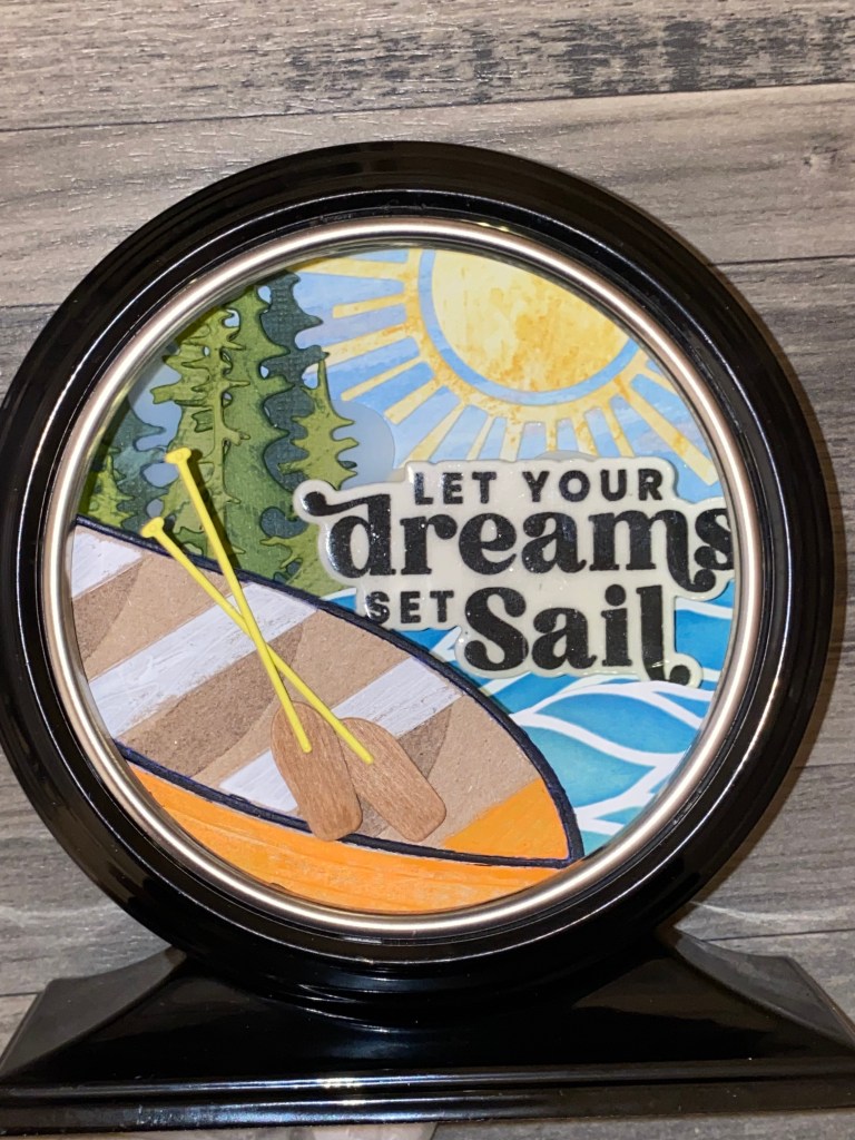
For the final piece of the challenge, I made this altered item. I actually started making this alongside the cards that I made. It took a longer time to design in my mind, and I had to keep playing and experimenting with ideas. That what makes this my favorite! I wanted to use the boat, and have the scene be a lake view on a pretty summer day. We are currently building a lake house in Central Pennsylvania in the beautiful Laurel Highlands area, so that was my inspiration. I had this empty clock case which is a Tim Holtz Idea-ology piece made specifically for altering. I wanted to fill the inside of the clock with layers of different pieces of the scene. Most of the layers are separated with dimensional foam tape, layered up on the back piece of the clock, which comes off.
I started by watercoloring a wispy summer sky with the two lighter blues from the Lapis Lazuli ink cube set (Iceberg and Eastern Sky) , along with Pink Pearl and Coral Bliss from the Tea Party ink cube set. I die cut the sun out of a piece of watercolor paper I had in my scrap box. using the Sizzix Circle Play die set again. The paper was most likely made using Distress Scattered Straw ink. I cut three layers of clouds out of vellum, and layered them on to the sky using dimentional tape. To create the trees, I used different shades of green cardstock, which I cut with the Sizzix Forest Shadows die, and added texture with the Tropical Forest ink cube set. I used the Dotted Waves stencil and two Distress Oxide inks (Uncharted Mariner and Bundled Sage) to create the water, so it would be different. It’s hard to tell from the photo, but I have two layers of water… one closer to the back, behind the sentiment, and one in front of the sentiment, directly behind the boat.
I created my boat out of heavystock kraft paper. I wanted to paint it and sand it, to have an aged look. I started with light blue, but changed my mind while I was putting it all together at the end. Just like a real boat, I just painted it over with orange. To get the shadow for the seats, I simply painted Versamark embossing ink, which is also a watermark ink, instead of using the die cut layer. I also didn’t use the trim piece for the seats. It’s okay… you don’t HAVE to use every piece of a die cut set just because it’s there! Also, to get the boat to fit into my clock, I had to cut the boat. To make sure I didn’t mess up, I cut a template of the boat from a scrap piece of paper, trimmed that to the size I needed (it took some experimenting), and then used that as a pattern to cut the actual die that would go into the project.
It is a little hard to see from the photo, but I added Tim Holtz “tiny lights” on the inside of my project. You can usually find little fairy lights like this at your local craft store or dollar store too. I used small, thin foam dimensional squares to stick the lights inside the clock case. I think you are not supposed to put tape or glue on the actual lights, because it can short out the strand, so make sure to just use adhesive on the wire part.
The Boat Adventures sentiment was stamped on white paper, cut with the coordinating die, and layered with 6 layers of clear embossing powder, just to give it dimension, depth, and a little rigidity.
This challenge was lots of fun for me, especially because there was an altered item included. Besides making cards, this is one of my favorite things to ddo! Thanks for stopping by my blog. Wish me luck on passing this challenge! I appreciate you!
Altenew products used: Boat Adventures Sentiment Stamp Set Boat Adventures Die Set Dotted Waves Debossing Cover Die Dotted Waves Simple Coloring Stencil Wooden Rowboat Die Set Pattern Play – Diamond Stamp Set Sentiment Strips 3 Stamp Set Fancy Celebrate Die Fancy For You Die Crisp Dye Mini Ink Sets – Tea Party, Lapis Lazuli, Tropical Forest Fresh Dye Mini Ink Sets – Sweet Dreams Watercolor Marker – Dusk
Also used: Honey Bee Stamps Lovely Layers Rod and Reel dies Honey Bee Stamps Hooked on You stamps Sizzix Tim Holtz Thinlits Circle Play Sizzix Tim Holtz Thinlits Specimen Sizzix Tim Holtz Thinlits Forest Shadows Ranger Distress Ink – Vintage Photo, Lost Shadow Ranger Distress Oxide Ink – Bundled Sage, Uncharted Mariner Ranger Distress Paint – Black Soot, Carved Pumpkin Ranger Distress Crayons Ranger Simon Hurley Solar Paste – Crocodile Tears Copic Sketch Markers – R27, YR04, YR09, Y19, YG63, B32, B34, 100
Hello creative friends! Today I’m sharing a card that I made after participating in Altenew Academy’s Masking Unleashed online course. This is my last course in the Level 2 Altenew Educator Certification Program! Soon I will get to see what my final project assignment will be! I can’t wait!
The inspiration for this card came from one of the backgrounds that was demonstrated during the second lesson in the course. The instructor used a wreath shaped die to create a mask out of masking paper. She blended a lighter toned neautral ink over that, and then lifted the mask off, rotated it slightly, and placed it down again. She blended ink over the top of the mask a second time. She thoroughly ink blended over her entire panel, so in the end, the panel was a consistent color, except for the wreath images of course. It was a very classy card, in my opinion.
I used her masking idea. I created masks of the leaves out of the Jumbo Garden Picks Layering Die Set. These leaves seemed to be better laid out in a straight line, so that’s what I did. I placed the leaf masks on a piece of Neenah Classic Crest Solar White cardstock, and lightly blended over them with Frayed Leaf Crisp Dye Ink from the Green Fields set, using a blending brush. If I had to pick only one set of green ink pads, this would be it. I just love these colors! I carefully removed the masks, turned them around on the card (from top to bottom) and blended over them again. I intentially did not cover the whole panel with the Frayed Leaf ink, leaving some white space. I then added some of the darker green in this grouping – Forest Glades – around the edges of the panel. Covering my masked areas, I spattered the darkest green (Evergreen) and some white Gouache onto my panel.
To give the edges of the panel some interest, I die cut the panel with a wonky stitched rectangular die. I think any kind of decorative edge would look nice with this card. Use what you have. You could even add some handdrawn lines if you prefer. A white Gel pen would look nice!
I wanted to add another layer of leaves, so I die cut another set out of vellum. I also decided to diecut the leaf layers from vellum. To give the leaf layers some color, and to make them more defined, I blended a little of the Evergreen ink onto the back of the vellum pieces. This is a great idea, because you can add a waterbased ink for color, but it won’t rub off, because it will be on the back side of the layer. I used the tiniest bit of Ranger Collage Medium to attach the green layer to the bottom layer of the leaves, and then glued those pieces in place on my card, setting them askew to the masked leaves. For my sentiment, I chose the Fancy Hugs die. I cut it out of a pearl white specialty paper, and then layered it on two more pieces of cardstock for dimension.
I just love the ethereal feel that I was able to create with this card. It seems so calming and soothing to me, using this green color scheme. The two layers of masking, combined with the vellum, is just a match made in heaven! Thank you for stopping by my blog, and Happy Making Season! Although this isn’t really a seasonal card, I’m looking for just the right poinsettia die that I could use this technique with. After all, part of this whole making thing is the collecting thing, am I right?
Altenew products used: Altenew Jumbo Garden Picks Layering Die Set Altenew Fancy Hugs Die Altenew Crisp Dye Ink mini cube set – Green Fields
Hello creative friends! Today I’m sharing a card that I made after participating in Altenew Academy’s Magical Marker Techniques online course.
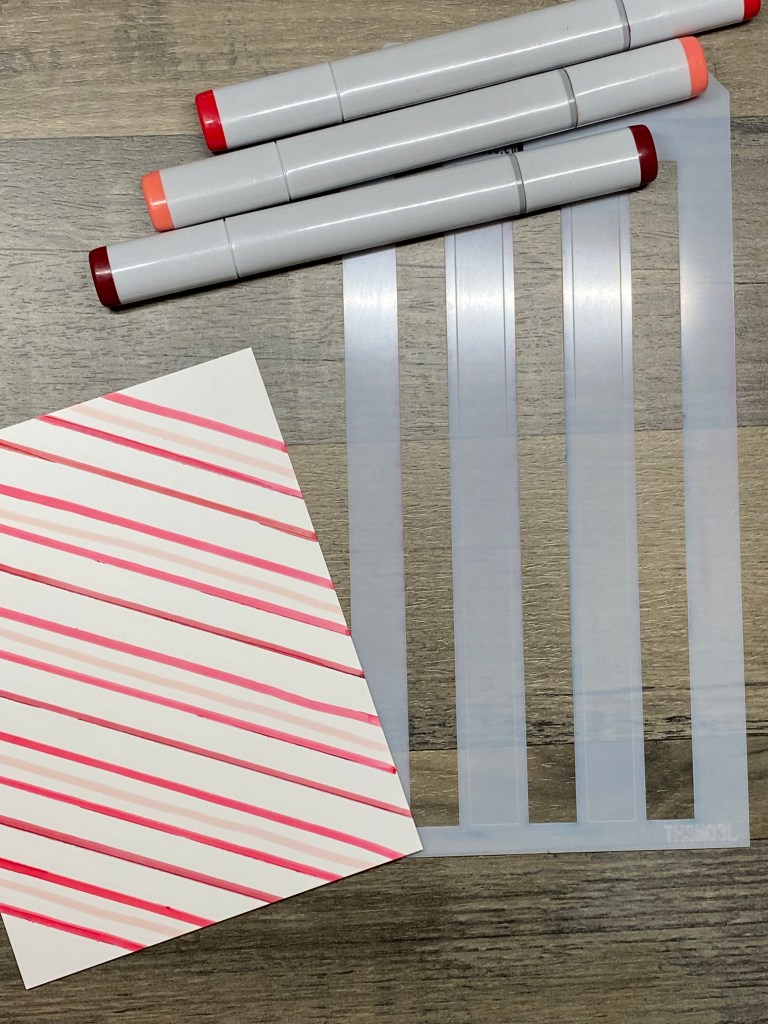
The inspiration for this card came from one of the backgrounds that was demonstrated during the course videos. The instructor used an Altenew stencil (which I don’t have) to create a free-hand looking striped background. In the next lesson, she spoke about using stencils in a different way than they look like they should be used at first glance. For example, she used only part of an all-over diamond diagonal stencil by turning it on the diagonal (which would be straight on her card) and only used a few diamonds in her design. I used a straight up and down vertical stencil, but turned it on the diagonal, to make diagonal stripes. I must have holidays and candy canes on my mind, because I immediately thought of using red!
As in the lesson video, I used three different red markers. I used my Copic Sketch markers, as those are the alcohol markers that I have, and I drew the stripes on a piece of white Yupo paper.
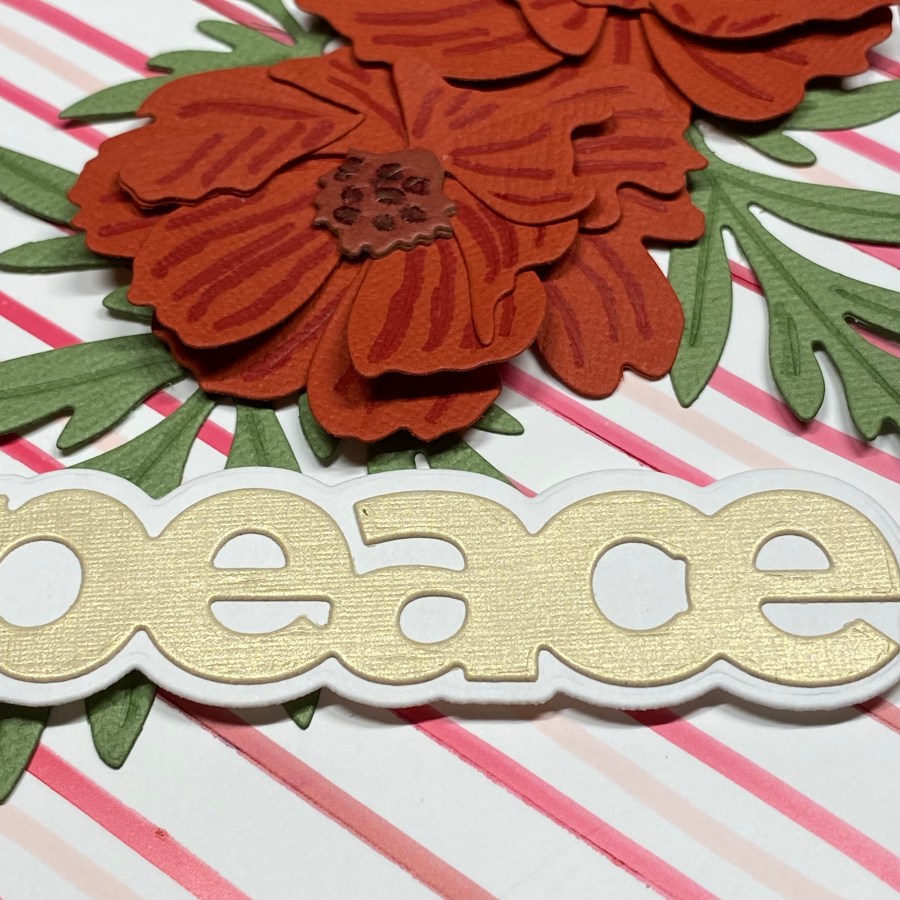
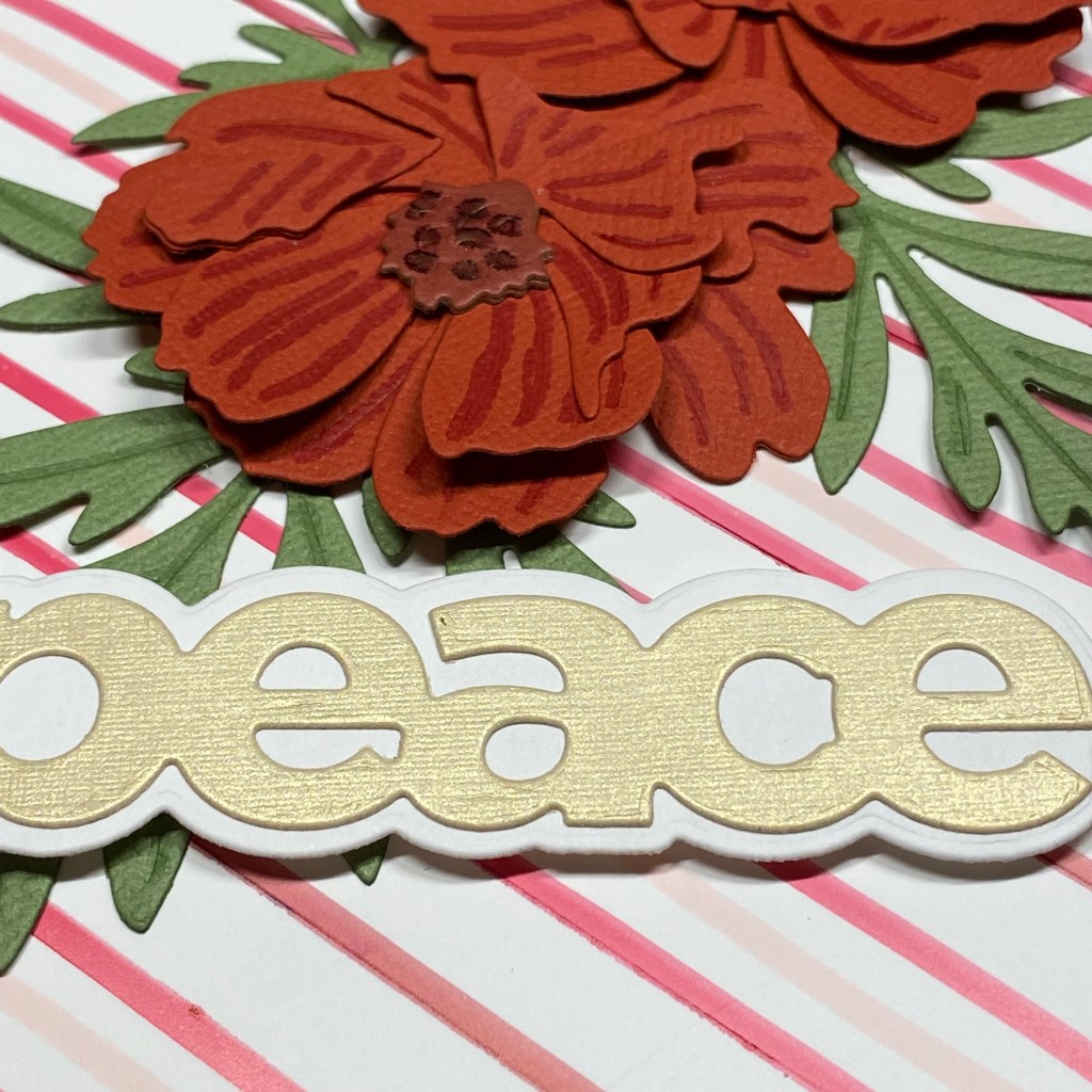
I used my favorite die set from Altenew, the Craft-A-Flower Sulfur Cosmos dies, to cut out both flowers and one of each leaf. I cut them out of colored cardstock that I had in my stash. To use the markers in a different way, I loosely traced the detailed lines from the dies to add some depth to my flowers and leaves. Up close you can see that I wasn’t very precise, but I’m sure the recipient won’t be looking that closely! I think it did add a nice touch to the flowers especially. I also used my fingers to shape the flower petals to add dimension, and used double sided tape to adhere the flowers to the card. For the sentiment, I used a simple two layer Peace die from a different manufacturer. I wanted it to feel like a Christmas Card!
Thank you for stopping by my blog, and Happy Making Season! Even if you can only find time to make one card, go ahead and do it! You can make one person on your list feel extra special!
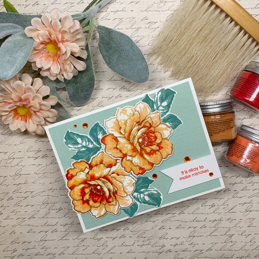
Hello creative friends! Today I’m sharing a card that I made after participating in Altenew Academy’s Impressive Heat Embossing Techniques online course.
My inspiration for this card was my box of Distress Embossing Glazes! I enjoyed the lesson that the instructor shared where she used embossing powder for several layers of a layering stamp set flower. I decided to do the same, and I wanted to use my distress embossing glazes to see what it would look like with the more transparent glazes, as opposed to embossing powder, which tends to be more opaque. I picked 3 glazes that I was hoping would go together fairly well: Tattered Rose, Saltwater Taffy, and Candied Apple.
I chose the Altenew Golden Days layering stamp set, as it had a nice, large flower that I thought would work well for this technique. I also used the coordinating Golden Days die set.
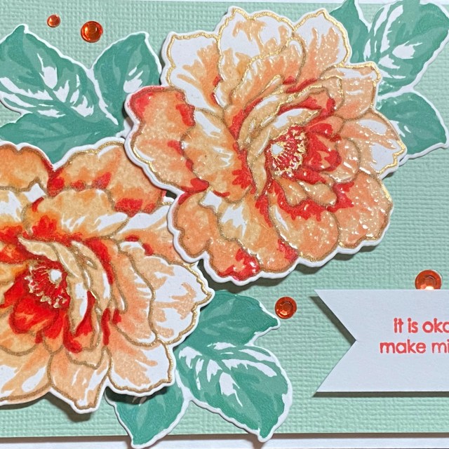
I felt it was important to use anti-static powder between each stamped layer, before stamping the VersaMark ink. This kept things clean and neat. I started by stamping the outline flower layer (A1) with VersaMark ink, and then applying a gold embossing powder and heat setting. This gave me a nice reference point to line up the layering stamps. Next I stamped the A2 layer with VersaMark, applied my lightest embossing glaze, Tattered Rose, and heat set. I used Saltwater Taffy embossing glass with the A3 layer, and Candied Apple with the A4 layer. I didn’t think it was necessary to use the center flower stamps, so I skipped them. I was thinking that the Candied Apple would be too red, but since it is layered over Saltwater Taffy, and it is translucent, it appears more orange. As I was styling the card to photograph it, I realized I had an artificial flower that almost matched my embossed flower in color.
After I finished the flower, I used a color wheel to pick blue-green for the leaves. I skipped the outline leaf stamp, and only used the 2 top layers of the leaf set. I like how the leaves turned out to be a more muted style than the flowers. That really made the flowers stand out, in my opinion.
For the background, I considered using an embossing folder, but used this linen texture paper instead. I used one of the included sentiments in the Golden Days Stamp Set, using Candied Apple Distress Oxide Ink to coordinate. The A2 card was finished with a few orange gems. Thank you for stopping by my blog. I appreciate you!
Altenew products used: Altenew Golden Days Layering Stamp Set Altenew Golden Days Die Set
Other products: Ranger Distress Embossing Glaze – Tattered Rose, Saltwater Taffy, Candied Apple Ranger Distress Oxide Ink Pad – Candied Apple, Evergreen Bough, Pine Needles
Hello creative friends! Today I’m sharing a card that I made after participating in Altenew Academy’s Color Your Day online course.
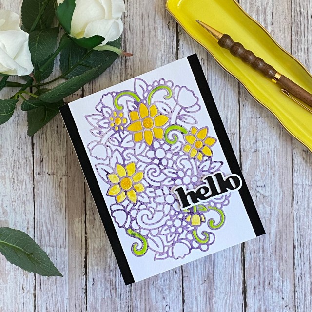
My inspiration from this card was from a different cover die that the instructor used. I knew I had this lovely Fragrant Flowers cover die, and I just love paper piecing with it! I also used the instructor’s suggestion for colors. I started with a piece of watercolor paper that I had colored purple with Ranger Distress Ink in Villainous Potion. Using a generic color wheel that I purchased at a local arts and crafts store, I selected the split complimentary colors of yellow/green and yellow/orange. The course instructor also suggested to use a 70-20-10 rule when combining colors. She said about 70% of your design should be the main color, followed by 20% of a different color, and 10% of the “pop” of color for interest. I used Ranger Distress Ink in Mustard Seed for my yellow/orange, and Twisted CItron with a little Mowed Lawn for the yellow/green. I added double sided adhesive to the back of each piece of colored watercolor paper, and then diecut the Fragrant Flowers die out of each one. I have a Big Shot machine, and usually if I’m using double sided adhesive on the back of cardstock or watercolor paper, I need to run it through 2 or 3 times in order to get a clean cut all the way through the adhesive backing.
Once I had my dies cut out, I removed all of the “inside” pieces of the purple to leave the outlines, and then adhered that to a piece of white cardstock. I picked a few flowers to paper piece in the yellow petals, around what I thought looked like about 20%. Then I used some of the green for a few of the swirls, just to add that pop of complimentary color.
The sentiment is from Versatile Greetings, and I used a black velvet textured cardstock for the “hello”, as well as the background frame. I love texture, and the combination of the cutout background, the filled in flowers, and the velvet cardstock is really great. I could pet this card for quite some time. I hope the recipient does too!
To add a touch of sparkle, I used some gold Ranger Stickles for the flower centers. This is a standard A2 sized card, and probably thin enough to go through the USPS mail with a regular stamp.
If you love jigsaw puzzles, you’ll want to try this paper piecing technique! The cool part is that if you lose a piece, you can just cut another! Thank you for stopping by my blog. I appreciate you!
Altenew products used: Altenew Fragrant Flowers Die Set Altenew Versatile Greetings Die Set
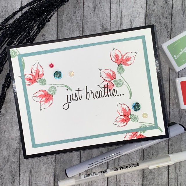
Hello creative friends! Today I’m sharing a card that I made after participating in Altenew Academy’s Beautiful Details online course. First let me just say that I am fully aware that my “details” don’t quite fit the “beautiful” description! Ha ha. The point is that I tried, and practiced, and came up with something that I’m not entirely unhappy with, using a technique that was VERY challenging for me! I will also say that as creators, we are often our own worst critic. The instructor for this class, Arika Rahtu, is extremely talented! She did a wonderful job with this class, encouraging participants to try the techniques she shared, and also to practice, practice, practice! She talked about when she started as a beginner, and how she had to practice a lot to get to the point where she is now.
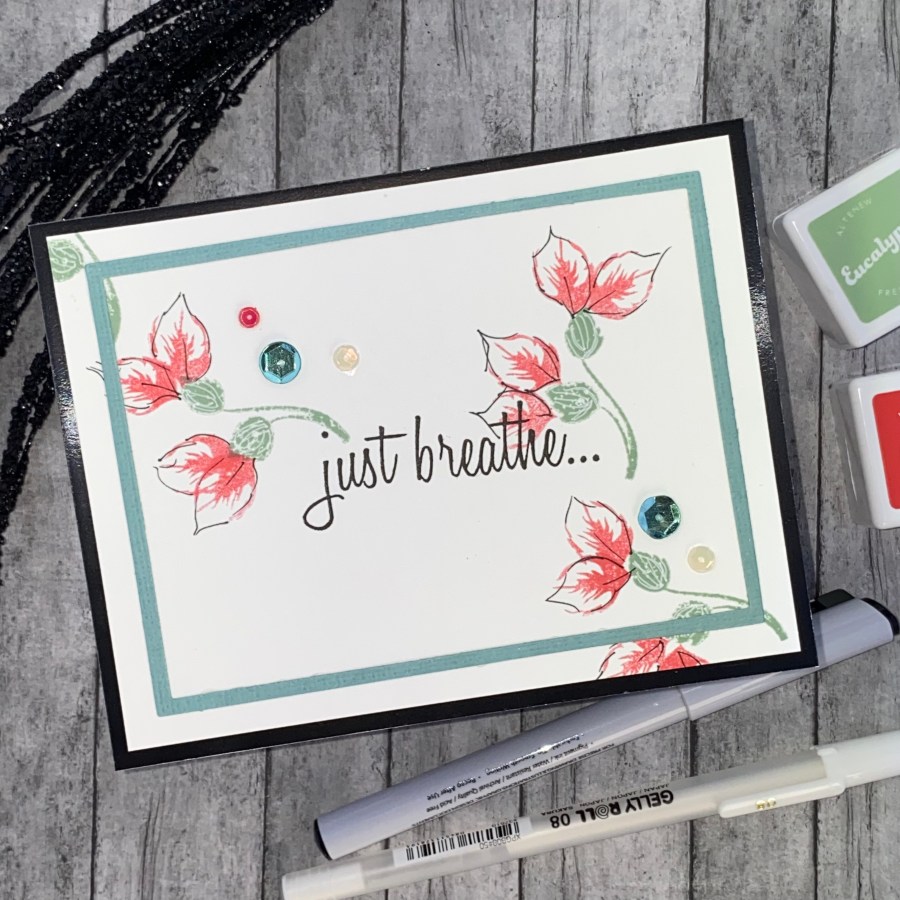
I didn’t have any of the stamp sets that she used in the course, so I used the Altenew Vintage Roses set, because there were some individual leaf layer stamps I thogught I could use. In the first lesson, Arika uses second and third generation stamping to get different shades of the same color to create the base of her flowers. I tried this several times, and just could not get anything I was happy with. Adding the “details” made it even worse, in my opinion. But, I was inspired to try my version of her technique, and also use the diagonal theme.
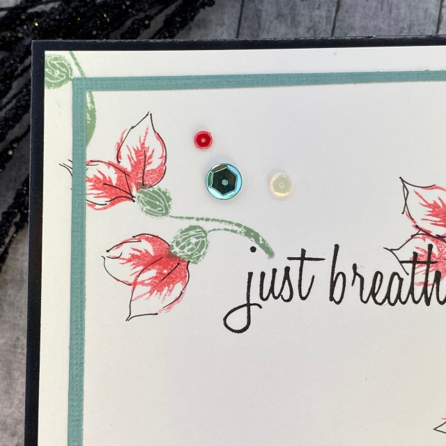
I ended up making these “flowers” by stamping one of the leaf layers twice. I stamped “just breathe” from the Bad Days Happen Stamp Set in the center of a piece of Neenah Classic Crest 110lb. Solar White cardstock. I used a leaf spray from the Vintage Roses stamp set first as the base of the flower, then added the two “petals”. I used a fine tip black marker to add some details (outlines) to the petals, and a white gelly roller pen to add some interest to the green flower base.
I cut a thin rectangle frame using some nested rectangle dies out of a coordinating cardstock, and added this as a border. I also added a few sequins.
For me, I would call this a “clean and simple” card, compared to the style I usually make. This class definitely pushed me outside of my comfort zone. To anyone who enjoys adding drawn in details, this would be the class for you! It is a very inspiring instructor, and a very inspiring class for those of you with more artistic talent! Thank you for stopping by my blog. I appreciate you!
Altenew products used: Altenew Vintage Roses Stamp Set Altenew Bad Days Happen Stamp Set Altenew Fresh Dye Ink Cubes – Crimson, Eucalyptus
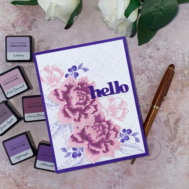
Hello creative friends! Today I’m sharing a card that I made after participating in Altenew Academy’s Polychromatic online course. This was another very good class. Several of the techniques used markers, and that’s probably my weakest medium to use, so I chose to make a card with a technique that would work with one of my Altenew Stamp Sets.
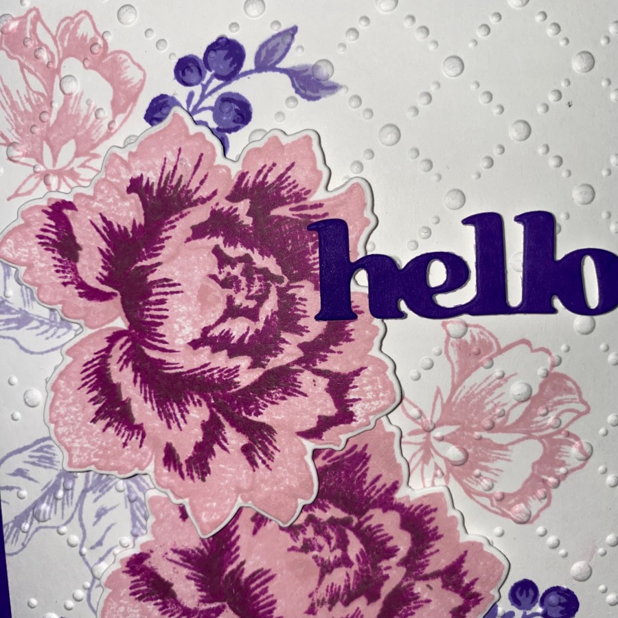
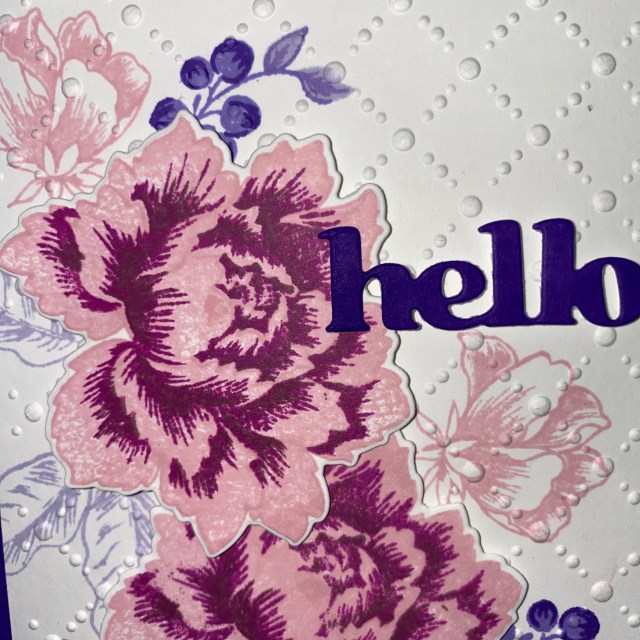
I was inspired by Lesson 4, which included two beautiful butterfly cards. The technique was watercoloring with similar colors, like pinks, violets and purples, or blues and teals. I used similar color combinations, but the big thing for me was that I did not only use the colors that are packaged together in the minicube sets. The colors I used for the main peony (Pink Diamond, Cosmic Berry, Grape Agate) all come from different sets. One of the reasons why I love Altenew inks is that you can purchased coordinating 4 piece minicube sets, where all of the colors are perfectly coordinated to compliment each other. This totally takes the guesswork out of selecting colors, and I suppose some might argue it takes the fun out of it as well! I find it helps me learn, and build confidence, until I’m ready to try something on my own.
I stamped the peony with the outline stamp first, and then used the same light pink color to stamp the first layer. This made it sort of difficult to see the outline in order to line up the next two stamp layers that I used, but I thought I got it close enough that it still looks nice.
For the background of my card, I stamped a couple layers of several of the leaves and the blossom directly onto the background panel. I used the lightest pink, Pink Diamond. I also used Wisteria, Hydrangea, and Ultraviolet which did come in the same minicube set. After the ink was dry, I ran the background through my die cut machine with a simple dotted embossing folder from my stash, to add some dimension. In the lesson, the instructor used a stitched rectangle die to add interest and texture to the white space.
I used one layer of the “hello” die from the Versatile Greetings set, and cut the sentiment out of paper that I had colored with the Ultraviolet ink pad. I really like the effect of stamping, and then dry embossing, to add texture. I don’t think I’ve done that before, or at least not very often. I also used the direct-to-paper method to color the border for my card with the Ultraviolet ink.
Up close, you can see that some of the pink ink on the flower is a little splotchy. I decided to leave it that way, again for interest and texture. Thank you for stopping by my blog. I appreciate you!
Altenew products used: Altenew Peony Bouquet Stamp Set Altenew Peony Bouquet Die Set Altenew Versatile Greetings Die Set Altenew Crisp Dye Ink Cubes – Pink Diamond, Cosmic Berry, Grape Agate, Wisteria, Hydrangea, Ultraviolet
Hello creative friends! Today I’m sharing a card that I made after participating in Altenew Academy’s Creative Watercolor Media online course. This was a fun class, because 3 of my favorite instructors teamed up together for this one: Laura Bassen, Jennifer Rzasa, and Debby Hughes. They each shared 2 cards, and several different techniques for achieving watercolor effects.
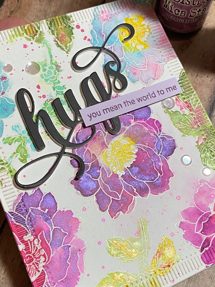
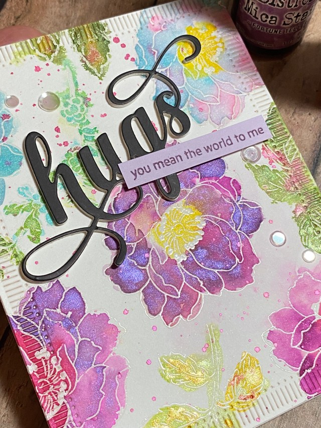
I was inspired by a card that Laura made. It was a loose watercolor floral panel. She used reinkers as watercolor paints. I don’t have many reinkers, and definitely not in a coordinating color scheme, so I used my Ranger Distress Mica Stain Sprays instead. I also used the suggestion of using plain clear water to help the inks blend better, and made sure to work the inks while everything was still wet. I tried really hard to “let the perfectionist side of you take a back seat”. I’ll definitely have to practice that suggestion, but I’m pretty happy with my final card.
I started with a half sheet (6 x 9) of Canson watercolor paper, the pad with the blue cover. I believe it’s hot press, so relatively smooth for stamping. Laura recommended starting with a big piece of paper, and actually got two A2 sized panels out of her sheet of watercolor paper. I was struggling with the technique a little, and didn’t finish my panel. I also prefer to work on more manageable sizes of paper, rather than a big piece. As I was applying the inks, I felt that I hadn’t stamped the flowers close enough together, and was going to scrap this attempt and start over. In the end, I ended up cropping down my panel to one A2 sized section I was happy with. Before I get too far, let me go back to the beginning…
I chose the Beautiful Day Stamp Set to work with, because I liked the size and detail of the large flower outline stamp. I thought it had some nice open space to apply the watercolors. I used Versamark embossing ink, and embossed with clear embossing powder. I also used a sprig and leaf cluster from the same set. I stamped an image, added embossing powder so I could see what I had just stamped, and moved on to another image. When I was done with the panel, I heat set the entire piece all at once. You need to be careful not to knock off any powder before you heat set it. Once that was done, I selected 5 different coordinating mica stain sprays for the flowers, and 2 greens for the leaves. I sprayed three or four pumps of each stain into a different disposable portion cup (like from a takeout food order). You can use a palette if you have one. The cool thing about these water-based mica stain sprays is that they dried up in the portion cups overnight, and all I had to do was add water to be able to use them again the next day. I’d imagine any water based spray would work the same.
I used the technique introduced in the class where you apply water to the image first, and then dab on the watercolor ink or paint, letting it move and blend with the water. Instead of misting the images with a mini mister as Laura did, I used a clear paint brush. This let me control where the water went, and therefore also where the ink went. My piece ended up not as loose as the background that Laura created in the class. I tried to let myself go a little more outside the lines with the leaf cluster on the far right below, but I didn’t like it as much. That’s when I stopped, and decided to take a break and come back after it dried, with less self-judgment in my eyes! To fill in some of the white space between the flowers, I spattered the pink mica spray over the entire piece, and let dry.
I wanted a subtle border on the final card. I used Spellbinders Fluted Classics Rectangles dies to cut an A2 sized panel from my background. I like how this die finished off the edge of the card, but didn’t detract from the beautiful colors of the mica sprays. I considered creating a border with cardstock (black, white, silver, or lavender), but didn’t like it as much as the effect of leaving it with just an etched border for this card. I finished off the card with the Altenew Fancy Hugs die, which I cut from black cardstock, and layered on top of 3 white diecuts for dimension. I also added a sub-sentiment from the Paint-A-Flower: Camelia Waterhouse Outline Stamp Set, and a few clear confetti sequins.
This is a pretty straight forward technique. You can make it as loose or as controlled as you want it to be. If you don’t have mica sprays, maybe you have metallic watercolor paints? Or, try it with some vibrant reinkers. Thank you for stopping by my blog. I appreciate you!
Altenew products used: Altenew Beautiful Day Stamp Set Altenew Paint-A-Flower: Camellia Waterhouse Altenew Fancy Hugs Die
Also used: Ranger Tim Holtz Distress Mica Stain Sprays – Hocus Pocus, Fortune Teller, Cocktail Party, Shniy Bauble, Harvest Moon, Wicked Elixir, Tree Lot
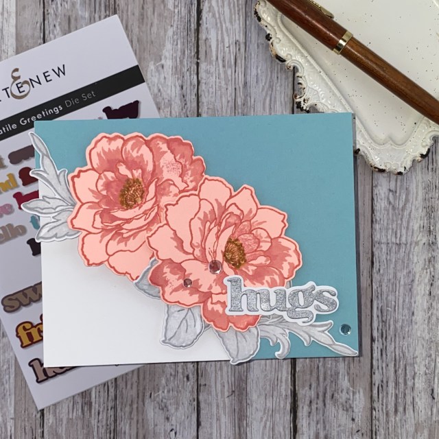
Hello creative friends! Today I’m sharing a card that I made after participating in Altenew Academy’s With a Twist online course. I chose one of my favorite stamp sets, Altenew’s Golden Days. It’s a beautiful flower, and I find it works for almost any occasion. I like the additional leaf that looks more like a flourish. Yes, part of the fun of this hobby is collecting all the stuff, but I do find I tend to grab my favorites time and time again. Try learning new techniques and trying different color combinations with the stamps, dies, and stencils that you already own. You’ll be amazed with what you can create, and the completely different looks you can achieve!
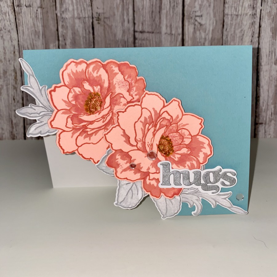
Some of the “things with a twist” that I did with this card included starting with colored cardstock. I actually started with a lighter coral/salmon color. I usually would start with white, and let the inks do all the heavy lifting. I selected some matching inks, which happen to be Ranger Tim Holtz’s Distress Oxide ink pads. After I stamped the flowers on the lighter cardstock, I decided to go a little more outside of my usual box (the point of this course), and tried the same inks on a bit more vibrant color cardstock, which is what I ended up going with for the final card. I did not use the largest layering stamp, or one of the flower center pieces. (It’s okay – there are no rules that you have to use them all!) I like how by using the colored cardstock to stamp on, you don’t end up with a white border around the outline, as you would if you used white cardstock to start. Not the look I’ll be going for every time, but it’s great when you happen to have the right color paper on hand, and you want to “twist” things up a bit!
Next I picked a bunch of colored paper from my stash, mostly blues, but some greens, reds and yellows. I decided to head towards a blue, and finally selected this teal blue.
Another twist was using a neutral for the leaves. I tried both tans and grays, and decided to go with the gray to keep the cooler look for the card.
Here’s the big one: cutting off the corner and having the card front reveal the inside of the card. I don’t think I’ve ever done this before, but I do really like how it came out.
This card was pretty straight forward as far as putting it together, so I didn’t take any in-process photos. I’d suggest to stamp and diecut your pieces, arrange them on the card, and then decide where you want to trim the front panel. Be mindful of your layering to create some interest, and add more diecuts if necessary. I ended up adding another leaf cluster at the end. The “hugs” sentiment was created with a small piece of metallic matte paper from my stash. To finish this card, I attached the front panel to a 4.25″ by 5.5″ base made with Neenah Classic Crest 100 lb cardstock, trimmed to match the front panel. A few confetti sequins were added to accent the sentiment. Thank you for stopping by my blog. I appreciate you!
Altenew products used: Altenew Golden Days Layering Stamp Set Altenew Golden Days Die Set Altenew Versatile Greetings Die Set Ranger Distress Oxide Ink Pads – Abandoned Coral, Worn Lipstick, Salwater Taffy, Hickory Smoke, Lost Shadow, Brushed Corduroy, Fossilized Amber