
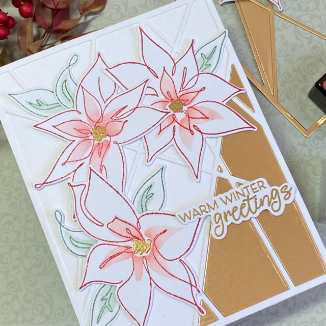
Hello creative friends! Today I’m sharing a card that I made after participating in Altenew Academy’s Elements of Floral Composition online course, instructed by Jaycee Gaspar. I took this class as part of my Altenew Academy Level 3 certification. This was an excellent course, and I learned a lot about the different aspects of composition in art. Jaycee is an excellent instructor, and I highly recommend following him on social media and taking some of his classes.
The inspiration for this card came from the beautiful coordinating set of stamps, dies and stencil that I treated myself to from Altenew before the holidays – Linear Life Poinsettias. I loved the modern design of the stamps. I thought the stencil, with it’s offset design, would surely stretch my comfort zone! Although I started with the Poinsettia set for this card, I had no idea what I was going to do as a design until I participated in this class with Jaycee.
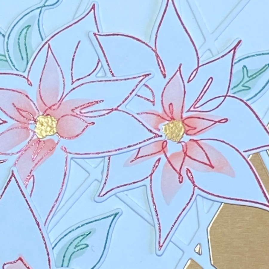
I just love how this class is divided into lessons with each one focusing on a different element of composition: Color, Value, Line, Shape, Form, Texture, and Space. The real inspiration for this card came from Jaycee. I used his 60-30-10 Color “rule”, striving for about 60% gold, 30% red, and 10% green. To add color Value, I used two coordinating red shades of ink (Vineyard Berry and Pink Pearl from the Tea Party mini ink cube set), and then softly blended a gradient of ink through the stencil to get more Value differentiation. I used a triangle Shape to arrange my flowers, and I also used the grid of thirds that he explained, for both the flower placement and the sentiment placement. I used dimensional foam tape to add Form, and the String Panel Cover die to add a layer of Texture to the background. Texture was also added with clear embossing powder for the outline of the flowers and leaves.
I started by stamping the poinsettias in Vineyard Berry ink on 80 lb white cardstock, applying clear embossing powder, and then melting the powder with a heat gun. The ink didn’t stay wet as long as I wanted it to (it’s winter and the air in the house is very dry), so the embossing powder didn’t stick as much as I wanted it to. It still gave the look I wanted, so I decided it would be fine. I stamped the leaf outline in Eucalyptus, and embossed in clear powder as well. I then used the stencil to apply color to the flowers and leaves, using Pink Pearl and Silver Sage. These are lighter colors in the same mini ink cube sets. I used a small blending brush, and tried to get more ink at the center of the flowers as a component of Value.
After my flowers and leaves were colored, I cut them out using the coordinating dies. This is when I started playing around with the placement, using my “rule of thirds” grid, and keeping a triangle shape. I then thought about adding the sentiment. The color gold would compliment the red and green nicely, so I stamped a sentiment from the set with VersaMark ink, and embossed in gold embossing powder.
I considered adding texture with texture paste through a stencil, but this seemed like a “cleaner” card to me, and I wasn’t feeling texture paste was the way to go. Looking through my supplies, I found the String Panel Cover Die. If I cut this out of white and used it for the background, I felt it would add a subtle, modern, clean element of texture. After cutting it out, I saw that there were several triangle shapes within the strings. That gave me the idea to focus on one of the triangles by filling in part of the cover die with gold cardstock. It’s very easy to do this, just by die cutting another piece in gold, and inlaying the pieces you want.
Originally I was thinking of my three colors being 60% red, 30% green, and 10% gold. I planned to use gold for the sentiment and some embellishments, like thread and sequins. After I pieced in the gold cardstock rectangle, I convinced myself I still had about the right proportions of color if I used gold as the predominant color, followed by red and then green. To carry the gold into the flowers and create a more balanced look to the card, I used an embossing pen to color in the flower centers, then applied and heat set gold embossing powder.

You can see that this gold paper has a brushed finish to it, adding another touch of texture. To add the element of form, I used two different thicknesses of dimensional foam squares for the flowers and sentiment, and liquid glue to attach the leaves to the card front.
Thank you for stopping by my blog – I appreciate you! Give yourself permission to take care of yourself today and spend time doing what fills your heart!
Altenew products used:
Altenew Linear Life: Poinsettias Outline Stamp Set
Altenew Linear Life: Poinsettias Die Set
Altenew Linear Life: Poinsettias Simple Coloring Stencil
Altenew String Panel Cover Die
Altenew Crisp Dye Ink mini cube set – Tea Party (Vineyard Berry and Pink Pearl)
Altenew Fresh Dye Ink mini cube set – Frosted Foliage (Eucalyptus and Silver Sage)

This is such a pretty card! LOVE the modern look!
LikeLike
Pingback: Caught by Altenew: 8 Amazing Fan Posts for January 2024