Scrappy Shak Design Team: Happy Fall Pumpkin Duo

Me: Does this look like a gourd?
Him: No.
Me: (tries yet another color combo) Does this look like a gourd?
Him: Well… that’s better…
Me: (finishes card)
Him: Now that looks like a gourd.

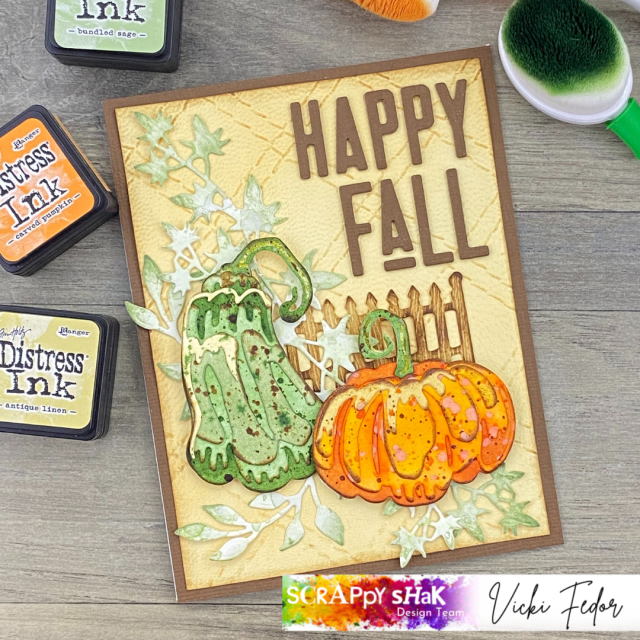
I had a bit of a time trying to get the colors “right” for the green gourd/pumpkin. I wanted to make one of those cool blueish green gourds you see at the pumpkin patches. I was thinking a hazy, blue green, grey… I didn’t quite accomplish that, but I think I’m okay with my green gourd, which may not exist in real life, but that looks good next to my orange pumpkin!

The colors I settled on were Rustic Wilderness and Bundled Sage. To get the four different paper colors for the colorize pumpkin die, I ink blended Rustic Wilderness on watercolor paper, using a heavy hand, and then did another piece using a light touch. I used Bundled Sage on another piece of paper, and Antique Linen for the small diecut on top which will be the highlight piece. After blending, I flicked water on all of the pieces, and dried. Then I splattered with Antique Linen, Rustic Wilderness, and Vintage Photo.

The pumpkin colors were much easier for me to choose: Crackling Campfire, Carved Pumpkin (surprise!) and Spiced Marmalade. I flicked and splattered again with the same colors I used for blending. I used Carved Pumpkin distress oxide spray for splattering, which gave a different look, but that was just a “use what you have”, not a planned happening. I like how it came out. By the way, when I splatter, I go from the lightest color to the darkest, and dry between layers. If I want tiny splatters, I will use a #4 fan brush. If I want small splatters, the distress splatter brush works for me. Otherwise, and if I’m being lazy, I’ll just splatter with the tube of the sprayer from the bottle of spray stain. Then I’ll curse myself for being lazy, because the splatters are too big!

The only part of the base layer dies (labeled A-Green-1 and B-Green-1) that you’ll see is the middle part of the stem. The rest of it gets covered up by the pumpkin, and the small accent stem pieces. I used spray stain in Peeled Paint for this. I used Rustic Wilderness to color the paper to use for the small stem accents.

After I finished my pumpkins, I worked on the background. I was thinking blue, so I blended Tumbled Glass and Prize Ribbon on watercolor paper, then flicked on some water, and dried. While I thought the intensity of the background matched the pumpkins, I decided it was too distracting, as I wanted the pumpkins to be the focal point. So the blue background went into my “use for something else” pile. Something else in my “use for something else” pile was a piece of tan paper that I had embossed with the Quilted embossing folder. But now, it looked better with the pumpkins. I’m glad I have that pile! I colored a piece of watercolor paper with Bundled Sage, and used it to cut out some leaves from the Garden Greens die set that kinda sorta could pass for squash leaves.

When I assembled everything on the card base, it seemed like the pumpkins needed a little more… grounding… so I cut a piece of picket fence from my Village Cottage Bigz die, using the Tim Holtz white wood grain paper. I blended Antique Linen onto the wood grain paper, then added Vintage Photo. I used Bearly Art glue with a precision tip to stick everything down, except for the pumpkin. For those, I used Scrapbook Adhesive Foam Squares: thin for the green one, regular thickness for the orange one.

For the sentiment, I used the new Alphanumeric Theory dies. I cut the sentiment out of brown textured paper from Sizzix, and then cut two more of each letter from kraftstock. I’m not sure how anyone with porkchop fingers can manage those little pieces, but I was able to glue the three layers together, to give it more dimension. It was difficult lining them up on the card, even using a T-square ruler. Too much caffeine for me I guess! Sometimes I will apply double sided adhesive to the back of the paper before I cut it, but with something this small, I knew I wanted to use liquid glue so I would have some “wiggle time” to line them up.

Happy Fall y’all, and thanks for stopping by!

Products available from ScrappyShak include:
Tim Holtz Sizzix Pumpkin Duo dies
Tim Holtz Sizzix Quilted embossing folder
Tim Holtz Sizzix Alphanumeric Theory dies
Distress Ink Pads
Distress Spray Stains
Tim Holtz Wood Grain cardstock
Tim Holtz watercolor paper
Tim Holtz Distress Splatter brush

ScrappyShak Design Team: Feathery Suspect

Hello crafty friends! I was so excited to get two of my new Tim Holtz Sizzix Chapter 3 dies, I wanted to use them both at the same time! I ordered Feathery and Specimen. I love birds, and have been searching for the older Sizzix Bigz feather die that has been retired for a while, so I was very happy that Tim released these new thinlit feather dies. I can see them being used for all kinds of different occasions and holidays, as well as Home Dec projects. I also had to get the Specimen dies, because they seemed like a staple that I would be using time and again, especially when I think about mixed media projects. So there I was… feathers… and files…. what to do? I could make a bunch of feathers, and put them in a file folder, like someone was collecting them to… do what? Then it hit me – evidence! Evidence of something, done by… a Snarky Cat! I have those stamps! Then it all came together.

The words that come with the Specimen set are things like “files”, “series”, “archive”, etc. I figured if I had enough patience, I could cut the teeny tiny letters out and make my own word, “evidence”. It worked, and it fit perfectly on the file folder in the specimen set.

I started by using my Distress Spray stains to color watercolor paper. I used two colors for each different color of feathers, drying in between each color. The colors were Aged Mahogany, Barn Door, Black Soot, Villainous Potion, Salvaged Patina, Antique Linen, Vintage Photo, and Gathered Twigs. After I die cut the feathers, I outlined each one with Vintage Photo and a sponge applicator. I tend to be a little lazy at times, but here’s where you shouldn’t skip a cleaning step. Even if your watercolor paper looks dry, I find some of the color stays on the die after cutting, so I always take time to rinse and dry my dies. Otherwise it might rub off the next time I use it, speaking from experience!

After getting my feathers cut, I cut my file folder. I have some neat paper I got a long time ago. It’s manilla colored, heavier, and has some wrinkles in it. I got it in a cardmaker’s paper pack, so I have no idea what brand it is. You can certainly use whatever you have. I grunged up the edges of this with Vintage Photo as well, and added my “Evidence” word.

Next I stamped my Snarky Cat onto Neenah Classic Crest Solar White cardstock with VersaFine ink in Onyx Black, using my Misti Stamp platform. The speciman die set comes with a die that will cut it out perfectly to fit into the slide cutout. I wanted it to look like a mug shot, so I used a darker yellow paper to layer behind my cutout numbers.

The Specimen set has the right size dies to make the black label, and a smaller die to fit behind it (in yellow). You have to be careful to save the circle in the middle of the letter “o”, and the number “0”, when you die cut “No. 3074”. The negative inside of the “4” was just too tiny to try to save, so I used a fine tip marker to draw in a small triangle so that it would look like a number. Hard to explain, but you’ll understand when you try it. You could of course leave those little pieces out, but I thought they were needed. I cut the slide again from black paper, just to get the little negative circles to pop in the corners of my slide. I’ve seen people use small brads, but I didn’t have any. I used Scrapbook.com’s Pops of Color in black first, but I smeared one before it was completely dry, so I had to start all over again! If you get a chance, watch Tim’s Youtube for this set. Lots of great ideas! The paper for the slide was from Tim’s kraftstock newer paper packs.

When I was ready to put the card together, I made a 5×7 base from Neenah Dessert Storm cardstock, and picked a piece of paper from the Backdrops paper pack that I thought would pull it together. I thought the file folder needed something else, like a sentiment. I felt there was too nuch white space. I chose one from the Noteworthy stamp set and used VersaFine ink. Poor Snarky Cat. Don’t lose hope! Maybe there isn’t enough evidence for a conviction! Ha ha. I positioned everything the way I wanted it before I glued the folder to the card front, added the feathers (with liquid glue), and then added a tiny clip embellishment. The Snarky Cat slide was popped up with dimensional foam and attached to the card.

I hope this inspires you to play with the Specimen and Feathery sets! It was lots of fun creating this!

Products used, available at Scrappyshak.com

Tim Holtz Sizzix Specimen thinlit dies
Tim Holtz Sizzix Feathery thinlit dies
Tim Holtz Stampers Anonymous Snarky Cats stamps
Tim Holtz Distress Spray Stains
Misti Stamp platform

Single layer masculine card with Simon Hurley stamping foam

Hello paper people! Today I have a card using a product I’ve been playing with, and thinking about, for a while. I used the Simon Hurley heart shaped stamping foam. As I’ve said before, I’m not a huge fan of heart shapes, but I really liked this set. For one, it is bigger than the regular rectangular Simon Hurley foam. I liked how I was able to use the large piece to cover the whole front of my card. Also, when you add texture and then stamp the two pieces together, either at the same time or separately, you get a tiny bit of white space around the heart. This automatically gives you the illusion of depth. So even with a single layer card, it looks like there’s more detail, and the heart becomes the focal point. You get two sets (heart and rectangle) of the foam in a package. You can use both sides of the foam, and you can reuse the foam, probably many times. If you’re using dye inks, you can clean the foam after use with water and a lint free cloth.

Simon Hurley has a bunch of Youtube videos demonstrating how to use the foam. It’s super easy to use, and the foam gives you a ton of flexibility to create different patterns for your cardmaking. You can use it to stamp images, like a stamp, or stamp a pattern, like you might have otherwise used a stencil. It can also add the illusion of texture that you would get with an embossing folder, but you have the freedom to cheese your own design! I encourage you to watch his videos, as he has a ton of great ideas! I’m not quite set up yet to make my own videos, however I will describe to you my process! Hopefully you’ll see how unique this product is, how easily you can pull a card together, and it will inspire you to try it yourself. I do have another idea I want to play with soon… I don’t have a lot of masculine stuff… like stamps or dies. So when I have to make a card for a guy, I’m often stumped. My guy relatives and friends get often get flowers on their birthday cards, because… I like flowers! I’m going to play around with using the foam with some tiny tools, like the little throwaway wrench you might get with something you have to assemble yourself, and the wire snips I use to cut apart my dies. Maybe washers, nuts, nails… I’ll have to raid the garage and see what I can come up with!

For this project, I started looking around my house to find something to use to create a pattern with the foam. I had this really cool cut glass dish from my mother, which probably came from my grandmother, or even further back up the family tree. We call it the cranberry dish, because it was what we always put the cranberry sauce in for holidays. I was thinking that I needed something that had a lot of depth in the design to make an impression in the foam, but that’s not the case. I ended up using a bamboo table runner to make the pattern for the background. I imagine lace or anything woven would work just fine as well.

Here’s the bamboo table runner that I used for the background, along with the two pieces of stamping foam. The pattern on the table runner is very fine, and I wasn’t expecting the foam to pick it up, but it did. I did have to apply a bit of pressure to it after I heated the foam. I used a large acrylic block, like Simon suggests, and pressed down while standing up at my work surface. I used Neenah Classic Crest, Solar White, 110 lb cardstock, and Hickory Smoke Distress Ink.

Here’s the cranberry dish! Isn’t it lovely? For this, I left the foam on my work surface after heating it up, and pressed the dish into the foam. The sides of the dish have that pretty circular pattern. After I made this card, I used the side of the dish to get that circle pattern. You can make an impression on the foam with something that is not flat – you just have to roll it onto the foam, but you only get one shot, as I found it was too hard to line it up again to make a second pass. Good thing is if you mess up, you just heat up the foam again, it restores to a flat surface, and you can try again.

Not to get all gloomy, but sometimes cardmaking and life are not all butterflies and rainbows. I was working on this card right after finding out my dog has cancer. I was trying to craft to distract myself from the bad news. Staring at the stupid heart, all I could think was that my heart was blue… I’m heartbroken at her diagnosis. That goes with the cut glass I guess. I picked some of my favorite blue distress oxides to color my heart (Salvaged Patina and Prize Ribbon). I just tapped the ink pads on the foam, gave it a teeny tiny mist of water, and stamped it on my background. It was very easy to line up and get it in the right spot in the middle. I wouId usually stamp onto another piece of paper, fussy cut it out, and add foam tape for dimension. But frankly, I was being lazy. To my surprise, I really like how it came out! It looks to me that there’s a little gap of white space around the heart, and that gives it a little better definition. One other way to stamp the heart in the right place would be to lay a clean piece of the rectangular foam onto the stamped background, and just pop the inked up heart into the hole in the center. That way you would know you’re lining it up perfectly. I’ll try that next time.

To finish off the card I used a label tape sentiment from Tim Holtz, and stamped part of a sentiment from the Stamper’s Anonymous Tim Holtz Noteworthy set. I just wanted to use the “you are” part, so I only inked up those words on the stamp. The Noteworthy set is a great set. I find it’s my “goto” set now for sentiments on A2 sized cards. I added a couple silver confetti sequins, and layered it onto a black background. I like this design, because it’s a single layeer design, so it won’t require extra postage, and will go through the mail just fine. You can of course use any color combination, and any textures you can find laying around your house. I would love to see what you create! Please add a photo in the comments! I will definitely be using this come Valentine’s Day, but I also can see using it for sympathy cards and birthdays. I might also try to come up with a Christmas card, because it goes together so quickly, and I make and send a lot of cards for Christmas! Get yourself over to scrappyshak.com and pick up some Simon Hurley stamping foam to play with!

Welcome

Hello, and thanks for stopping by my blog. My initial idea in creating this blog was for it to be more of a visual journal where I could keep a record of my papercrafting makes, and inspire myself to find time to let myself enjoy the process of creating. In an attempt to get out of myself, and possibly help or inspire another human being (which I have found is a big part of why we are on this earth in the first place), I decided to make it into a public blog, and possibly include other inspirational thoughts and ideas. I know that I tend to believe I’m most comfortable by myself, but that probably stems from an irrational core belief that isolating/hiding equals safety. As I journey through this life, I find I am more fulfilled personally and spiritually through connecting to others, and I find a greater well-being by helping others in their journey.

I grew up in Rochester, New York, being the smart one, the rule follower, the quiet “wall flower”, although I felt like I was more like the “wall weed”. I excelled in school, especially science and math, which was not cool for a girl in the 70s and early 80s. My first career was in Computer Science, followed by motherhood, winemaking, addiction, finding recovery, and becoming a substance abuse counselor. I have two wonderful adult children, and a loving husband who has been by my side through it all. At the time of this writing, we had just celebrated 30 years of marriage.

I hope you find something here that inspires you to live your best life. I’ve adopted a mantra, which is “connect, contribute, and grow”. I stole it from someone else, so feel free to do the same. I find greater peace in trying to check those three boxes on a daily basis.