
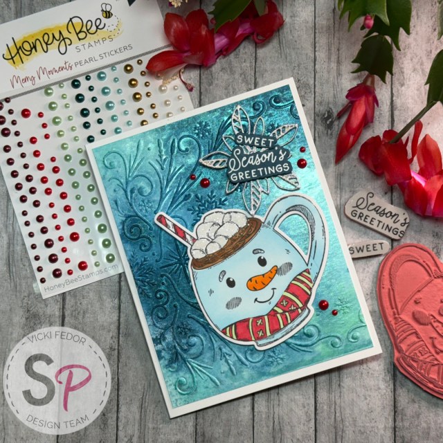
Hello ScrapbookPal friends! I don’t know about your neck of the woods, but it sure is getting chilly here in Northern Virginia! When I saw this set of adorable character mugs from Honey Bee Stamps, I could almost taste the homemade hot chocolate that my mother would have ready for us after sledding! Back then, I’d have to share with my sister and friends. Today, I decided to pick my one favorite design and make a (paper) cup of hot cocoa just for myself! Honey Bee – Cling Stamps – Sweet Season Mugs is a fabulous stamp set that includes four fun mugs (Santa, reindeer, snowman and gingerbread man) and several sentiments. I love that Honey Bee uses real red rubber to make their stamps, ensuring that they will last for years to come. In my experience, they are a much better investment than the clear photopolymer cling sets. All of that stamps have coordinating dies in the Honey Bee – Honey Cuts – Sweet Season Mugs set. On a whim, I decided to splurge and get the Honey Bee Stamps – Pearl Stickers – Merry Moments because I was drawn to the colors. I ended up using the pearls to select my colors for this card (had to add the orange nose!)


For my snowman mug, I didn’t want to just leave him white… I thought that might be too much white with the white marshmallows on top. I am not ashamed to say that my Copic Marker skills are still in the beginner category – okay for some small details, but probably not the best to show off on the focal point of my card. After I used my Copic Sketch Markers (YR04, YR16, R35, YG11, E35, E37) to color in the details of the mug, I hemmed and hawed about messing up the rest of the mug by trying to blend Copics. I had an idea to mask off all the parts that I had just colored, and use a blending brush and a lighthanded application of Ranger Tim Holtz Distress Ink in Tumbled Glass. It looks a little darker in the photo, but it really is a nice light shade of blue in person.


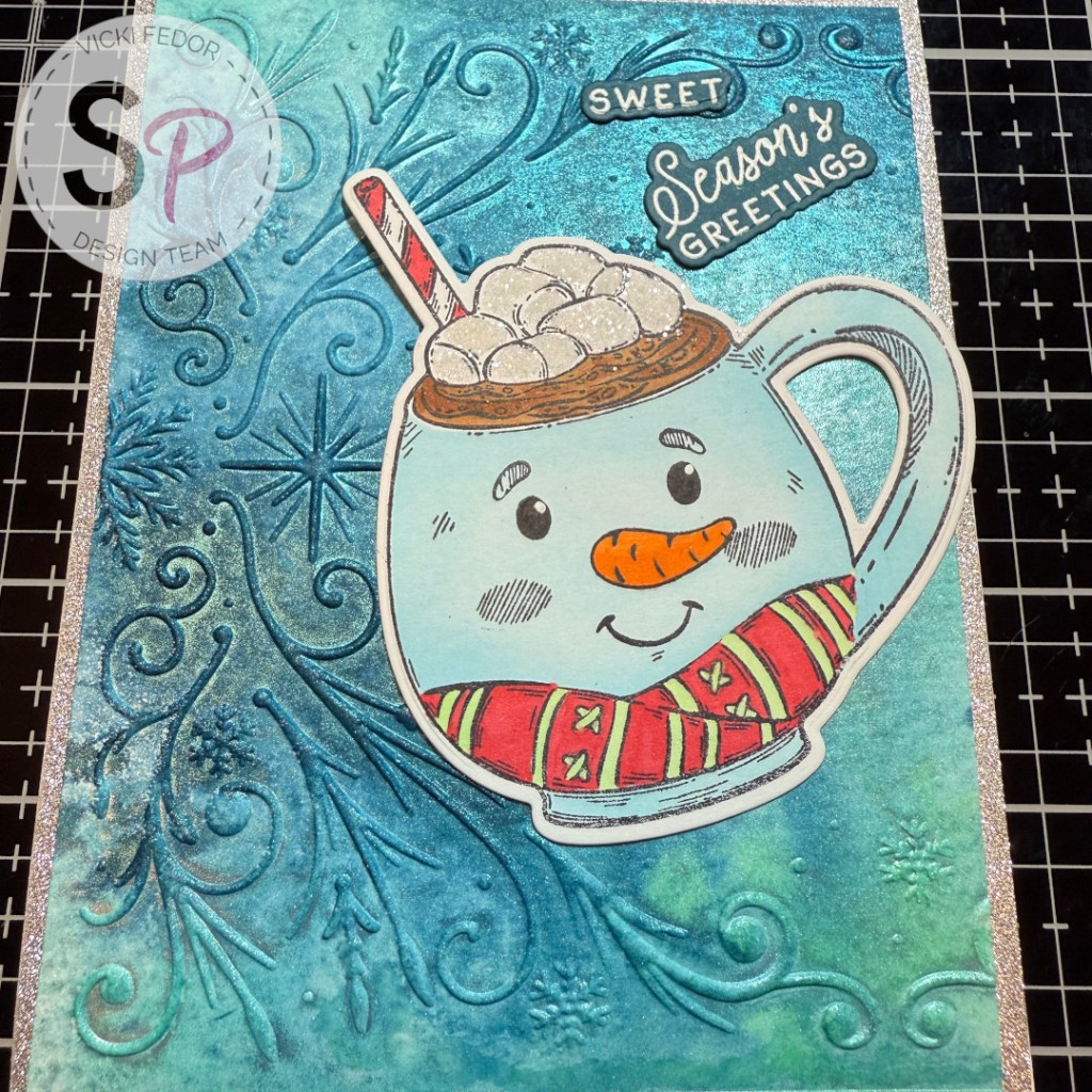
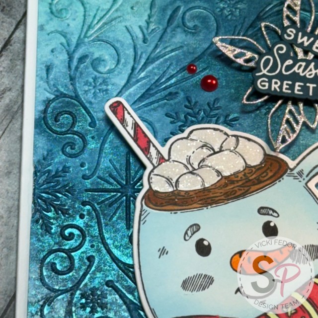
I also added a bit of clear glitter to the marshmallows – because – it’s the holidays! More glitter always! Now that my focal point was finished, I went on to the background of my card. I had also purchased the Honey Bee Stamps – 3D Embossing Folder – Frosted Filigree. This folder is soooo pretty and detailed. It’s a nice 5×7 size folder, but I wanted to stick to a smaller, A2 sized card. I realized that if I turned the folder sideways, I could get a 5 1/4 inch by 4 inch piece for the background with just a tiny 1/8 inch frame of the base card color. Still thinking glitter and sparkles, I reached for my Ranger Tim Holtz Mica Spray Stain swatches. When I purchased mine several years ago, they came in seasonal sets of 3 different sprays. Now, ScrapbookPal sells them individually! And, at the typing of this post, they are ON SALE! I again went to the Honey Bee Stamps – Pearl Stickers – Merry Moments for color inspiration, and chose the Distress Mica Spray Stains in Frosty Mint, Wonderland, and Juniper Berry I highly suggest making swatches of all of your sprays, especially the mica ones that look different when they are settled out on your shelf than they do after you shake them up and spray them. I never used to use my Mica sprays until I swatched them!
I used a piece of watercolor paper, spritzed it lightly with water on both sides, and ran it through the embossing folder first. Then I used the mica sprays, randomly spritzing 2 squirts of each of the lighter colors, and 3 squirts of the darker Juniper Berry color. To get the colors to blend, I spritzed lightly with water again. Then I just walked away! I couldn’t believe how beautiful it was when I returned and it was mostly dry! I couldn’t have planned it any better if I tried! The raised swirly bits and snowflakes seemed to hold a darker concentration of the color, and really stood out beautifully. I had thought that I would have to add some ink on top for definition, but honestly didn’t want to do anything more and end up messing it up! I finished drying it completely with my heat tool, but you could also just wait and let it air dry.
The greetings (I love the tiny little “sweet” stamp!) were stamped in VersaMark embossing ink and dusted with white embossing powder before being heat set. I wanted to give the greetings a landing space on the card. I tried a few things, and then decided a snowflake die would be great. I couldn’t find one that was the right size in my stash, but I did find this poinsettia cutout from Sizzix – Tim Holtz – Thinlits Dies – Vault Seasonal Sketch. I used a glittery paper to diecut my “snowflake” wannabe.
The last step was to use Scrapbook Adhesives Foam Squares Variety Pack and Scrapbook Adhesives Thin Foam Squares Variety Pack, and Bearly Art Precision Craft Glue to attach everything to my A2 white cardbase, and add the Honey Bee Stamps – Pearl Stickers – Merry Moments.

Thank you for visiting my blog. I know through first had experience that the thought of going through the holidays without a special loved one can be overwhelming. I try to find joy in little things like cardmaking, time with friends and family, and random acts of kindness. Please ask for help if you need it. Have a blessed season, however you choose to celebrate. My supplies are listed below, and available at ScrapbookPal.com!
Products used in this project, available at ScrapbookPal.com:
Honey Bee – Cling Stamps – Sweet Season Mugs
Honey Bee – Honey Cuts – Sweet Season Mugs
Honey Bee Stamps – 3D Embossing Folder – Frosted Filigree
Honey Bee Stamps – Pearl Stickers – Merry Moments
Sizzix – Tim Holtz – Thinlits Dies – Vault Seasonal Sketch
Ranger Tim Holtz Distress Ink Pad – Tumbled Glass
Ranger Tim Holtz Distress Mica Stain – Frosty Mint, Wonderland, Juniper Berry
Tsukineko – VersaFine Ink Pad – Onyx Black
Tsukineko – VersaMark Watermark – Stamp Pad
Gina K. Designs – Embossing Powder – Detail White
Spellbinders Mini Blending Brush Set
Ranger Ink – Glossy Accents
Lawn Fawn – Glitter – Prisma
Bearly Art Precision Craft Glue – The Bundle (with precision tip)
Scrapbook Adhesives Foam Squares Variety Pack
Scrapbook Adhesives Thin Foam Squares Variety Pack
Copic Sketch Markers – YR04, YR16, R35, YG11, E35, E37