ScrappyShak Design Team: Yuletide Colorize

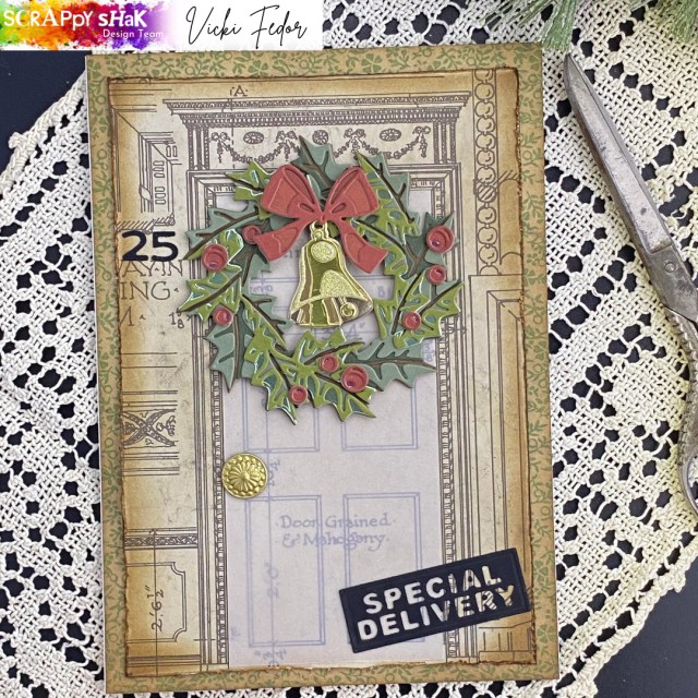
Hello crafty friends! I wanted to share this card that I made for the ScrappyShak Design Team. The inspiration was the Yuletide colorize thinlit die, and also the Christmas Backdrops paper pack.

This card ended up nothing like I had originally planned! I wanted to make a wreath featuring colors that my son and his partner were using to decorate their home for the holidays – pink, silver, and sage green. My plan was to color watercolor paper using distress inks and sprays, and then assemble the wreath. When I started to look at the dies, I wasn’t sure exactly which colors I wanted to use for the different layers. I figured I had better assemble the wreath with cardstock first, so I could decide how I wanted to color my watercolor paper for the differnt layers. I also thought that I would use a coordinating paper from the Christmas Backdrops papers for the background. That got me going in a whole different direction!

I found the Backdrops paper that looked like an architectural drawing of the front of a home with a door that was pretty much exactly the right size for the wreath. I didn’t think the pink and sage wreath would go the best with this background paper. Looking through my stash, I was drawn to the Idea-ology Kraft stock paper stacks. The coordinate so well together. I pulled out some greens and reds, and decided to use them instead. The pink and sage green wreath would have to wait for another day!

Then I had the thought – wouldn’t it be neat to use only the papers in the idea-ology line? I needed 4 different greens to make the wreath, but there were only two that I thought went together in the Cool paper stack. I ended up using a dark brown from the Neutral paper stack for the base, and added in a metallic green from the Metallic Confections pad. I used three different reds from the Warm paper stack for the bow, and added a metallic pink from the Confections pad for the base layer of the berries. For the bell, I used two gold colors from the Metallic Confections pad, a gold from the silver and gold metallic paper pad, and the gold from the Christmas Deco sheets.

TIP: You don’t have to be a hero and figure out this die on your own! Go to Sizzix.com and check out the video for this die. Otherwise you might start to have a panic attack, like I did! I honestly almost gave up before I watched the video (several times). It is easier than it looks, once you get the hang of it.
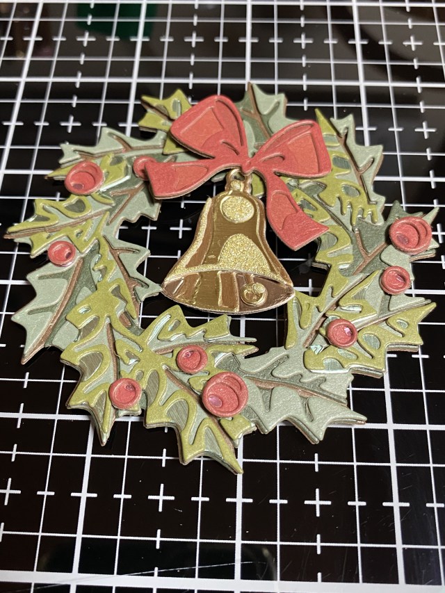
The tricky part is the third layer of the wreath. The fourth layer goes right on top of the third in the same orientation. It really is gorgeous in real life, and certainly worth the effort. Photos do not do it justice. I found the berries to be somewhat frustrating, because they are so small, and I absolutely hate glue oozing out of the teeny tiny pieces. Next time I will definitely use double sided adhesive on the back of my paper before I die cut the berries. I’ve also seen many people using sequins, droplets, or other round embeliishments as a replacement for the paper berries, and they look fabulous as well.

To make the door stand out a little more, I cut a piece of vellum to fit over it, so you could still see the details on the door. I found an old brad that I wanted to use as a door knob, but it was silver, so I colored it with Distress Foundry Wax in Gilded, and heat set it. Another TIP: If you heatset something metal it will get VERY HOT! Use something to hold the item, and then don’t touch it to see if it’s dry (speaking from experience)!
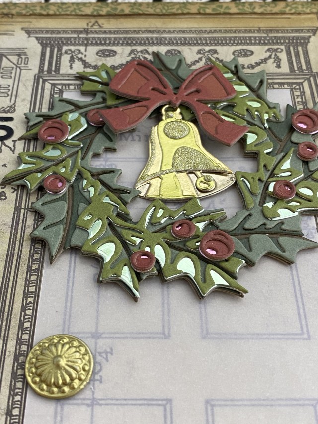
I distressed the edges of the Backdrops paper, and added Vintage Photo Distress Ink. I layered this on top of another piece of the Backdrops paper, and then attached them to a 5×7 card base.

I wanted to add a house number and a sentiment. I found the right size numbers in the Postale die set, and decided to use the “Special Delivery” as the sentiment. Both of those were cut out of black alcohol ink cardstock, my favorite black paper. They need to make the black alcohol ink paper in “regulation size” sheets instead of the 5×7 size!

If you have this die, I hope you are inspired to give it a try. I’d love to see what you make, especially if it’s pink and sage green! Thank you for stopping by my blog, I appreciate you!

Products used, available at ScrappyShak:
Tim Holtz Sizzix Yuletide dies
Tim Holtz Sizzix Postale dies
Tim Holtz Idea-ology Christmas Backdrops Paper
Tim Holtz Idea-ology Kraft-Stock Metallic and Metallic Confections
Tim Holtz Idea-ology Christmas Deco Sheets
Tim Holtz Black Alcohol Ink Cardstock
Distress Foundry Wax Gilded

Also used:
Tim Holtz Idea-ology Kraft-Stock Cool, Warm and Neutral
Tim Holtz Tonic Paper Distresser

ScrappyShak Design Team: Department Store Bells

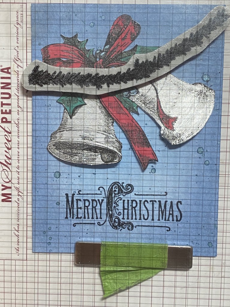
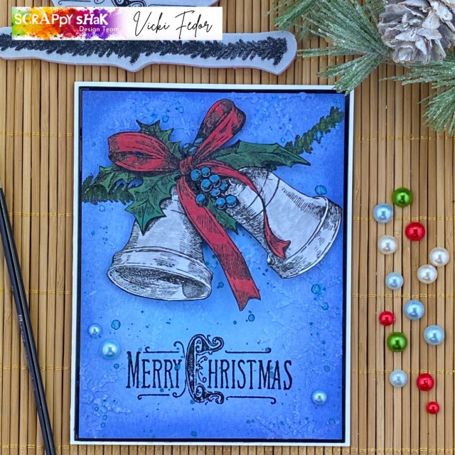
Hello again crafty friends! I wanted to share this card with you that I made for the ScrappyShak Design Team. The main element was the new Tim Holtz Stamper’s Anonymous Department Store stamp set. I wanted to share my process with you in case you would like to replicate this card. I ended up changing a few colors, so the leaves and the bow are actually layered – distress oxide first, then painted with mica stain.

I think I put too much pressure on. myself with this, because I really wanted to do something different. I had seen a lot of makes by other people on social media, and I wanted to do something different, in my own style, whatever that means. I knew I wanted silver bells. I started playing around with stamping on silver metallic cardstock. I used Archival ink, embossed with clear embossing powder. I liked the bells, but I didn’t like the rest of the stamp on the metallic paper. I wasn’t sure how the inks would work on the metallic paper. I thought about fussy cutting the bell part, and then stamping the bow and leaves on watercolor, and piecing them together. But, I also didn’t want this card to be so complicated that you would say “that’s nice, but too much work”. Everyone is so busy this time of year!

The stamp is beautiful. Very intricate, and very detailed. Trying to keep the beautiful detail of the stamp, I stamped on smooth Neenah Classic Crest Solar White. Because I didn’t use watercolor paper, I knew I’d have to use water or spray stains sparingly. I stamped with Archival Jet Black ink, and embossed with detail clear embossing powder. I though this would help keep the color where I wanted it, and keep the lines of the stamped image clean. It worked well when I was using oxide ink, but it didn’t resist the brushed pewter as well as I wanted it to. It’s still lovely in my opinion!

My first coloring was using Distress oxide ink pads. I smooshed them on my craft mat, and then used my smallest Ranger paint brush to apply the color to the stamped image. I used Lumberjack Plaid and Pine Needles. For the berries and bells, I sprayed a bit of Winterfrost Mica spray stain on my craft mat, and painted it on the berries. I did the same with the Brushed Pewter for the bells. Several thin layers are best with this paper. TIP: If you’re painting on inks or sprays like this, the embossing powder will resist the medium, and sit on top of it. So as not to smear everything, paint one color and one area at a time, then carefully blot the excess off with a clean paper towel before moving to the next section.

I fussy cut the stamped image. Here’s another TIP: If you’re not leaving a white border when cutting out a stamped image, use a marker in the same color as the stamped image around the edge of the paper. This will cover up and imperfections in your cutting, and also give it a more finished look. After I finished (my first round) of coloring, I decided on the background colors. I went for blues to match the berries. I wanted the card to have a lighter blue behind the bells, gradually incerasing in intensity to the edge of the card panel. I used Distress Watercolor cardstock, and started with Tumbled Glass Oxide in the middle of the card panel, applied with a blending brush. Then I switched to Stormy Sky, which I only had in a Distress Ink pad. I would later add Faded Jeans Oxide around the edges. Use what you have! The Inks and Oxides blend well together. I think blending foam would work just as well if you don’t have brushes.

I stamped my sentiment in Archival Jet Black, and embossed with clear embossing powder. I added some splatter with the Winterfrost Mica Spray. To add some texture, I used Snowfall grit paste through the Snowflake stencil, THS050, moving the stencil and placing the snowflakes all over the background. Once I got the background done, I decided I wasn’t really happy with the pine needle coloring on the leaves, so I rummaged through my mica stains, and found Tree Lot Mica Spray from last year’s Christmas collection. I spritzed some on my craft mat, and colored in the leaves. After that, well, the bow just looked like it needed some sparkle too. I used Tart Cranberry over the Lumberjack Plaid. I suppose if you are reproducing this card, you could just use the mica sprays to paint the image, but I’m not sure if it would look exactly the same, since the oxide inks add a base layer underneath the sprays. If I were to make this card again, I would definitely try it with the mica sprays first, and skip the coloring with the oxides first. I just wanted to be clear explaining my process in case your card doesn’t look exactly as you expected. I also wanted to share that as long as the ink is dry, you can change the color by layering something else over the top if you’re not happy, especially if it’s in the same color family.

To visually “anchor” the bells to the card, I used a strip of garland from the Darling Christmas stamp set. You could make a garland out of any small pine stamps you have, or skip this part. I positioned the garland strip in my stamping tool in a curved shape, using the bells to position the garland, and stamped in Archival Jet Black, and then colored by painting on Tree Lot mica stain. I attached my bells to the card using dimensional foam squares. I blended Faded Jeans oxide around the edge of the panel, and added 3 blue Christmas Droplets.

I tried to show the shine of the mica sprays… the photos don’t really do the justice. To finish the card, I layered the panel onto shiny black cardstock and then attached it to an A2 cardbase made with Neenah Solar White Classic Crest 110 lb. cardstock. Thanks for stopping by my blog, and happy making season to you!

Products used, available at ScrappyShak:
Tim Holtz Department Store stamp set
Tim Holtz Darling Christmas stamp set
Distress Oxide Ink – Tumbled Glass, Faded Jeans, Lumberjack Plaid, Pine Needles
Distress Mica Stain – Tart Cranberry, Tree Lot, Winterfrost, Empty Tomb
Distress Spray Stain – Brushed Pewter
Distress Grit Paste – Snowfall
Distress Watercolor Cardstock
Ranger Archival Jet Black ink pad
Idea-ology Droplets – Christmas

Also used:
Tim Holtz Stencil THS050 Snowflakes

ScrappyShak Design Team: Holiday Brushstroke #3

Hello fellow makers! Today I’m sharing a card I created for the ScrappyShak Design Team with the new Tim Holtz Holiday Brushstroke #3 die set. I know… how many poinsettia dies do I need? Well, whatever you already have plus one more! I love the artsy brushstroke design of this one, and it goes together so easily. The greens that are included are beautiful. You don’t even have to use the layering pieces if you are short on time or want to simplify your card. Just start with an interesting piece of paper colored with multiple inks, and that will give you a beautiful result as well as the layers will.

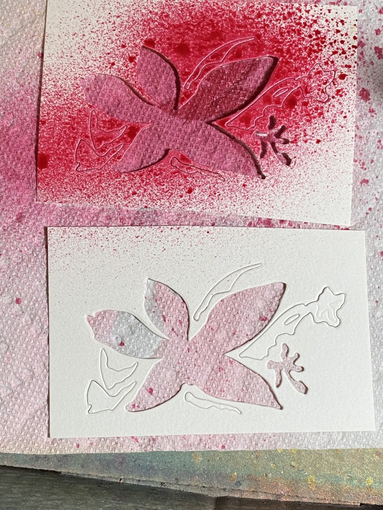
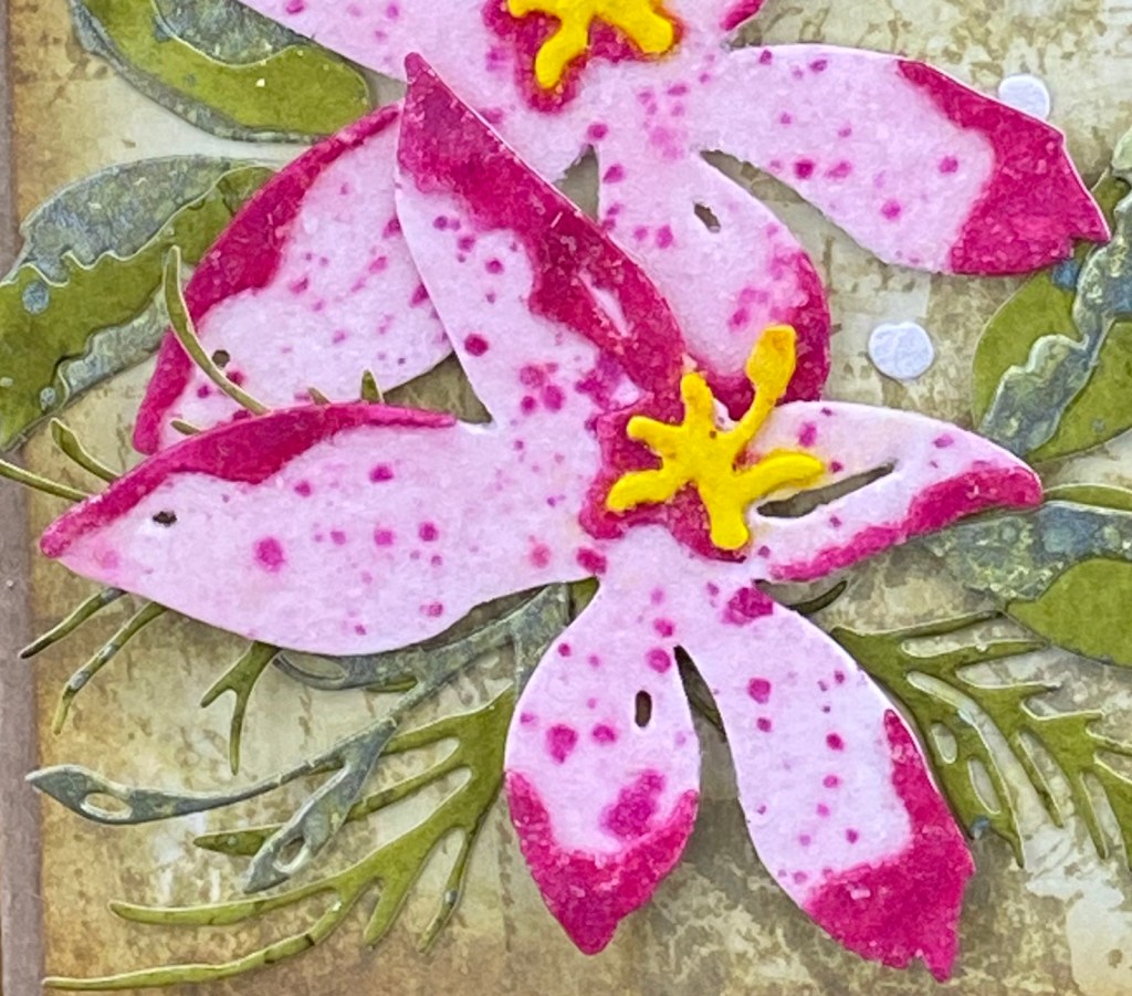
I started by coloring my flowers. At first I thought about going with more subdued pinks. I die cut the flower die out of watercolor paper, and colored the base of the flower with Distress Oxide Spray in Spun Sugar. Then I saw my new Mica Sprays… so much for a subdued color scheme! Cocktail Party Mica Stain spray was calling to me! It’s such a pretty, sparkly pink! All of the layering pieces were still left in my cardstock piece that I had die cut, so I popped out the center flower piece (which would be sprayed with Harvest Moon Mica Spray) and sprayed the little layering pieces while they were still in the piece of cardstock I ran through my machine. This held them in place while I sprayed (see photo) and dried them with my heat tool. I popped them out when they were mostly dry, and layered them onto the flower base. I then splattered my flower (without the yellow center) with more Cocktail Party.

Do you ever get into “the zone” when you’re making? I can get so focused on what I’m doing, I lose track of time, what’s going on around me, and what I’m supposed to be doing… like taking photos of my process! Sorry! As I said, this flower is an easy one to put together, so the photos wouldn’t have been super interesting anyways! The one thing that I did play around with was how to get some sparkle on my flower. First I experimented with Distress Glitter, but I didn’t like the mess. I tried some on a scrap piece of paper, using collage medium to adhere the glitter. I thought about using clear embossing powder over that, but again, thought through the mess and decided not to. My next thought was to use some transparent texture paste, and mix in some glitter. Then I realized I already had a product just like that – the Distress Snowfall Grit Paste! Okay, problem solved. I added a light coat of the snowfall grit paste over the top of my flower with a palette knife, and set it aside to dry. I also used my fingers to move it around a little, and then used my die pick to get it out of the holes in the petals.

TIP: One thing to be aware of is that the Distress Inks, Oxides, and Mica Sprays will react when they get wet, even with the grit paste. You need to be careful how you apply the grit paste so that you don’t make your colors run together. I got a little yellow from the flower center onto the pink, and vice versa, but I was able to mostly wipe it away and fix it. It’s not a bad look, just not what I was going for.

Now on to the foliage… I picked some greens that I thought went together and complimented the pinks… Forest Moss and Bundled Sage Distress Inks, and Fresh Balsam Mica Stain. I colored different pieces of watercolor cardstock with each one of them, and splattered the Mica Stain on the Bundled Sage and Forest Moss pieces. I diecut the leaves out of the Fresh Balsam and Bundled Sage. I used the Forest Moss piece for the evergreen looking dies. I found a small piece of white textured paper in my stash that I thought would be prefect for the little berries. By the way, there’s no real guide as to where to place the berries on the die cut that is shown on the packaging. There aren’t any score lines or anything. Just wing it. I even scattered some of the berries on my final card front.

I went with tone on tone for the background. I started by coloring a piece of watercolor paper with Distress Ink in Old Paper. I smooshed some ink onto my craft mat, spritzed with water, swiped, dried, pounced, dried, etc. They I used two of the large stamps from the Stamper’s Anonymous Festive Collage set. I put them both in my Misti, side by side, and stamped at one time onto my background. You could of course use any combination of stamps to achieve the same look. I just wanted some more interest for the background. I cut the background down to 4 x 5.25 inches, and applied a bit of Vintage Photo around the edges.

After playing with my arrangement for what seemed like HOURS, I was happy enough with it to start finishing my card. Before I glued anything down, I added a sentiment from Stamper’s Anonymous Holiday Sketchbook, using Forest Moss Distress Ink. I wanted to emboss the sentiment, but I didn’t have an Oxide ink pad in Forest Moss. Instead, I used my Misti, stamping first in Forest Moss Distress Ink, then cleaned the stamp and stamped in VersaMark so the clear embossing powder would stick. I used some foam behind the Poinsettias, and added some of the small berries around my floral arrangement. Lastly, I attached my card front to an A2 sized base made from Distress Kraft Heavystock.

I hope you enjoyed my card, and that you got some ideas or learned something. Thanks for stopping by my blog! Please head on over to ScrappyShak to pick up your supplies!

Products used, available at ScrappyShak:
Tim Holtz Sizzix Holiday Brushstroke #3 dies
Tim Holtz Stampers Anonymous Festive Collage Stamps
Tim Holtz Stampers Anonymous Holiday Sketchbook Stamps
Distress Ink Pads – Bundled Sage, Forest Moss, Old Paper
Distress Oxide Spray – Spun Sugar
Distress Mica Stain Spray – Cocktail Party Holiday Set 4, Harvest Moon Halloween Set 3, Fresh Balsam Holiday Set 3
Distress Grit Paste Snowfall
Misti Stamping Tool

ScrappyShak Design Team: Harvey

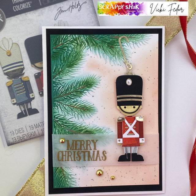
Hello my crafty friend! Thank you for joining me today. I’m sharing my process of assembling the new Tim Holtz Harvey colorize die. I hope you see that it’s not as intimidating as it looks, as long as you have good eyes (or glasses, maybe a microscope) tweezers, and a fine tip bottle of glue! He’s just so darn cute!

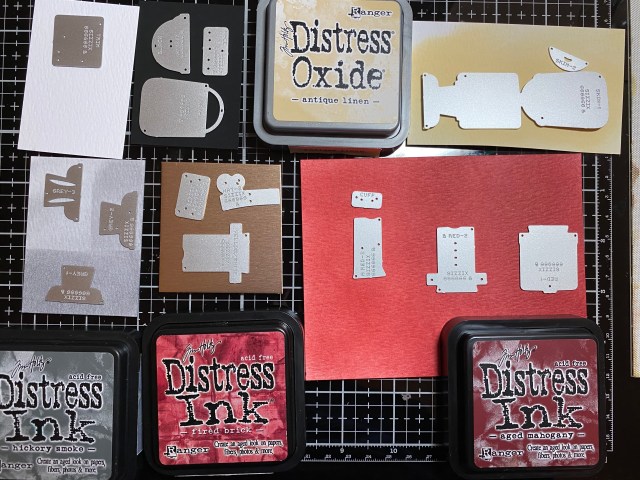
WIth many of the colorize dies, I think, I don’t have 4 different papers of the same color, and then I get stuck. They’re not the right shade of … whatever. Analysis paralysis as they say! I came up with an idea that I’ll hope you try. If you want to make a red Harvey, you’ll need 3 different shades of red for his top, and 3 different shades of gray for his pants. What I did was to start with white watercolor cardstock, two different red inks, and one gray, and simply use a blending tool to get the colors I needed.

For the red, I started blending the lighter red on one end of the paper, and the darker on the other end. In the middle, I overlapped them until I got a medium shade between the two. I used Fired Brick Distress Ink, and Aged Mahogany. You could even go with a lighter red, like Festive Berries to get more of a contrast. The point is that you only need two different colors of red ink pads to make this work, a lighter one and a darker one, and then blend them together for the middle shade.

It’s kind of hard to tell in this photo, and clearer to see with the gray. I only have one gray ink, Hickory Smoke, so I just applied it to the cardstock lightly, darker, and darkest, to get the three shades I needed for his pants. Some of the colorize dies need 4 different shades of the same color family. I have a bit of a paper stash, but I just never seem to have the “right” colors. Starting with white paper and making my own shades seemed to make it a bit easier for me. I used black alcohol ink paper for his boots, and gold metallic kraftstock for some of the accents. I didn’t really have any skin color tone paper at all, so I just used Antique Linen.

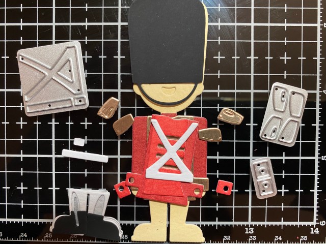
Once I had all of the pieces diecut, I played around with different color choices for the cuffs and shoulders. I had to cut more cuffs and shoulders out of white. It seems like Harvey goes together better with either the cross piece OR the shoulder pieces. But I wanted to use both, so I did! You could use the shoulder pieces and the belt. I just glued the shoulders on where I wanted them, even though they don’t sit flat.

I was going for more of a toy soldier look, so I didn’t use some of the pieces, like the feather plume, and I really am not a fan of facial hair, even on my cards, so no mustache on this guy!

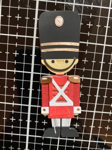
Here’s Harvey! All put together. Since he’s so thick, I went around the edges of his boots and hat with a black Copic marker. Yes, there’s a glue smudge or two. I’m hoping it’s less noticable on the final card!

There’s a helpful video on sizzix.com as to the order to assemble him. They start with the pants, which I did as well. When you get to the shirt, you’ll see that it overlaps the top of the pants, so the shirt doesn’t sit flat on his body. This wasn’t clear in the video, but that’s the only way it fits. I convinced myself that was the way it was supposed to be, but it bothered me a little. I guess he’s more of an “untucked” guy!

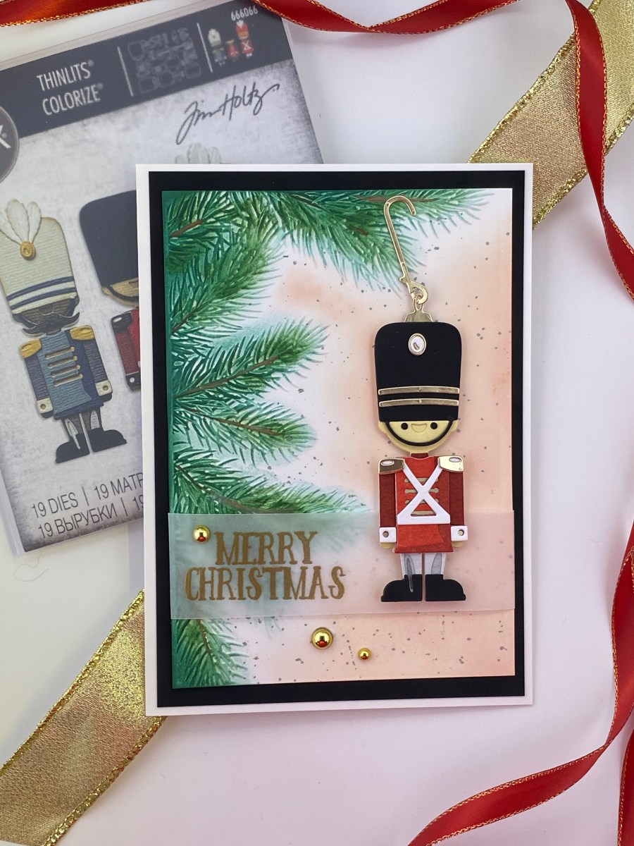
I knew I wanted to use the Pine Branches 3-D embossing folder. I embossed a piece of white Neenah Classic Crest 110lb Solar White cardstock with the folder, spritzing the back of the paper, and running it through my die cut machine 3 times. I colored the raised branches with Pine Needles Distress Ink and a domed foam blending tool. I then added a little Rustic Wilderness, and went over the branch parts with a Vintage Photo Distress Pencil. A marker would work just as well, or you could skip that part.

I wanted the rest of the background to be something light, like Antique Linen, but it had to be different, because I used Antique Linen for his face. I applied Tattered Rose (which I happened to have in an Oxide ink pad) with a blending brush, and then added some splatters of Iced Spruce.

Now what to do with Harvey? Is he just going to be standing under the tree? Should he have something else around him, like presents? Toys? Santa? This card had the potential to get really complicated! I decided to make him into an ornament. I used the ornament top and hanger from an older die set, Circle Words Christmas. You could easily shape a little piece of wire, or (I just thought of this now) use a real ornament hanger! To have it look right, I had to use a 5×7 cardbase so he would fit with the hanger.

For the sentiment, I stamped and embossed Merry Christmas from an older stamp set I had in my stash on a piece of vellum, and wrapped that around the card front. I attached Harvey to the card with foam squares for dimension. I layered that onto black alcohol ink paper (I love that stuff), and added some metallic droplets to complete the card. I really wanted Harvey to stand out on this card, and I think I accoplished that. Thank you for stopping by my blog. Please leave a comment if you are so inclined. I love answering your questions and hearing your feedback and comments!

Products used, available at ScrappyShak:
Tim Holtz Harvey Colorize die set
Tim Holtz Pine Branches 3-D Texture Fades Embossing Folder
Idea-ology Black Alcohol Ink cardstock
Distress Watercolor Cardstock
Metallic Kraft Cardstock
Idea-ology Metallic Droplets
Distress Ink Pads (Aged Mahogany, Fired Brick, Hickory Smoke, Pine Needles, Rustic Wilderness, Antique Linen, Iced Spruce)
Distress Oxide Ink Pads (Tattered Rose)
Distress Watercolor Pencils

Also used:
Tim Holtz Sizzix Circle Words, Christmas #664205