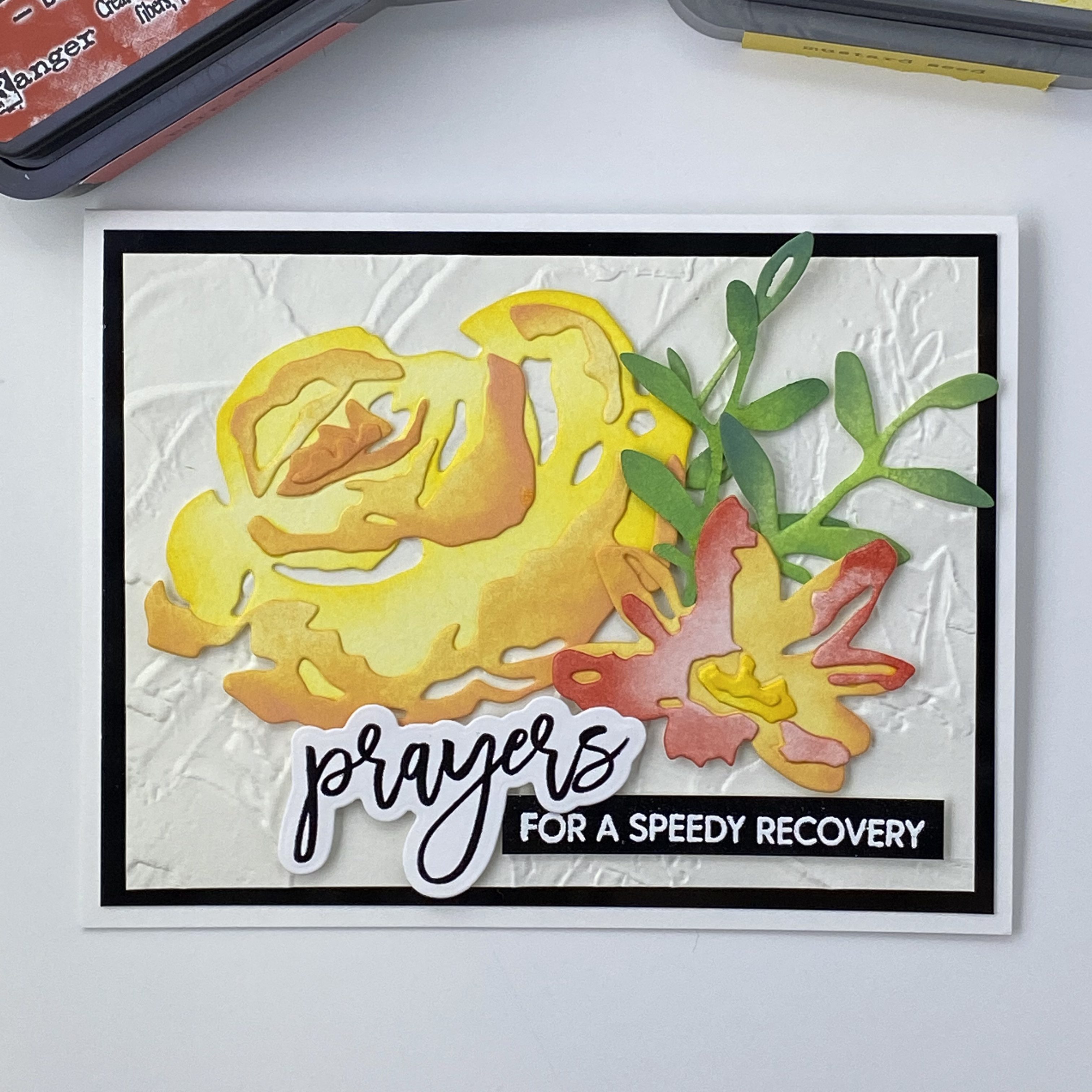
The inspiration for this card was a color challenge on a Facebook group I belong to. Someone posted a picture of a cream and black building with a red, orange a yellow logo. When I started thinking about what direction to go with this card, the colors took me to flowers. But most everything takes me to flowers! I also wanted to incorporate the industrial feeling of the building. I also needed a Get Well card!
I had just seen an amazing looking embossing folder, again on social media, and ordered one. It’s from Stampin’ Up, and called Painted Texture. It is even more fantastic in real life! I’m so glad I got it. I really like the whole mixed media aspect of card making, and this folder makes it super easy to get great texture. I haven’t played around yet with adding color to it, but I really just like it as is. I’m going to use this as the background for my card. In hindsight I should have made a larger card, because I hated having to cut this down and lose some of the character.
I chose some colors to work with: Mustard Seed, Orange Marmalade, and Festive Berries in the Distress Oxide ink pads. I blended them on a scrap piece of paper, and decided I wanted a more orangy red, so I picked Barn Door. I only have that in the Distress Ink pad, but it won’t matter much because I plan on using my blending brushes to apply color to my cardstock. For this card, I’m using Canson XL watercolor paper, even though I’m not using water. I like the weight of it, and that it is not as bright white as the Tim Holtz watercolor cardstock. Plus, I think it’s less expensive. I used it when I’m not using a lot of water to move the ink around.
I used the Tim Holtz Brushstroke Flowers #4 dies, cutting them out of the Canson watercolor cardstock. I thought it would be more interesting to blend the colors from lighter to darker on each flower layers, keeping the center of the flower lighter, and having more color towards the outside of the flowers. I used the packaging photo to help decide how to color the layers before gluing them together.
I chose to go with an A2 sized card. After trimming the background, I decided to add a layer of black behind my embossed background layer. This will help to connect the sentiment. The sentiment and sub sentiment are from Waffle Flower, Oversized Prayers. I used the smaller script prayers stamp, embossed with black, and cut out with the coordinating die. The sub sentiment was embossed with white on glossy black card stock. After I got all of my pieces ready and started to lay out the design, I decided I needed a bit more foliage, so I cut another stem and blended it with Mowed Lawn and Rustic WIlderness, like the others. I applied the yellow flower and greens directly to the background with liquid glue, and used thin and thick foam squares for the orange-red flower and sentiments.
I really like how this card came out. I hope it brings lots of good healing energy to the recipient! Thanks for stopping by!
I am absolutely thrilled to announce that I have been selected to participate in the very first Design Team for ScrappyShak! I have the honor of working with the owner, Melanie, and a fabulous and talented group of women. You can check out the whole Design Team here. This is my first experience being part of a design team, and I hope that I can inspire just one more person to take a leap of faith into letting their artistic juices start to flow! I feel like I’m relatively new to this arena, and would like to honestly share my journey, complete with successes, failures, and tips I’ve picked up along the way. I’m excited to expand my repertoire beyond the world of Tim Holtz, but you’ll probably see a lot of his products here as I continue to discover other brands and styles. I would love to hear your feedback, so please feel free to leave a comment or drop me an email.
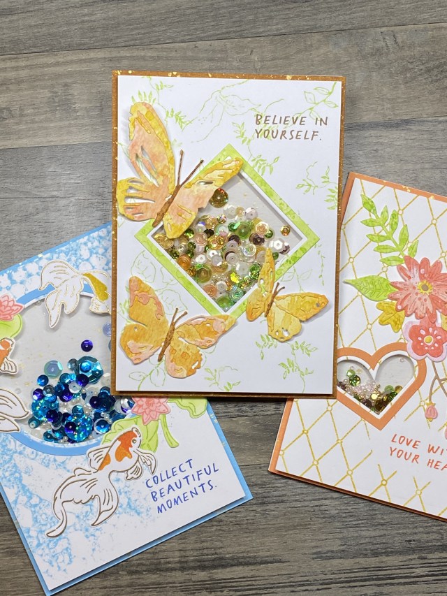
The first assignment for the Design Team was to use the Sizzix Shaker Panes line, products 665451 (hearts), 665448 (circles), and 665452 (squares). There are really neat framelit dies available that are sized to work with these sets, products 665661 (hearts), 665660 (circles), and 665662 (squares). There are three different sizes in each set, so you can be sure to find one that fits your project. The framelits make these so easy to use! I took the photo below after I had used one of each shape, but they do come with three different sizes in each package. They are currently available at ScrappyShak. If you click through on any of the product links, I will earn a small commission from your purchase, at no additional cost to you. I appreciate your support. Everything I earn will be used to support my ability to continue to create and share with you!
The shaker panes have adhesive on both sides, and Sizzix includes a heat resistant acetate top sheet that you can emboss on! Don’t forget to remove the protective film that keeps the top sheet clean and scratch free until you’re ready to use it, and make sure to remove any cat or dog hairs before you seal up your shaker pane! (speaking from experience).
We were told that we could use either of the shapes in our design. After I had gone down the “square” road, I was thinking, “I have a great idea for the circle”! Well, then of course I felt I needed to do something with the heart, not wanting the heart to feel left out. That would just be sad. I’ll have to say, hearts aren’t my favorite shape. It’s probably and old counterproductive brain pattern from an ex-boyfriend in high school, but by now I was determined to use all three shapes, including the heart.
I started by choosing a die to work with, Tim Holtz’s Brushstroke Butterflies. Then I picked a bunch of colors I thought would go together: Saltwater Taffy, Orange Marmalade, and Fossilized Amber. I used the smoosh – dry – smoosh – dry – repeat technique on my craft mat with Distress watercolor cardstock to create some colored paper to work with.
I cut out my butterflies, then decided I was a little too heavy handed on my smooshing and coloring with the Saltwater Taffy. I went a little lighter on a new piece of paper, and added some Scattered Straw, and was happier with that. I saved my extra colored paper panels, and ended up using them later on the heart shaker card. Sometimes it takes me a bit to figure out colors, but I usually save the paper that I don’t end up using on the current project for something else. If they sit on my desk for too long, they usually end up in the “circular file”, but hey, it’s only paper! This time it worked out great, because as I went along, I decided to use the same general design and colors for each of the three cards that I ended up making for this project, so I pretty much used up all my extras. Here’s a great resource for you: My new crafty friend and fellow Design Team member, Tracy Fear, created a color wheel for the Distress colors! You can visit her account on Etsy and get one!
After I put my butterflies together, I moved on to thinking about the card front background. When I layed out the butterfles and the medium square shaker pane, I thought it would look better as a 5×7 card, as opposed to an A2 sized card, which I usually make. I tried both the large and the small shaker panes as well, but the medium size let me fit the butterflies where I wanted them on the 5×7 sized card. I wanted to add something to the background for interest and balance, but I didn’t want it to overshadow the butterflies or the shaker element. I thought dry embossing on white cardstock would be nice, but I didn’t have any embossing folders or stencils that would work on a 5×7 card. So I started with a piece of Distress watercolor paper, cut down to 4.75×6.75, so I could layer it against a solid color card base, and house the shaker pane in between. Here’s something I might have done differntly – I tend to layer my card front with 1/8 inch, all the way around. This works out great, in my opinion, on an A2 card. I don’t make as many 5×7 cards. This 1/8 inch border just felt a little too narrow for me. Next time, I might layer with a 1/4 inch edge. I’ll definitely try both. But I didn’t figure this out until I was done with the second card, and figured I would just go with it! We are our own biggest critics!
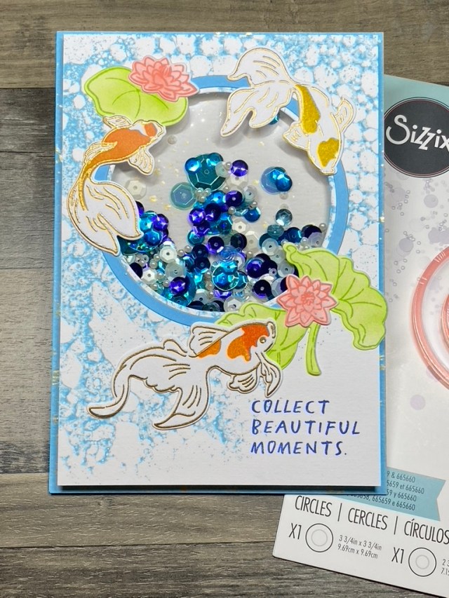
Looking through my stamps, I decided to use the new Floral Elements stamp (CMS445). I picked out all of the leafy stamps, and used my Misti stamp platform to stamp the smooth side of my cardstock with Twisted Citron. Since it was looking kinda sparse, I used a couple of my favorite stamps from that set to fill in where I wanted more elements, using an acrylic block to stamp more leaf images.
I thought about lightly spritzing this with water before I stamped, but I chose not to, because I wasn’t sure I could get them to all look similar, with some being stamped with my Misti, and some by hand. When I made the circle Goldfish card with the Bubbles stamp, I did mist it very lightly with water before I stamped, and I just love how that one came out. When the background was how I wanted it, I played around with where I wanted to place my butterflies, shaker pane, and a sentiment. For the sentiments on all the cards, I chose the Noteworthy stamp set, CMS 446, and simply stamped the sentiment directly on to my background once I figured out where everything should go. Be sure to do all of your stamping before you add the shaker pane, otherwise it’s a lot more difficult to stamp. I hadn’t yet decided on a color to use for the body of the butterflies. I wanted something softer than black. I tried a couple different browns, and picked Brushed Corduroy, because it seemed to look good with the colors I was using. I decided to use Brushed Corduroy as the base layer for my card to tie it in more. The Brushed Corduroy was ink blended just around the outside of the base for the card, as I wanted it to be white behind the shaker pane window. I began thinking that a plain brown card base might be a bit too plain and brown, and not really go with the sparkly shaker element. I decided to add some gold splatter, using a very pretty Nuvo Mica Mist spray in Aspen Gold. I also added that to where the background of the shaker pane would be. Again, trying to connect the elements of the card so they feel like they belong. It’s like when someone makes a dish on Chopped, and the judges point out one of the basket ingredients is just thrown on the plate and not integrated into the dish. We don’t want that!
The easiest part of this card was adding the shaker element. The dies work perfectly to cut out a window for the shaker pane, and a frame to either highlight the shaker pane if you put the pane in the backside of your paper, or cover up the edge if you put your frame the frontside of your paper. You can do it either way; whatever seems to work for your design. I wanted the front of my card flat, so I could overlap the butterflies a little over the shaker window, so I put the shaker pane in back of my background, on top of my card base. Since the shaker pane is nice and beefy, you can add lots of shakety bits, beads, and charms. I went through my stash to pick colors that would match. I thought about putting something else in the shaker pane, but I didn’t have anything on hand. I used a combination of sequins and small beads, most of which were painstakingly chosen, one by one, because that’s how I roll!
I used Bearly Art Precision Craft Glue with a precision tip to glue on the shaker pane frame and butterflies. The shaker pane comes with it’s own adhesive – just pull off the backing and you’re good to go. It couldn’t be easier. To layer the front of the card onto the base, I used Scrapbook Adhesive double sided tape roll. Since the shaker is 1/8 inch thick, you need to use two layers of the mounting tape. Supposedly, the easy way to do this is to measure or eyeball how much tape you need, then fold it over on itself, sticky side to sticky side, to get an even double layer of tape, then cut it off the roll. It worked better for me to make two shorter pieces for the long sides of the card, instead of one long piece. It was easier to handle. I might go back to putting one layer of mounting tape down perfectly, then adding the second layer of tape on top of that. Folding the tape on itself is not very forgiving, and kind of awkward. Oh, and no, I don’t do my nails like a lot of the people who blog about cards. I have chickens, and I like to do outdoorsy things, and play in the dirt.
My favorite way to attach a base to a blank card is to use my Scotch ATG 700 tape runner, back from the olden days of scrapbooking. I just love that tool. I’m sure the newer tape runners are more affordable, but that thing just feels right in my hand! Here’s the finished card. I hope you heard me say how easy these shaker panes from Sizzix are to use!
Here are the other two cards I made for this project. I used the Sizzix circle Shaker Pane with a stamp and die set from Altenew (Goldfish Pond), along with the amazing new Stamper’s Anonymous Tim Holtz Bubbles (CMS449). I used the same process as described above, using Saltwater Taffy and Twisted Citron for the lilypads, Orange Marmalade, Ripe Persimmon, Fossilized Amber for the fish, and Tumbled Glass for the background and frame. The sentiment from Noteworthy was stamped with Prize Ribbon. For the last card using the heart shaker pane, I used Spellbinder’s Simply Perfect Layered Blooms. No, it’s not perfect! Much patience was needed to put together the tiny little pieces with these old eyes, but I did use up all of my leftover papers. The background is stamped with Altenew’s Pattern Play Diamond set. Thanks again for stopping by, and please come back soon. I appreciate you!
Hello fellow paper lovers! Thank you for stopping by my inaugural blog post! Comments and feedback are welcome and appreciated! Today I’d like to share with you a card that I designed for the Simon Says Stamp Wednesday Challenge. The suggested theme was to use RIley and Company products, but I don’t have any, yet! I saw that they tend to have snarkiness and whimsy, so I chose to use my Tim Holtz Snarky Cats. This guy jumped out at me. I also wanted to use the new Tim Holtz Noteworthy stamp set from Stampers Anonymous. I wanted to have my cat doing something a little crazy, or with a wacky color combination.
I had recently watched a technique video by Nicole Watt Creates. It’s a background technique that she calls “Pollock Style Splatter“. I love how Nicole is so warm and authentic in her video tutorials, and how she does a lot of them in real time. You should definitely check her out.
My supply of sprays is limited, so I used what I had… Tim Holtz Distress Spray Stains and Oxides in Festive Berries, Dusty Concord, Spun Sugar, and Carved Pumpkin to match the little bit of orange in my cat. There’s something about orange cats that scream snark, in cartoons and in real life! I used Canson XL watercolor paper for the background.
With the background done, I stamped my cat in Ranger Archival Jet Black onto Neenah Classic Crest Solar White, 110 lb. paper. I stamped it twice using my Misti platform, as I knew I was going to be embossing it, and I wanted to make sure it was wet enough to hold the powder. I like to emboss images if I’m going to be coloring them with markers, because I’m not great at coloring, and it seems to help keep me in the lines! I embossed using some detail clear embossing powder from my stash.
My cat was colored with Copic Sketch markers, but I didn’t take note of the numbers…a couple earth tones, and an orange that seemed to match the Carved Pumkin. I stamped a couple brushes from the Tim Holtz Crazy Things set, and colored them with Copics as well. I’m fortunate to have both sets of framelit dies for the Snarky Cats and Crazy Things, so I used those to diecut my images.
Finishing the card, I decided to use Kraft cardstock as the card base, again from Tim Holtz. That helped me to decide to use Kraft for the sentiment strips. Instead of wasting a sheet of heavyweight Kraft, I stamped the sentiments on the back of a piece of colored kraft cardstock from my scrap bin, using the same black Archival ink and clear emobossing powder. I inked the edged of the sentiment strips with a little Black Soot, and then decided to help my background stand out by layering it on some black cardstock from my stash. The cat, brushes, and sentiment strips were popped up on foam mounting squares. I added a couple lines with a black journaling pen to try to show movement, but they just seem to blend in with the background. Thanks for stopping by! Have a snarky day, but not too snarky!