The inspiration for this card was a color challenge on a Facebook group I belong to. Someone posted a picture of a cream and black building with a red, orange a yellow logo. When I started thinking about what direction to go with this card, the colors took me to flowers. But most everything takes me to flowers! I also wanted to incorporate the industrial feeling of the building. I also needed a Get Well card!

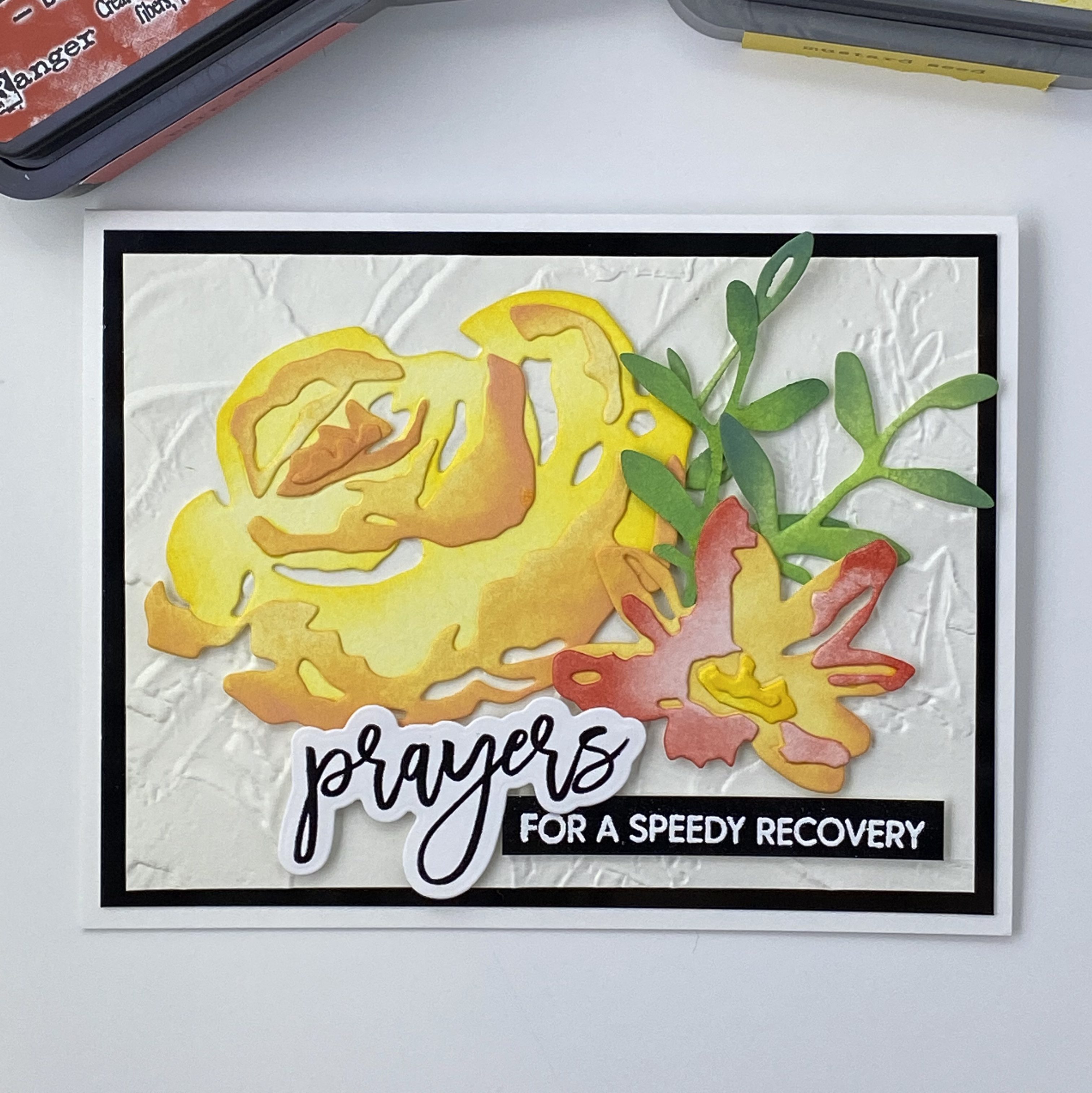
I had just seen an amazing looking embossing folder, again on social media, and ordered one. It’s from Stampin’ Up, and called Painted Texture. It is even more fantastic in real life! I’m so glad I got it. I really like the whole mixed media aspect of card making, and this folder makes it super easy to get great texture. I haven’t played around yet with adding color to it, but I really just like it as is. I’m going to use this as the background for my card. In hindsight I should have made a larger card, because I hated having to cut this down and lose some of the character.
I chose some colors to work with: Mustard Seed, Orange Marmalade, and Festive Berries in the Distress Oxide ink pads. I blended them on a scrap piece of paper, and decided I wanted a more orangy red, so I picked Barn Door. I only have that in the Distress Ink pad, but it won’t matter much because I plan on using my blending brushes to apply color to my cardstock. For this card, I’m using Canson XL watercolor paper, even though I’m not using water. I like the weight of it, and that it is not as bright white as the Tim Holtz watercolor cardstock. Plus, I think it’s less expensive. I used it when I’m not using a lot of water to move the ink around.

I used the Tim Holtz Brushstroke Flowers #4 dies, cutting them out of the Canson watercolor cardstock. I thought it would be more interesting to blend the colors from lighter to darker on each flower layers, keeping the center of the flower lighter, and having more color towards the outside of the flowers. I used the packaging photo to help decide how to color the layers before gluing them together.
I chose to go with an A2 sized card. After trimming the background, I decided to add a layer of black behind my embossed background layer. This will help to connect the sentiment. The sentiment and sub sentiment are from Waffle Flower, Oversized Prayers. I used the smaller script prayers stamp, embossed with black, and cut out with the coordinating die. The sub sentiment was embossed with white on glossy black card stock. After I got all of my pieces ready and started to lay out the design, I decided I needed a bit more foliage, so I cut another stem and blended it with Mowed Lawn and Rustic WIlderness, like the others. I applied the yellow flower and greens directly to the background with liquid glue, and used thin and thick foam squares for the orange-red flower and sentiments.
I really like how this card came out. I hope it brings lots of good healing energy to the recipient! Thanks for stopping by!

