ScrappyShak Design Team: Sizzix Eileen Hull Silverware 3-D Textured Impressions Embossing Folder

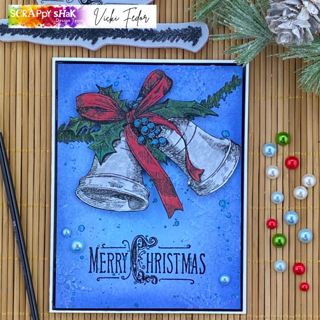
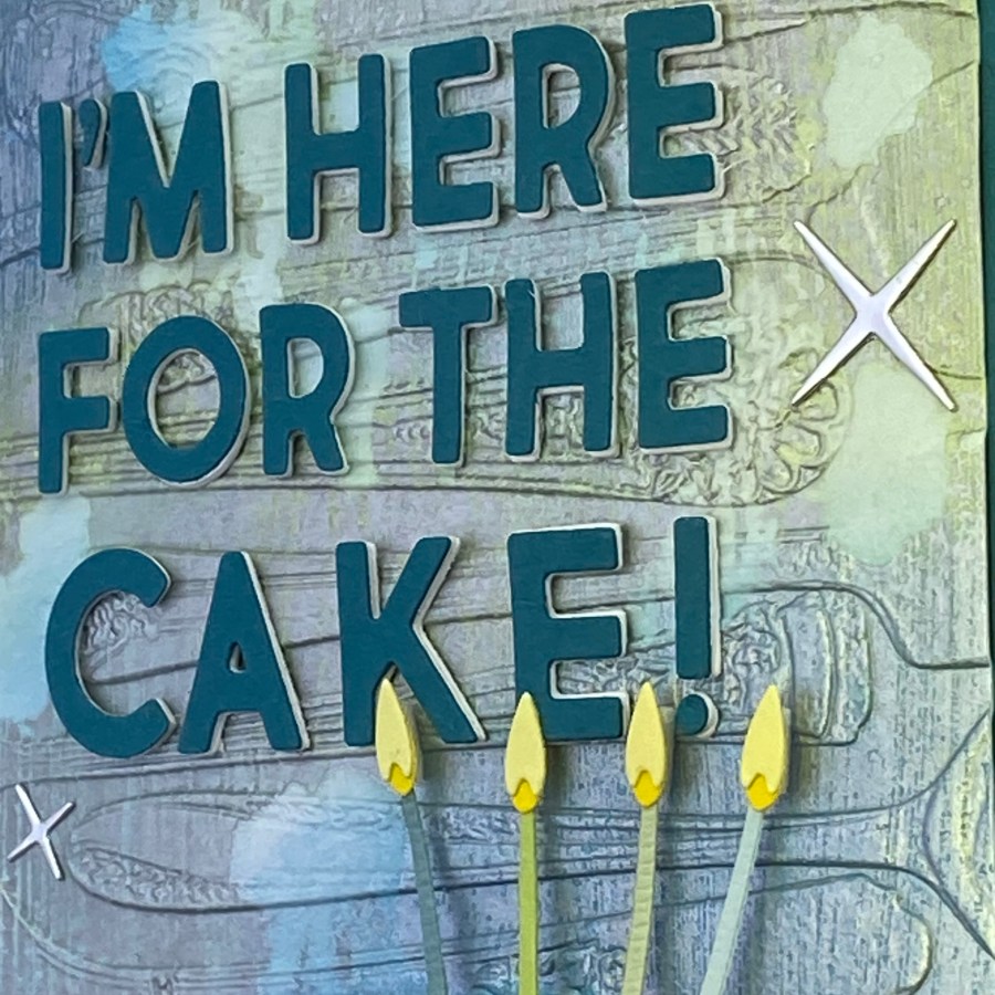
Hello crafty friends! Today, I’m sharing this card that I made for a ScrappyShak Design Team. My challenge was to use Eileen Hull’s Silverware embossing folder. And… as it just happens to be MY BIRTHDAY, I seem to have cake on my mind. I usually (I said usually) eat cake with silverware, so it seemed like a good fit.

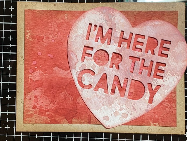
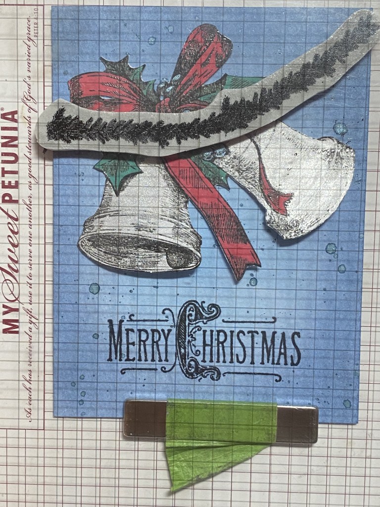
I wanted to use the eroded metallic technique that Tim Holtz has been demoing recently. He uses various Distress Paints to color mixed media paper, dries the paint, then applies a thin layer of metallic Distress Paint. After that, water is applied, more in some areas, and the metallic paint is quickly dried. A paper towel is used to soak up the water and wet paint, exposing some of the base colors, giving an eroded metal look.You can find the technique in his YouTube video from 4/22/23.

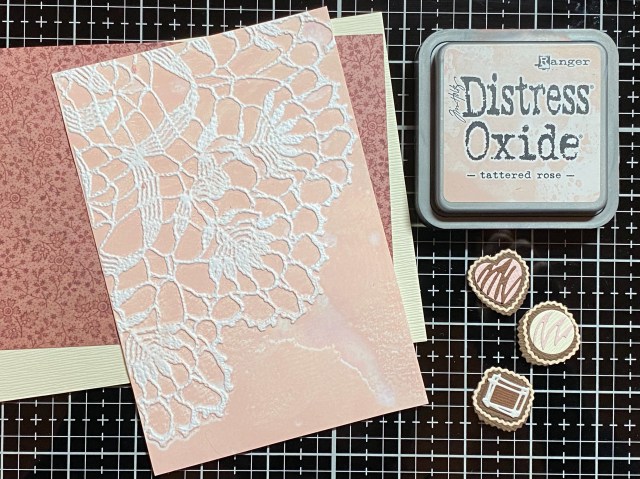
I didn’t have any Distress Paints (placing my order to ScrappyShak today!), so I thought I’d try it with oxide inks. I applied some Oxide inks randomly to a piece of mixed media paper with a sponge blending tool. I then sealed the inks with Distress Micro Glaze, applied with a sponge blending tool. I wiped off the extra microglaze with a paper towel. I dried it slightly with a heat tool. In hindsight, it might be good to let it air dry for a while. I will try that next time. I think this yielded decent results, using what I had. What I learned was that after I applied the layer of metallic Brushed Pewter Distress Paint it began to dry quicker than I anticipated. It’s a quick process. Once you put the metallic Distress Paint down, you need to quickly add the water (don’t overthink it!), apply a few seconds of heat from a heat tool, then use a paper towel to soak up the wet paint. I know it will work better with the paint, but it worked okay for me with the sealed oxide ink. It might not exactly be the look I expected, but I like it for this card, and I’m glad I took time to experiment with this technique.

After the background was dry, I embossed my panel with the Eileen Hull Silverware embossing folder.

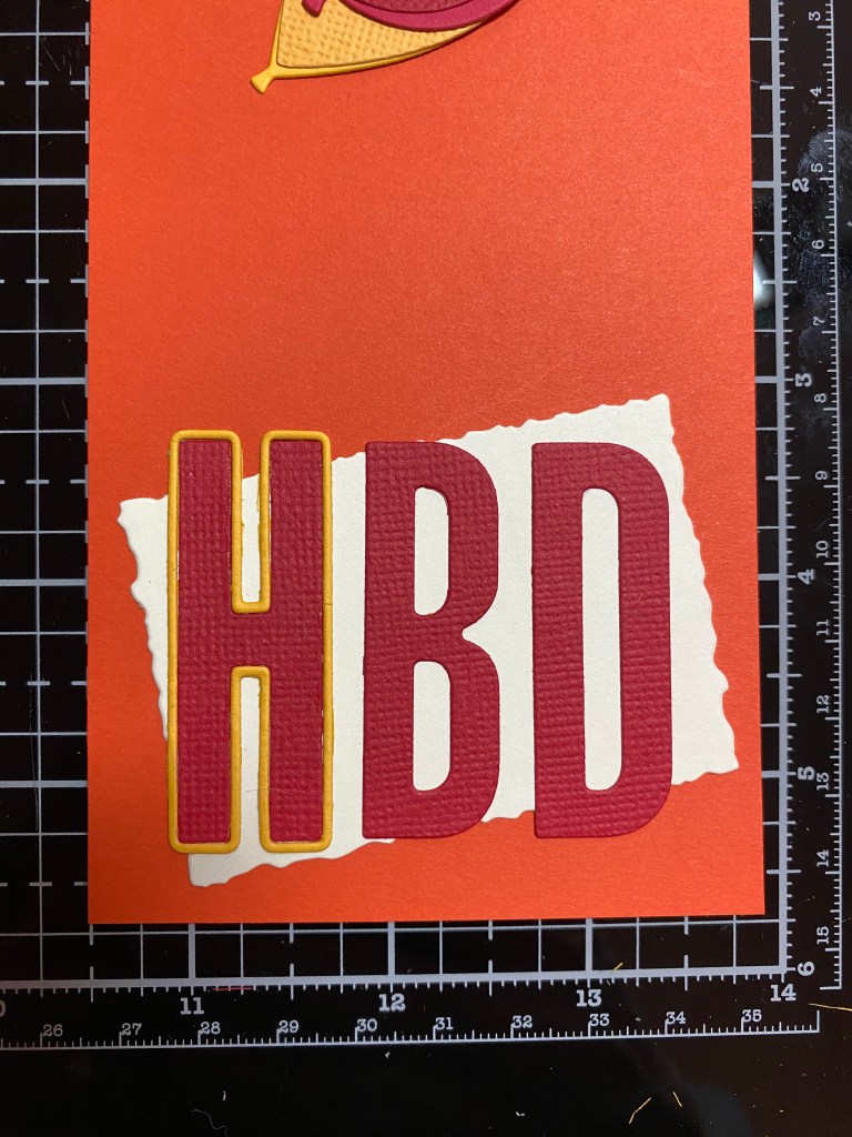
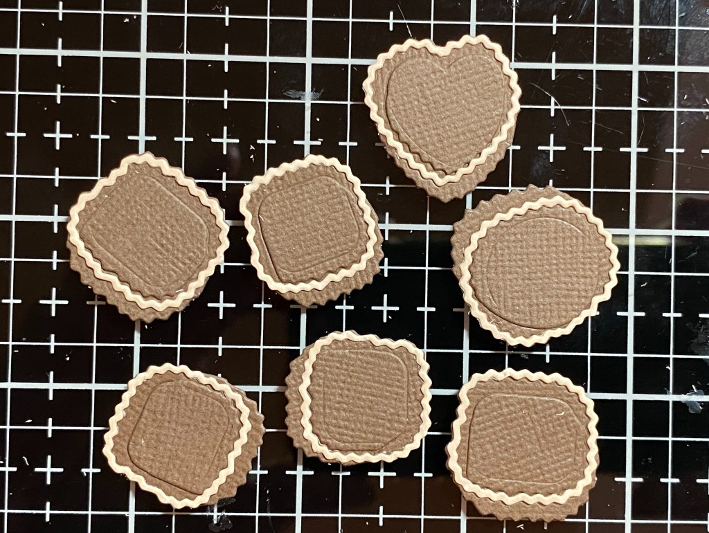
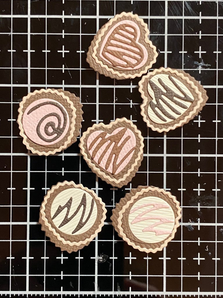
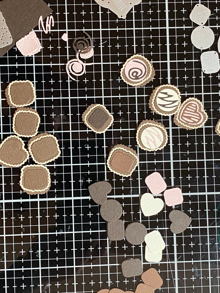
The sentiment for the card is from the Bold Text Halloweeen Thinlit dies – “I’m here for the candy”, but I replaced “candy” with “cake”, I have in the past found the letters that I needed to change the wording within the Bold Text die sets. Recently, I got the Alphanumeric Bold die set, which matches the font for all of the Bold Text sentiment die sets. I don’t believe ScrappyShak has the Bold Text Halloween in stock at the moment, but you can also find great sentiments in Bold Text #1 or Bold Text #2. Or, use a Birthday die or stamped sentiment that you already have. To add some dimension, I cut the letters out of white cardstock, and layered two layers underneath my teal cardstock. The cake is from the Celebrate Colorize Thinlit set. I used scraps to cut out the shapes, and used Bearly Arts glue with the precision tip to assemble the cake. Not quite as delicious as using frosting to assemble a cake, but easier to mail.

I hope you enjoyed this card. I had a bit of trouble with the lighting for the photography, as it’s been pouring and/or overcast for days here in Northern Virginia. Thank you for stopping by my blog, I appreciate you!

Products used, available at ScrappyShak:
Sizzix Eileen Hull Silverware 3-D Textured Impressions Embossing Folder
Sizzix Tim Holtz Celebrate Colorize Thinlits
Sizzix Tim Holtz Thinlits Bold Text #1 or Bold Text #2 (option)
Ranger Distress Oxide Ink Pad – Salvaged Patina, Uncharted Mariner, Peeled Paint
Ranger Distress Paint – Brushed Pewter
Ranger Distress Micro Glaze
Bearly Arts Glue with precision tip

Also used:
Sizzix Tim Holtz Thinlits Bold Text Halloween
Sizzix Tim Holtz Thinlits Alphanumeric Bold

ScrappyShak Design Team: Pink and Main Scratch-Off Gender Reveal

Hello crafty friends! Today, I’m sharing this card that I made for a ScrappyShak Design Team challenge. The challenge was to use any of the Pink and Main Scratch-Off stickers or sticker sheets. I came up with this idea for a gender reveal card that did not involve pyrotechnics. No person or animal was hurt while creating this card, and I suspect the same will be true when the gender is revealed!

I thought it would be cute to use balloons to reveal the gender. I used the Sizzix Tim Holtz Celebrate Colorize Thinlit dies to make some paper balloons, I had recently gotten the incredibly adorable Lawn Fawn Elephant Parade stamps and dies. The stamps include “It’s a girl”, “It’s a boy” and “Hello baby”. They’re small enough that they fit on the balloon. I just inked up the part that I wanted, and stamped away. I decided my gender reveal was going to be for a girl. I stamped “girl” on one of the balloons (a blue one… ha ha), and “baby” on the rest.

I wanted to cut out the Pink and Main Scratch-off sticker sheet to cover up the words using a circle die. You get both silver and gold Scratch-off paper in the package, and since you only need a little, I imagine the package would last a long time. I found this neat small circle die with a zigzag edge in the Sizzix Tim Holtz Postale set, which I thought was perfect for this. The Scratch-offs also come in precut circle stickers in silver, gold, and silver glitter, but they are about an inch in diameter, and too big for my balloons. I suppose I could have diecut them to be smaller too, but I didn’t think of that initially! I made an A2 sized card, and for my design I was able to fit 6 balloons. I could have made a larger card, with more balloons. Imagine a large table decoration with as many balloons as people invited to the gender reveal party! Everyone gets to scratch off a balloon until the answer is revealed! After I had used up my sample Scratch-off sticker sheet, I realized I didn’t have to use pink and blue balloons, and might have picked better colors. But it’s okay – you. do you – I’m sure you can come up with a prettier balloon bouquet for your card!

I used a Lawn Fawn stencil to add some grass with Mowed Lawn Distress Ink. I stamped an elephant from the Lawn Fawn Elephant Parade stamps onto a piece of watercolor paper that had been inked with several layers of Lost Shadow distress ink, and then used the coordinating die to cut him out. I also added a banner that I stamped “It’s a” and then added “…” in black marker. I added a background border with a dry embossed piece of printed paper that had been in my scrap pile for years, and a few clear confetti sequins.

I hope you enjoyed this card. I think it’s kind of brilliant, but I bet it’s been done before, like everything else! Well, I haven’t done it before! Thank you for stopping by my blog, I appreciate you!

Products used, available at ScrappyShak:
Pink and Main Scratch-off Sticker Sheets
Sizzix Tim Holtz Celebrate Colorize Thinlits
Sizzix Tim Holtz Postale Thinlits
Lawn Fawn Clear Stamps Elephant Parade
Lawn Fawn Lawn Cuts Dies Elephant Parade
Distress Ink Pads – Mowed Lawn, Lost Shadow
Bearly Arts Glue with precision tip

Also used:
Lawn Fawn Grassy Stencil


ScrappyShak Design Team: Tim Holtz Blossom

Hello crafty friends! Today, I’m sharing this card that I made for the ScrappyShak Design Team. I’m not gonna lie, it took me a couple days or three to finish this, so don’t think I just sit down and this happens! 🙂 There’s lots of try this and maybe that, with some good old prying off foam tape and trying again. I’m pretty happy with how it came out in the end.

To start off, I planned on using the Tim Holtz Sizzix Blossom Die. I know it’s pretty big, so I was leaning towards a bigger card, like a 5×7. But first, the flower… I picked dried marigold, scattered straw, and antique linen to start. I colored some watercolor paper with those inks, and also inked some paper with mowed lawn and rustic wilderness, which I was planning on using for the leaves. I also did a piece of iced spruce, just to see if it would fit in for the background. After messing around a bit, I decided the flower was going to be too washed out. I colored some paper with rusty hinge, and liked where that was going. It felt better with the colors for the leaves. So for the flower, I was going to use the rusty hinge, scattered straw, then dried marigold. When I cut those layers out, the dried marigold seemed too washed out. I put that piece back in the negative space of the watercolor paper, and blended some spiced marmalade over it. That looked better. Fitting the die back into the negative space helped to keep all the detailed edges from getting out of shape when I blended over it. I colored some scraps with walnut stain ink and gathered twigs oxide for the center of rhe flower.

I really wanted to use that piece of Iced Spruce, but it just wasn’t working in my mind. Maybe too outside the box for me? I decided to try my go-to blue background, Stormy Sky. I colored a piece of watercolor paper, then ran it through my machine with the Dotted embossing folder, and rubbed some lost shadow oxide ink, direct pad to paper, over the raised dots. This showed up better before it dried, but I’mn happy with how the lost shadow just lightly highlighted the dots after it dried.

I got a little stuck with how to finish up the card, but lucky for me, my ScrappyShak order arrived! I had ordered some of the new idea-ology papers and ephemera and stuff! Yippee!! Because I knew this was going to be a blog post eventually, I wanted to be sure that the card would be something you could reproduce. So I kept the stuff I added to the card to just the Backdrops #5, the Ephemera Palette Pack, and the Quote chips, so you don’t have to purchase the whole release like I did!

This is the fun part for me, pulling out things that I like, or just things that are the right color. I picked an orange piece from the Backdrops #5 pack, as well as a darker blue floral piece. I thought I’d layer them for the background. I also used a piece of the dark blue paper to cut a die from the older Crochet set to add some feminity to the card. I used my favorite squiggle from the Media Marks dies to add some more orange. You can use whatever you have, if you don’t have these same sets. The goal was just to add a layer of something interesting with a touch of coordinating color. You could add some small cirles instead. You could even use the center flower dies to cut some circles out of a coordinating color. Use your imagination! Look through what you have! Shop your stash!

I really wanted to use the oval photo of the young girl reading the book that is in the photo above. But, in the end, it just didn’t seem to work with this card. I chose another piece (this moth) from the Palette Ephemera pack. It sort of has that same neutral silvery blue color that iced spruce has, that I had wanted to use in the beginning. I used the new Large Fasteners on the Quote chip, but I actually just used them as a decoration, and used foam squares to attach the quote chip to my card. I wasn’t sure exactly where I wanted to put it, so this way was more flexible. I could wait until the end.

I hope you enjoyed this card, and I hope you can add some of the new idea-ology items to your stash. It’s so much fun to have more color! If you can only add one thing, I’d suggest the Backdrops Volume #5, because you can always cut it up, and get lots of use out of each piece. Easy to say of course, I had a hard time cutting it because I didn’t want to use up all of my favorites! Thank you for stopping by my blog, I appreciate you!

Products used, available at ScrappyShak:
Tim Holtz Sizzix Blossom die
Tim Holtz Sizzix Dotted Embossing Folder
Tim Holtz Idea-ology Backdrops Volume #5
Tim Holtz Idea-ology Ephemera Pack Palette
Tim Holtz Idea-ology Quote Chips
Tim Holtz Idea-ology Large Fasteners
Distress Ink Spray Stains – Rusty Hinge, Scattered Straw, Stormy Sky, Rustic Wilderness, Mowed Lawn
Distress Oxide Spray – Gathered Twigs
Distress Ink Pads – Walnut Stain
Distress Oxide Pads – Spiced Marmalade, Lost Shadow, Dried Marigold
Bearly Arts Glue with precision tip

Also used:
Tim Holtz Sizzix Crochet Dies
Tim Holtz Sizzix Media Marks Dies


ScrappyShak Design Team: HBD with Celebrate Colorize

Hello crafty friends! I wanted to share this card that I made for the ScrappyShak Design Team. I was inspired by the Sizzix Celebrate Colorize die set by Tim Holtz. And, it just so happens to be my hubby’s birthday next week! SHHHH! Don’t tell…. it’s a surprise!

After picking the die set, and the format for the card (slimline), I started working on a color scheme. At first I thought red and blue, because I just had to have a red balloon (I’m a Stephen King fan). But I didn’t want to be all July 4th red and blue. Also, in an effort to keep it simple, I decided to go through my paper stash instead of inking paper myself. I found some lighter blues that seemed to work together for the hat (you need 4 shades). I found some lighter mint green paper that I liked for the present, but I only had two shades of paper. I got another shade by blending a little Cracked Pistachio Distress Ink onto the lighter paper. I also didn’t want all the colors to be too light, like baby colors, so I picked a darker yellow.

I assembled the party hat, the present, and a couple balloons. The rest should be easy, right? Pick and background and a sentiment, and boom! you’re done! Well, this was the hard part for me. I decided to have three parts to the design, the hat, the present, and the balloons. To anchor them, I cut out 3 rectangles with an older dies set – Stacked Deckle. You could also use the Deckle Trimmer to cut similar squares or rectangles, or use any other geometric die you have. I can’t even remember how many different colors I cut before I settled on off-white. I tried black, white, green, darker blue, lighter yellow, light orange… nothing seemed to look good behind all of the diecuts. I also tried to add texture to the off-white rectangles with an embossing folder, but that just got too crazy busy in my opinion for this card. The light orange for the rectangles wasn’t so bad. That’s when I thought maybe orange would be a good background.

Before gluing anything down (I’ve learned my lesson!), I was trying to find a place for a sentiment. Nothing seemed to fit. I had an idea to use “HBD” instead of spelling it out, so I started playing around with the new Alphanumeric Bulletin dies. What colors? Here we go again… but, it’s just paper! After walking away a few times, I convinced myself red would balance out the balloon and make it seem not so out of place. I used yellow for the outline. These things are tiny! You will want to either back your cardstock with double sided adhesive before you diecut the letters, or make sure you have some good, thin, glue with a precision tip applicator. I love my Bearly Arts glue. It worked great for this.

After I got the HBD aligned as good as I could and glued down, I played around arranging the other diecuts. I decided to add another balloon – blue. I attached the dies to the card using foam tape for dimension.

I don’t usually make slimline cards. My mind words in A2. But I felt I needed more space to add all the elements I wanted to add. For the base of the card, I cut an 8.5″ by 7″ piece of Neenah Classic Crest Solar White in 110lb, and folded it half. The orange base was 8.25″ by 3.25″. I built my card design on the piece of orange cardstock, and then glued the panel onto the base.

This really wasn’t a difficult card, it just took me a while (days) to figure out the colors, mostly. I wanted a color scheme that would not be absolutely feminine, but could be used for anyone. And, I wanted it to be fun! I will be making duplicates of this card while I have all of my paper scraps out. It does go together fairly quickly and easily. When I do finish a card that I start from scratch, and I’m happy with the results, I like to make a few more to have on hand. Then it seems like the time I spent figuring it out was well spent! (of course it was well spent, I enjoyed it!)

Thank you for stopping by my blog, I appreciate you!

Products used, available at ScrappyShak:
Tim Holtz Sizzix Celebrate Colorize dies
Tim Holtz Sizzix Alphanumeric Bulletin dies
Distress Ink Pad – Cracked Pistachio
Bearly Arts Glue with precision tip

Also used:
Tim Holtz Sizzix Stacked Deckle dies – try the Torn Edge Deckle Trimmer instead


ScrappyShak Design Team: DIY 3D Woodland Animal Kit

Hello crafty friends! I wanted to share this project that I made for the ScrappyShak Design Team. My Design Team friends and I were asked to make something with a potential new product line that Melanie, the owner, was exploring. The products are these adorable Woodland Animals that are laser cut out of Bass Wood. They are easily assembled into a 3D animal. Melanie had three different animals for us to use in a project: a deer, a bear, and a fox. I was drawn to the fox, as my new rescue pup is about fox sized, and has similar colors in her red brindle fur. Below is a photo of what the deer and the bear kits look like, and of course the fox kit is similar.

These kits are not yet available, but if you love them, we’d love to hear from you! They may be available soon, depending on feedback and interest from the Design Team posts. Please email Melanie@scrappyshak.com if you’d like to pre-order some of these! I used Distress paint, inks, and crayons on this wood with good success. It’s beautiful quality. I am more of a paper crafter than a painter… I considered using paper to cover the wood pieces before putting them together, but thought it would probably require a whole lot of cutting. For this project, I went with inks and paints.

I started by coloring my fox. I thought Rusty Hinge would be a great fox color. I tried painting some spray stain onto a scrap piece of the wood first, to make sure the wood would take the ink, which it did. I knew I wanted parts of the fox to be white, but white ink is hard… it’s never as intense as I want it to be. I didn’t think it would cover the wood as well as I wanted it to. Instead, I used Picket Fence Distress Paint, again testing a bit on a scrap piece of wood, before potentially messing up my fox. I thought I should apply the paint first, as it’s permanent when dry, and I can always adjust the ink with water if I had to. So I painted Miss Fox where I thought she should be white, and then added Black Soot Distress Paint to the tips of her ears, her nose, and her feet. I should say that I didn’t put her together until the end. I painted each “puzzle piece” separately, but had to fit them together at times to figure out how the colors should line up, like her cheek fluff. After the paint was where I wanted it, and dry, I painted the rest of her with Rusty Hinge Distress Spray Stain. After that was dry, and I removed any stray marks with water, I assembled her with a tiny bit of collage medium. Later, I used Walnut Stain Distress Crayon to add some shading around the edges to give her a bit of a primitive look. I suck at painting, and I can’t draw a straight line or a circle to save my life! I considered making her look more fur-like, adding different paint, or maybe texture paste, but I know when I’m out of my league! I didn’t want to make a mess, so I stuck with simple.

I thought Miss Fox would fit perfectly in the largest of the Square Vignette boxes. I wanted her to be sitting in a field of flowers. I started by creating a sky background, and then planned to add flowers with die cuts. I hadn’t figured it all out yet… I was kind of just winging it, which I have learned is not the best way to go, but I continue to do so anyways! For the background, I used Stormy Sky Distress Spray and Tumbled Glass Oxide Spray. I was happy how it came out, so I cut it to fit, and glued it inside my box. Then I thought… I should add a sentiment, or an inspiring quote… make this a pretty little decoration for a desk or a shelf. But… my glue had dried already. I tried stamping my sentiment inside of the box, but that was just a hot mess. No worries, it’s just paper. I took a step back, and made another sky colored piece for the inside of the box, but this time I stamped it before gluing it in the box. I stamped the sentiment (which was an older Hero Arts stamp) using my Misti and black VersaFine Ink, then embossed it with clear embossing powder.

I wanted to use the new Brushstroke Flowers Mini dies to make the flowers. This took longer than I thought… the pieces for the flowers are soooo tiny! All of the piece to complete each type of flower are on one die. If the flower has three layers, you would either have to run the same die through your machine with each different color (for example, light pink, dark pink, and yellow for the big rose type flower in my project), or use white cardstock and color each piece individually. This is what I did. Since the pieces are so small, to hold them in place, I used a piece of Sticky Grid underneath, and left the die cuts in the negative space. This helped to hold them while I colored them, and I didn’t lose anything. I used Distress Watercolor Pencils and a waterbrush to color the die cut pieces. I chose to use the watercolor pencils because they are highly pigmented, and I knew they would give me some nice, rich colors for my flowers. I scribbled a little pencil onto each piece, and then blended it out with the waterbrush. I didn’t worry about being precise here, and I think being a little “free” with the coloring added some interest to the flowers.

The leaves in the Brushstroke Flowers Mini set are teeny tiny as well. I wanted something to fill up more of the space, so I went back to an older die that I had in my stash, the Flower Field die. I colored some watercolor paper with Rustic Wilderness and Mowed Lawn, made a couple die cuts out of it, and attached them inside of the vignette box, wrapping them up the sides as well. If you don’t have this die, you could certainly use any kind of flower stems you might have. Or use the leaves that come in the set, and cut strips of paper for the stems. There are lots of different ways to achieve a similar look. It’s the fox and the flowers, and the sentiment, that will draw people’s attention. Use what you have!

To finish up, I covered the outside of the box with idea-ology Paper Stash paper, and used Design Tape to finish the front edge of the box, for a clean look. Of course at the very end, I thought I should have added Tiny Lights! Another reason not to glue anything down until the very end!

Thank you for stopping by my blog, I appreciate you!

Products used, available at ScrappyShak:
ScrappyShak D.I.Y. 3-D Woodland Animal Kit: Fox
Tim Holtz Idea-ology Square Vignette Boxes
Tim Holtz Sizzix Brushstroke Flowers, Mini
Distress Crayon – Walnut Stain
Distress Spray Stain – Stormy Sky, Rustic Wilderness, Rusty Hinge
Distress Oxide Spray – Tumbled Glass, Mowed Lawn
Distress Paint – Black Soot, Picket Fence
Distress Watercolor Pencils – Sets 1 and 2

Also used:
Tim Holtz Sizzix Flower Field
Tim Holtz Idea-ology Paper Stash
Tim Holtz Idea-ology Design Tape – Butterfly/Papillon/Mariposa

ScrappyShak Design Team: My Bunny Valentine

Hello crafty friends! OOPSIE! I wanted to share this card that I made for the ScrappyShak Design Team BEFORE Valentine’s Day, but I just found this post hanging out in my Drafts folder… I had shared on Social Media, but forgot to finish my blog post! It stinks getting old, that’s for sure!

The idea for this card started with the bunny, and thinking of him leaning back in recline, munching through a box of chocolates. He’s just so darn cute! Then I thought of the Easter Bunny, who obviously loves candy. What would he be doing on Valentine’s Day? Well, he’d probably just be there for the candy, and thanks to Tim Holtz, there’s a die for that! It’s in the Bold Text Halloween set.

I started by making a bunch of candies from the Tim Holtz Sizzix True Love Colorize Dies. I used colored cardstock to speed things up, as opposed to coloring my own paper. I wanted my bunny to be holding a candy with a bite out of it, so I made one without the wrapper, and cut some bunny teeth marks in it. After making the candies, I got the idea to use the top of the candy box heart in the True Love set on my card, and die cut the words out of it. I used Victorian Velvet to color a piece of watercolor cardstock, and used the Bold Text Halloween sentiment. I wanted a brownish red for the background of the card, so I used Fired Brick Distress ink, leaving room to layer over Kraft cardstock for a border.

I made the bunny to coordinate with the chocolates. I started with white Canson XL watercolor paper, and colored it with Brushed Corduroy and Vintage Photo Distress inks, using the several layers of ink for interest.

All that was left to do was to add my bunny and chocolates to the card, and finish off with a little distressing around the edges.

Thank you for stopping by my blog, I appreciate you!

Products used, available at ScrappyShak:
Tim Holtz Sizzix True Love Colorize dies
Tim Holtz Sizzix Bunny Stitch
Tim Holtz Sizzix Bold Text Halloween
Distress Ink Pads – Vintage Photo, Brushed Corduroy, Fired Brick
Distress Oxide Ink Pads – Victorian Velvet


ScrappyShak Design Team: Road Trip Colorize

Hello crafty friends, and Happy Saturday! I wanted to share this card that I made for the ScrappyShak Design Team. I made this last week while I was thinking about getting out of the dreary, cold weather here in Virginia. Gladys the flamingo hopped in her sunny yellow car and decided to head out to SoCal for the rest of the winter. She’s stopping to visit her BFFs in Arizona on her way. I used the new Tim Holtz Road Trip Colorize dies for my inspiration.

This is just a quick post to share some of the details in this card, as it’s just basically picking colors and putting the dies together. First I made Gladys using Distress Watercolor Paper. I colored the paper first with Kitsch Flamingo, Picked Raspberry, and Cocktail Party Mica Spray. Her beak is Mustard Seed. I used black and white cardstock for some details. I shopped her legs off so she would fit in the car, but I kept one to make it look like she has a foot steering the car.

The car is mostly made with yellow cardstock. I added some watercolor paper sprayed with Harvest Moon Mica Spray, and some metallic gold paper for the highlights. There are 4 layers to the main passenger compartment of the car. To make it look like Gladys was inside the car, I put her in between the 4 layers. I glued the bottom two layers together, placed her “in” the car, and then put the top two layers on.

For the background, I used Stormy Sky Distress Spray and Tumbled Glass Oxide Spray. I wanted it to be a bit dreary. I used the exhaust puff for grey, overcast clouds. I added Crypt Grit Paste on the bottom of the card for the road. I wanted a bit of green grass to transition from the road to the sky… but I had already colored my whole background piece with the blue sprays. How can I get some green in there? Well, blue and yellow make green. I took some Mustard Seed Spray stain (stain instead of Oxide because I wanted it to be more transluscent) and dabbed it on with a dry brush. It looked green enough for me! The letters and the numbers on the sign are from the Specimen die set. My first thought was to have Gladys driving out of Darlington County, but there wasn’t a “g” in the Specimen set, and Darlington didn’t fit on the sign. (I’m a die hard Bruce fan, and the song kept running through my head).

If you have this die or are contemplating purchasing it, I hope you are inspired to give it a try. Look through your dies to find a different character to put in the car in stead of Gladys! What about a snarky cat? Paper doll? I’m sure you can find something fun. Thank you for stopping by my blog, I appreciate you!

Products used, available at ScrappyShak:
Tim Holtz Sizzix Road Trip Colorize dies
Tim Holtz Sizzix Gladys Colorize dies
Distress Oxide Ink Pads – Kitsch Flamingo, Picked Raspberry
Distress Mica Spray – Cocktail Party, Harvest Moon
Distress Spray Stain – Stormy Sky, Mustard Seed
Distress Oxide Spray – Tumbled Glass
Distress Grit Paste – Crypt

Also used:
Tim Holtz Specimen dies

ScrappyShak Design Team: True Love Colorize

Hello crafty friends! I wanted to share this card that I made for the ScrappyShak Design Team. The inspiration for this card made with the Tim Holtz Sizzix True Love Colorize die set was a box of Valentine’s Day chocolates that I remember from my childhood. What I recall, not that it’s a fact, is that my Dad got my Mom a huge box of chocolates for Valentine’s Day, which was. a big thing, because our family didn’t have the luxury of splurging like that. I remember that it was a huge yellow heart, covered with satin flowers and ribbon. I thought it was the prettiest thing I had ever seen, and hoped that one day I would have someone who loved me enough to do the same for me (which I do). I remember my Mom kept that box for a long time, and kept special treasures in it. I had the most fun putting this die set together, imagining the flavor combinations, and who of my family would enjoy each one the most.

I started by building the chocolate box first. I chose several shades of gold foil kraftstock, including one from the Metallic Confections pad, and a couple from the Metallics Classics Idea-ology pack. Although I remember my Mom’s box being yellow, it seems odd to me now, and I could be wrong… unless the yellow boxes were on sale! After I put it together, I thought the top of the box needed a bow, so I got out my Bowtied Colorize die and made a big red bow. To get three colors I needed, I used two different pieces of red cardstock, and darkened the lighter one with Lumberjack Plaid Distress Ink to get three different shades for the bow. I don’t have a huge collection of colored cardstock, and I often use ink to alter the color that I’m looking for.

Next was the really fun part… putting together the chocolates! I couldn’t decide what color to use for the wrappers, so I went with something similar to what Tim showed on the packaging. After picking through my brown cardstock, I found pieces that looked the most like milk chocolate and dark chocolate, and then picked a slightly lighter shade for the wrappers. I also found some cream cardstock for the white chocolates, and picked a light pink for a pink confection. I cut out more than what I thought I would use. I think this was a tip from a Jennifer McGuire YouTube video. In hindsight, I might have cut all the circle pieces first, then assembled, so as not to mix things up, and make it easier on myself. I kept seperate piles of each different shape, including the decorations, just to keep things sorted. Once you get the hang of one of the shapes, it seems easier to do all of the same shape at the same time. I put together the wrapper pieces first, then added my chocolates, and finally the decorations. I used Bearly Art glue with a precision tip, but I could see using double sided adhesive sheets before cutting everything out, to make the assembly easier. Tweezers are your friend. What helped a lot for me was to use my Sizzix Sidekick die cutting machine, which I didn’t know I couldn’t live without until I bought one. I had a hard time justifying the expense for a smaller size manual die cutting machine, but I was lucky enough to find one on clearance. It’s perfect for something like this for me. The way my studio is set up, I have to get up from my worktable to get to my BigShot. It was very handy to be able to run a small die through my sidekick if I wanted another dark chocolate, or a different color for the decorations. Amazingly enough, the Sidekick works really well for having such a small footprint. I love having it right on my worktable.

I decided to make a 5×7 card so I could fit everything, and have room for a sentiment. I went through my Christmas Backdrops paper and found one I liked that reminded me of my Mom. I wanted to add some texture, so I embossed a piece of white cardstock with the Doily 3D embossing folder, after applying Tattered Rose Distress Oxide to the “inny” side. I misted the back of my paper, and also the side of the embossing folder with the ink. You can see I was a little heavy handed with the water, as I got a bit of a smear, but I decided to leave it. I don’t mind it, I think it adds a little something. Before I put everything together, I distressed the edges with coordinating inks. I added splatters of Vintage Photo and gold mica spray to the cream cardstock for more interest.

For the sentiment, I used the Crazy Talk stamps and Archival Vintage Photo. While I was straightening up my worktable, I noticed one of the candy embellishments fit around the work “love”, which I thought was pretty cute!

If you have this die or are contemplating purchasing it, I hope you are inspired to give it a try. Make sure you have some real chocolate on hand, because you’ll be craving some for sure! Thank you for stopping by my blog, I appreciate you!

Products used, available at ScrappyShak:
Tim Holtz Sizzix True Love Colorize
Tim Holtz Sizzix Bowtied Colorize
Distress Archival Ink – Vintage Photo
Distress Ink Pads – Tea Dye, Lumberjack Plaid, Vintage Photo
Distress Oxide Ink Pads – Antique Linen, Tattered Rose
Tim Holtz Idea-ology Christmas Backdrops Paper
Tim Holtz Idea-ology Kraft-Stock Metallic Confections
Tim Holtz Idea-ology Kraft-Stock Metallic Classics

Also used:
Nuvo Mica Mist Aspen Gold
Tim Holtz Sizzix 3D Embossing Folder Doily
Tim Holtz Stampers Anonymous Crazy Talk CMS236

ScrappyShak Design Team: Yuletide Colorize

Hello crafty friends! I wanted to share this card that I made for the ScrappyShak Design Team. The inspiration was the Yuletide colorize thinlit die, and also the Christmas Backdrops paper pack.

This card ended up nothing like I had originally planned! I wanted to make a wreath featuring colors that my son and his partner were using to decorate their home for the holidays – pink, silver, and sage green. My plan was to color watercolor paper using distress inks and sprays, and then assemble the wreath. When I started to look at the dies, I wasn’t sure exactly which colors I wanted to use for the different layers. I figured I had better assemble the wreath with cardstock first, so I could decide how I wanted to color my watercolor paper for the differnt layers. I also thought that I would use a coordinating paper from the Christmas Backdrops papers for the background. That got me going in a whole different direction!

I found the Backdrops paper that looked like an architectural drawing of the front of a home with a door that was pretty much exactly the right size for the wreath. I didn’t think the pink and sage wreath would go the best with this background paper. Looking through my stash, I was drawn to the Idea-ology Kraft stock paper stacks. The coordinate so well together. I pulled out some greens and reds, and decided to use them instead. The pink and sage green wreath would have to wait for another day!

Then I had the thought – wouldn’t it be neat to use only the papers in the idea-ology line? I needed 4 different greens to make the wreath, but there were only two that I thought went together in the Cool paper stack. I ended up using a dark brown from the Neutral paper stack for the base, and added in a metallic green from the Metallic Confections pad. I used three different reds from the Warm paper stack for the bow, and added a metallic pink from the Confections pad for the base layer of the berries. For the bell, I used two gold colors from the Metallic Confections pad, a gold from the silver and gold metallic paper pad, and the gold from the Christmas Deco sheets.

TIP: You don’t have to be a hero and figure out this die on your own! Go to Sizzix.com and check out the video for this die. Otherwise you might start to have a panic attack, like I did! I honestly almost gave up before I watched the video (several times). It is easier than it looks, once you get the hang of it.

The tricky part is the third layer of the wreath. The fourth layer goes right on top of the third in the same orientation. It really is gorgeous in real life, and certainly worth the effort. Photos do not do it justice. I found the berries to be somewhat frustrating, because they are so small, and I absolutely hate glue oozing out of the teeny tiny pieces. Next time I will definitely use double sided adhesive on the back of my paper before I die cut the berries. I’ve also seen many people using sequins, droplets, or other round embeliishments as a replacement for the paper berries, and they look fabulous as well.

To make the door stand out a little more, I cut a piece of vellum to fit over it, so you could still see the details on the door. I found an old brad that I wanted to use as a door knob, but it was silver, so I colored it with Distress Foundry Wax in Gilded, and heat set it. Another TIP: If you heatset something metal it will get VERY HOT! Use something to hold the item, and then don’t touch it to see if it’s dry (speaking from experience)!

I distressed the edges of the Backdrops paper, and added Vintage Photo Distress Ink. I layered this on top of another piece of the Backdrops paper, and then attached them to a 5×7 card base.

I wanted to add a house number and a sentiment. I found the right size numbers in the Postale die set, and decided to use the “Special Delivery” as the sentiment. Both of those were cut out of black alcohol ink cardstock, my favorite black paper. They need to make the black alcohol ink paper in “regulation size” sheets instead of the 5×7 size!

If you have this die, I hope you are inspired to give it a try. I’d love to see what you make, especially if it’s pink and sage green! Thank you for stopping by my blog, I appreciate you!

Products used, available at ScrappyShak:
Tim Holtz Sizzix Yuletide dies
Tim Holtz Sizzix Postale dies
Tim Holtz Idea-ology Christmas Backdrops Paper
Tim Holtz Idea-ology Kraft-Stock Metallic and Metallic Confections
Tim Holtz Idea-ology Christmas Deco Sheets
Tim Holtz Black Alcohol Ink Cardstock
Distress Foundry Wax Gilded

Also used:
Tim Holtz Idea-ology Kraft-Stock Cool, Warm and Neutral
Tim Holtz Tonic Paper Distresser

ScrappyShak Design Team: Department Store Bells

Hello again crafty friends! I wanted to share this card with you that I made for the ScrappyShak Design Team. The main element was the new Tim Holtz Stamper’s Anonymous Department Store stamp set. I wanted to share my process with you in case you would like to replicate this card. I ended up changing a few colors, so the leaves and the bow are actually layered – distress oxide first, then painted with mica stain.

I think I put too much pressure on. myself with this, because I really wanted to do something different. I had seen a lot of makes by other people on social media, and I wanted to do something different, in my own style, whatever that means. I knew I wanted silver bells. I started playing around with stamping on silver metallic cardstock. I used Archival ink, embossed with clear embossing powder. I liked the bells, but I didn’t like the rest of the stamp on the metallic paper. I wasn’t sure how the inks would work on the metallic paper. I thought about fussy cutting the bell part, and then stamping the bow and leaves on watercolor, and piecing them together. But, I also didn’t want this card to be so complicated that you would say “that’s nice, but too much work”. Everyone is so busy this time of year!

The stamp is beautiful. Very intricate, and very detailed. Trying to keep the beautiful detail of the stamp, I stamped on smooth Neenah Classic Crest Solar White. Because I didn’t use watercolor paper, I knew I’d have to use water or spray stains sparingly. I stamped with Archival Jet Black ink, and embossed with detail clear embossing powder. I though this would help keep the color where I wanted it, and keep the lines of the stamped image clean. It worked well when I was using oxide ink, but it didn’t resist the brushed pewter as well as I wanted it to. It’s still lovely in my opinion!

My first coloring was using Distress oxide ink pads. I smooshed them on my craft mat, and then used my smallest Ranger paint brush to apply the color to the stamped image. I used Lumberjack Plaid and Pine Needles. For the berries and bells, I sprayed a bit of Winterfrost Mica spray stain on my craft mat, and painted it on the berries. I did the same with the Brushed Pewter for the bells. Several thin layers are best with this paper. TIP: If you’re painting on inks or sprays like this, the embossing powder will resist the medium, and sit on top of it. So as not to smear everything, paint one color and one area at a time, then carefully blot the excess off with a clean paper towel before moving to the next section.

I fussy cut the stamped image. Here’s another TIP: If you’re not leaving a white border when cutting out a stamped image, use a marker in the same color as the stamped image around the edge of the paper. This will cover up and imperfections in your cutting, and also give it a more finished look. After I finished (my first round) of coloring, I decided on the background colors. I went for blues to match the berries. I wanted the card to have a lighter blue behind the bells, gradually incerasing in intensity to the edge of the card panel. I used Distress Watercolor cardstock, and started with Tumbled Glass Oxide in the middle of the card panel, applied with a blending brush. Then I switched to Stormy Sky, which I only had in a Distress Ink pad. I would later add Faded Jeans Oxide around the edges. Use what you have! The Inks and Oxides blend well together. I think blending foam would work just as well if you don’t have brushes.

I stamped my sentiment in Archival Jet Black, and embossed with clear embossing powder. I added some splatter with the Winterfrost Mica Spray. To add some texture, I used Snowfall grit paste through the Snowflake stencil, THS050, moving the stencil and placing the snowflakes all over the background. Once I got the background done, I decided I wasn’t really happy with the pine needle coloring on the leaves, so I rummaged through my mica stains, and found Tree Lot Mica Spray from last year’s Christmas collection. I spritzed some on my craft mat, and colored in the leaves. After that, well, the bow just looked like it needed some sparkle too. I used Tart Cranberry over the Lumberjack Plaid. I suppose if you are reproducing this card, you could just use the mica sprays to paint the image, but I’m not sure if it would look exactly the same, since the oxide inks add a base layer underneath the sprays. If I were to make this card again, I would definitely try it with the mica sprays first, and skip the coloring with the oxides first. I just wanted to be clear explaining my process in case your card doesn’t look exactly as you expected. I also wanted to share that as long as the ink is dry, you can change the color by layering something else over the top if you’re not happy, especially if it’s in the same color family.

To visually “anchor” the bells to the card, I used a strip of garland from the Darling Christmas stamp set. You could make a garland out of any small pine stamps you have, or skip this part. I positioned the garland strip in my stamping tool in a curved shape, using the bells to position the garland, and stamped in Archival Jet Black, and then colored by painting on Tree Lot mica stain. I attached my bells to the card using dimensional foam squares. I blended Faded Jeans oxide around the edge of the panel, and added 3 blue Christmas Droplets.

I tried to show the shine of the mica sprays… the photos don’t really do the justice. To finish the card, I layered the panel onto shiny black cardstock and then attached it to an A2 cardbase made with Neenah Solar White Classic Crest 110 lb. cardstock. Thanks for stopping by my blog, and happy making season to you!

Products used, available at ScrappyShak:
Tim Holtz Department Store stamp set
Tim Holtz Darling Christmas stamp set
Distress Oxide Ink – Tumbled Glass, Faded Jeans, Lumberjack Plaid, Pine Needles
Distress Mica Stain – Tart Cranberry, Tree Lot, Winterfrost, Empty Tomb
Distress Spray Stain – Brushed Pewter
Distress Grit Paste – Snowfall
Distress Watercolor Cardstock
Ranger Archival Jet Black ink pad
Idea-ology Droplets – Christmas

Also used:
Tim Holtz Stencil THS050 Snowflakes