
I know, it’s really fun to get the latest and greatest products, especially if you are a lover of everything Tim Holtz. Along with the new Stamper’s Anonymous Tim Holtz Exquisite stamp set, I was fortunate to have been able to purchase Set 1 and Set 2 of the new Tim Holtz Distress Watercolor Pencils. I also have a small stash of the Distress Crayons which I’ve collected. I wanted to see for myself what the big deal was about the new pencils. Were they really going to be that different than the crayons? I know each of the Distress products were designed for differnet applications, and I wanted to compare these two. I know you can color a rubber stamp (before stamping) with various mediums to achieve different results, so that’s what I decided to do with the pencils and the crayons, and compare the results. While I was at it, I also got out my Copic Sketch markers.
I’m using the new Stampers Anonymous Exquisite set, and my Misti Stamp Positioner stamping platform. I tried to use the same colors in the crayons and pencils, when I had both, and similar colors with my Copic Sketch Markers. I started with the crayons first. I colored the stamp with differnet crayons, and then lightly sprayed the stamp with 3 pumps of water. I wanted to make sure I had the same process with the pencils. After I stamped the first image, I spritzed with 3 pumps of water again, and stamped a second time, without applying any more crayon. This is often referred to as a “second generation” stamping. The second generation stamping came out very light. I decided to overstamp it in Hickory Smoke Archival Ink. First I dried the image with my heat tool, leaving it in my stamp platform. Then I cleaned my stamp really well with water and a scrubber, again, leaving it in place in my stamp positioner platform. I inked the stamp with archival rather than distress ink or oxide, so it wouldn’t react in case the image wasn’t completely dry. Here are my results with the distress crayons:
I really liked both of these. The first stamping will be beautiful as a background, possibly as a sympathy card. The second stamping, with the Hickory Smoke, came out very vintage looking to me. This technique would look really pretty with flowers done in an analogous color scheme (like pinks and reds, or blues and purples). I’m planning on trying this technique on a cream colored paper. You can change up the color you overstamp with. I’d love to see what you try!
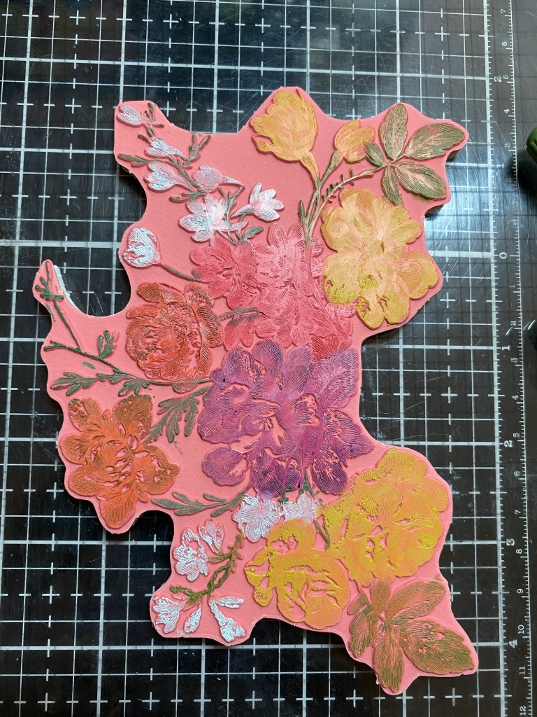
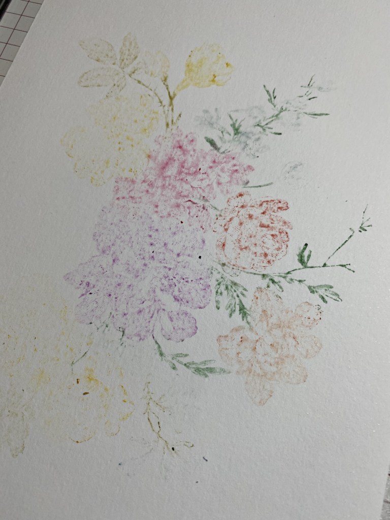
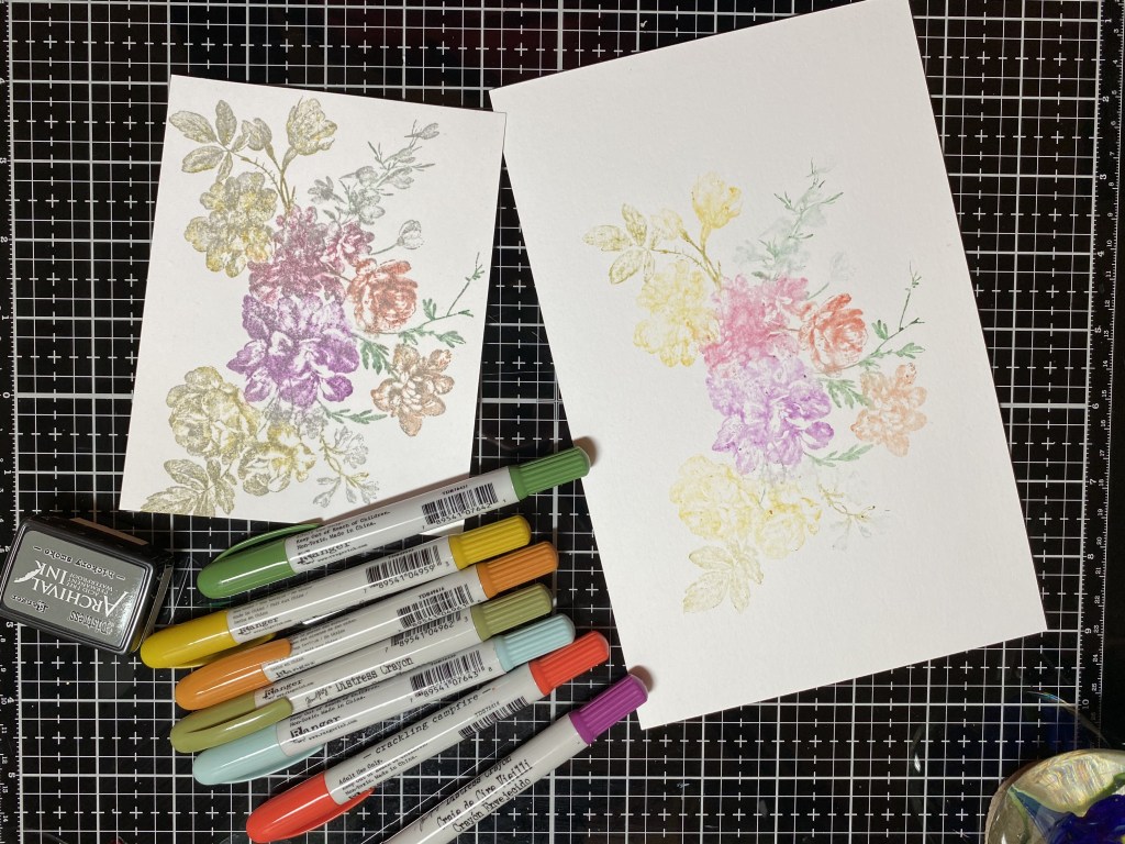
Next I cleaned my stamp again really well with Archival Cleaner and then water, and then dried it. Using colors of Distress pencils from Set #1 and Set #2 that were the same as the crayons, or similar, I colored the stamp again. The pencils need to be slightly wet to apply color to the stamp. I spritzed water on my craft mat, and scribbled in the water with the pencils until it started releasing color, then I colored the stamp. I was so excited to get started, I didn’t even think of sharpening the pencils to get a finer tip, but I didn’t have any problems coloring this particular stamp with the pencils right out of the box. From time to time I would have to rewet the pencil if I was coloring a larger flower. As with the crayons, once I was done coloring, I spritzed the stamp 3 times, and then stamped onto Distress watercolor cardstock. Wow! Seedless Preserves! So beautiful! I got a nice impression of the stamp with the first stamping. I then spritzed with water 3 times, and stamped a second generation print onto smooth white cardstock, and then repeated to get a third generation. These pencils have a lot of pigment! My wheels are turning as to how I can use these with the Christmas stamps that I have. What a time saver! Three images from one coloring! I tried a forth generation, and I felt it just wasn’t really recognizable anymore, but I might use it for something else, like die cutting. It turns out at the end of this experiment, my favorite is the second generation on smooth white cardstock. I like the vibrant colors, and I like that you can see some of the details of the stamp, while some of the details are more diffuse. I feel like if I would have used more water on the first stamping, it may have been more vibrant, which is ultimately what I have in mind with all of this! I guess you just have to play with it to get the results you want. Since it was still in my Misti, I could have rewetted and stamped onto the first image again, but then it would have messed up my experiment!

The next process I wanted to try was to stamp the image in Archival ink, color it with pencils, and then overstamp in archival again. I used watercolor paper for this. Again, this has a vintage look to it, to me. I will definitely use this technique again, with different colors. I don’t particularly like the pink flower, and I think there is too much yellow. My color choices began with what Distress Crayons I had! I will definitely crop this one down and make something beautiful I’m sure.
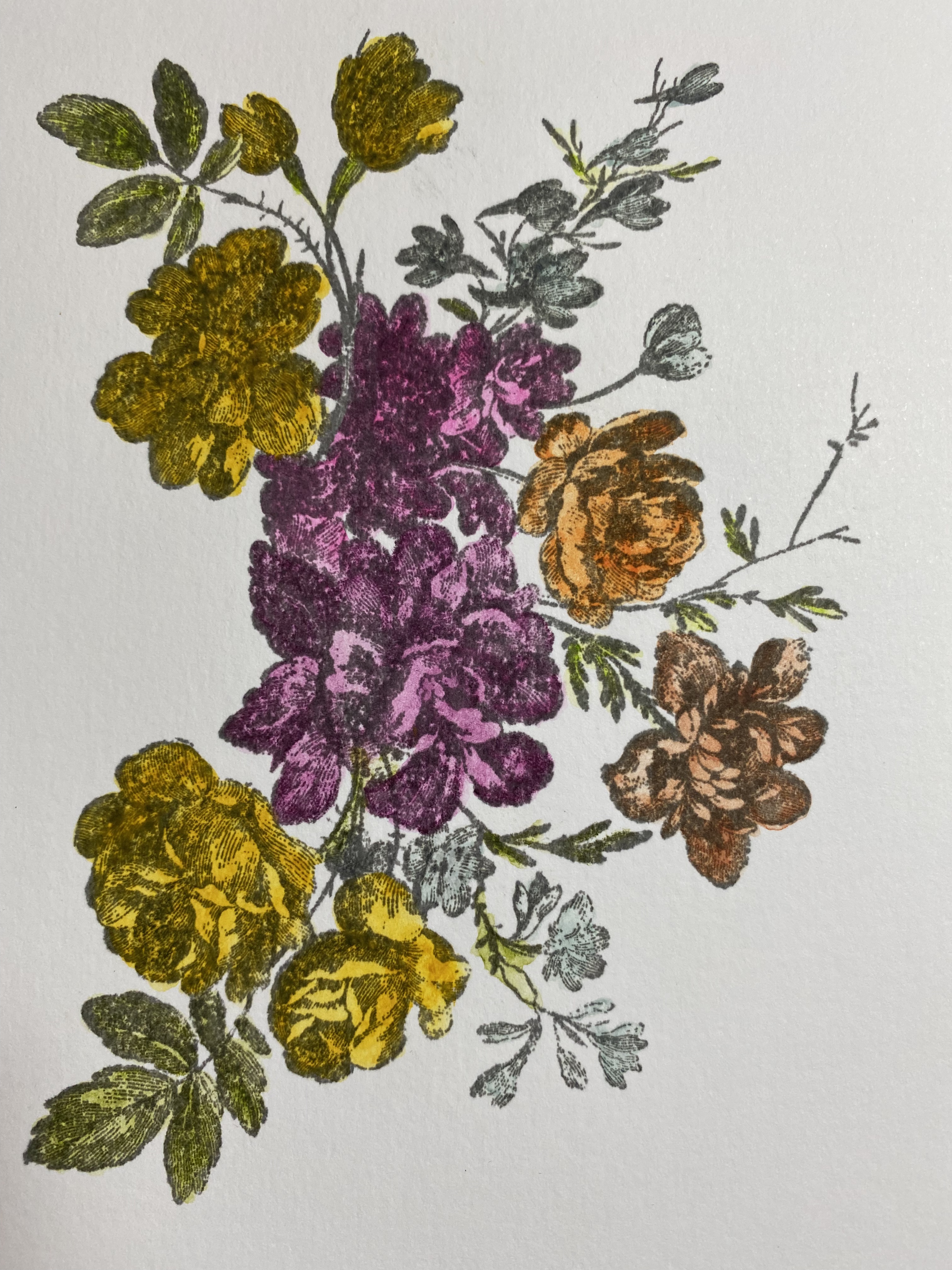
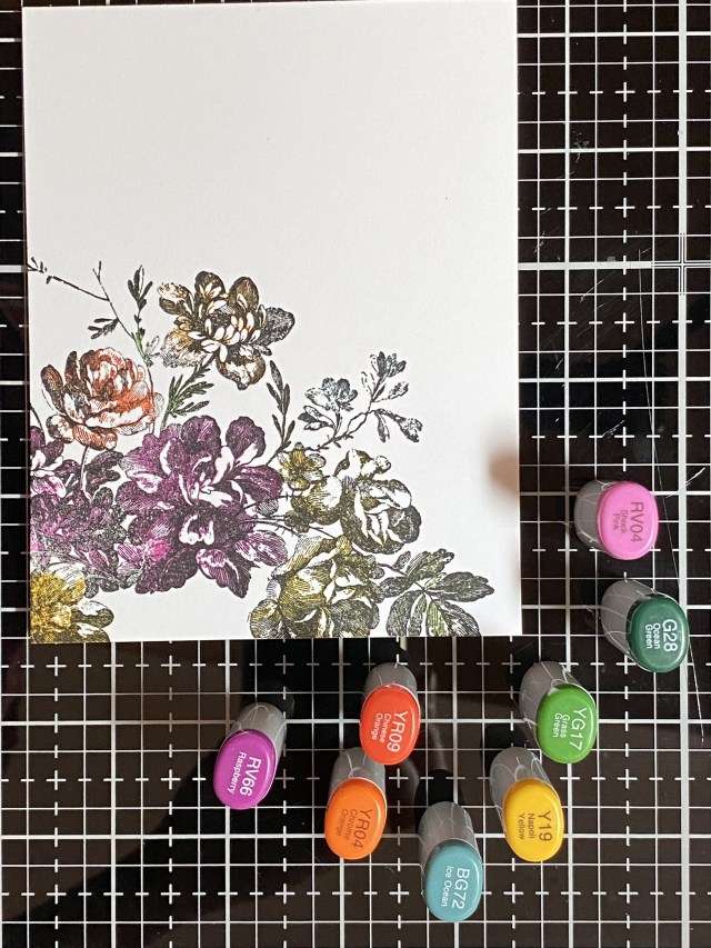
The final experiment was to color the stamp with my alcohol markers. I’m glad I started with only using half of the stamp. This was hard! I should have looked to see if anyone had tips for doing this. I thought I could color the purple flower first, stamp it, and then move on to the next flower. I found that the alcohol markers dried a lot quicker than I thought, and I didn’t know what to rehydrate them with (alcohol?). Maybe watercolor markers would have worked better, but I don’t have any. What I ended up doing was to color part of the purple flower, stamp, color more of the purple flower, stamp, etc. Even then, it was difficult to get the color to transfer from the stamp to the paper. I was just about to toss is in the trash, so I figured, what the heck… try to overstamp in black and see if that helps. I think it did. I think this produced a dramatic image that can be a focal point. It would look nice with a fancy, larger sentiment die in white cardstock with a black shadow.
This was all a great learning experiment for me! For my actual card, I used the technique of coloring the stamp with Distress Pencils, spritzing 4 or 5 times with water. I looked more closely at how much water was on the stamp. If I thought it was just about right, I spritzed one more time! Before I stamped the flowers, I used the other stamps in the set to add some interest to the background. I stamped part of the stamp in opposite corners of the card, using Distress Watercolor paper. I decided to only use the Set #1 pencils for the card, and selected my colored from that package only. Tim talked about how he tried to get a full compliment of colors in each set, so you didn’t have to get them all to have a great selection. I’m very partial to the colors in Set #1 too.
After my stamping was done, I rifled through all of my stuff to try to find a sentiment that worked. This card made me happy, and lifted my spirits. When I was putting it together, the world had just lost Queen Elizabeth II. I was thinking of how her grace and strength will always live on in the hearts of her countrymen and women. In the darkness of grief, there is always hope for the light to come again, with time and healing.
I die cut the hope circle die into my cardfront, added a small gold circle cut from the same die set, and then popped up the cardfront onto a gold metallic kraftstock panel. I added a metallic sentiment strip, and attached the cardfront to a 4 1/4 by 5 1/2 top fold card base, made with Neenah Solar White 110lb cardstock.
Thanks for stopping by. I hope you learned something, or at least were inspired to play with what you have, see what different effects you can produce, and find inspiration to use what you create! Now I have a whole stack of “Exquisite” pieces to use in future projects!
Products used, available at Scrappyshak:
Tim Holtz Stampers Anonymous Exquisite Stamp set
Tim Holtz Distress Pencils, set #1 and #2
Distress Crayons in Seedless Preserves, Festive Berries, Crackling Campfire, Peeled Paint, Rustic Wilderness, Speckled Egg, Fossilized Amber, Rusty Hinge
Misti Stamp Positioner
Foam tape
Distress Sprayer
Distress Oxide Ink Pad Antique Linen
Distress Watercolor Cardstock
Distress Metallic Kraftstock
also used:
Tim Holtz Sizzix CIrcle Words Christmas dies
Copic Sketch Markers
Tim Holtz Idea-ology Metallic Phrases stickers
DMC gold thread
Bearly Art Precision Craft Glue with precision tip
Neenah Classic Crest Solar White cardstock
