ScrappyShak Design Team: True Love Colorize

Hello crafty friends! I wanted to share this card that I made for the ScrappyShak Design Team. The inspiration for this card made with the Tim Holtz Sizzix True Love Colorize die set was a box of Valentine’s Day chocolates that I remember from my childhood. What I recall, not that it’s a fact, is that my Dad got my Mom a huge box of chocolates for Valentine’s Day, which was. a big thing, because our family didn’t have the luxury of splurging like that. I remember that it was a huge yellow heart, covered with satin flowers and ribbon. I thought it was the prettiest thing I had ever seen, and hoped that one day I would have someone who loved me enough to do the same for me (which I do). I remember my Mom kept that box for a long time, and kept special treasures in it. I had the most fun putting this die set together, imagining the flavor combinations, and who of my family would enjoy each one the most.

I started by building the chocolate box first. I chose several shades of gold foil kraftstock, including one from the Metallic Confections pad, and a couple from the Metallics Classics Idea-ology pack. Although I remember my Mom’s box being yellow, it seems odd to me now, and I could be wrong… unless the yellow boxes were on sale! After I put it together, I thought the top of the box needed a bow, so I got out my Bowtied Colorize die and made a big red bow. To get three colors I needed, I used two different pieces of red cardstock, and darkened the lighter one with Lumberjack Plaid Distress Ink to get three different shades for the bow. I don’t have a huge collection of colored cardstock, and I often use ink to alter the color that I’m looking for.

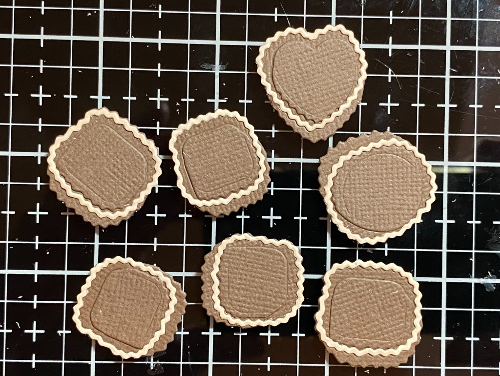
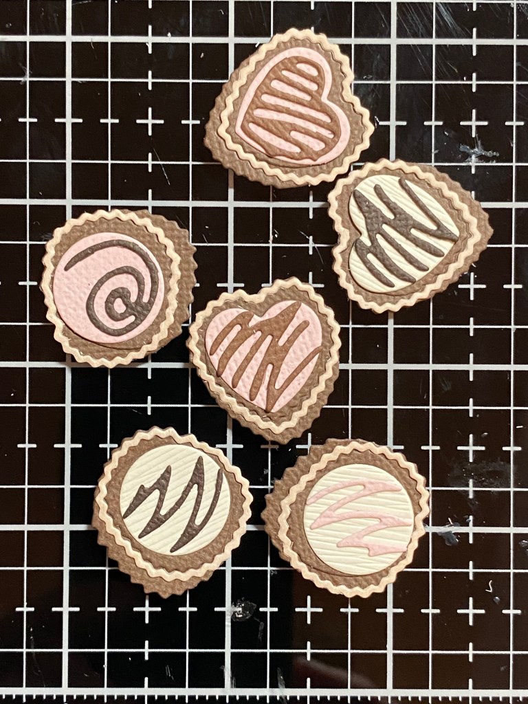
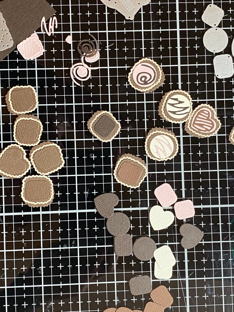
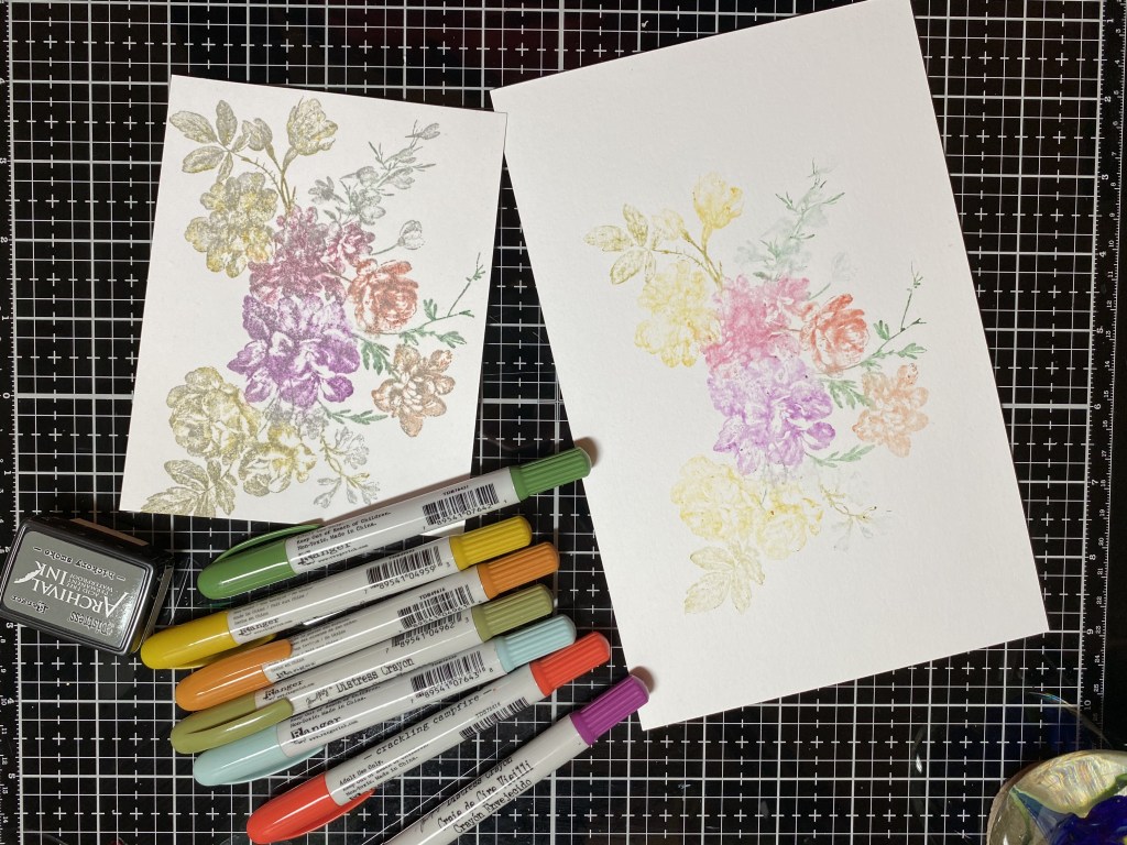
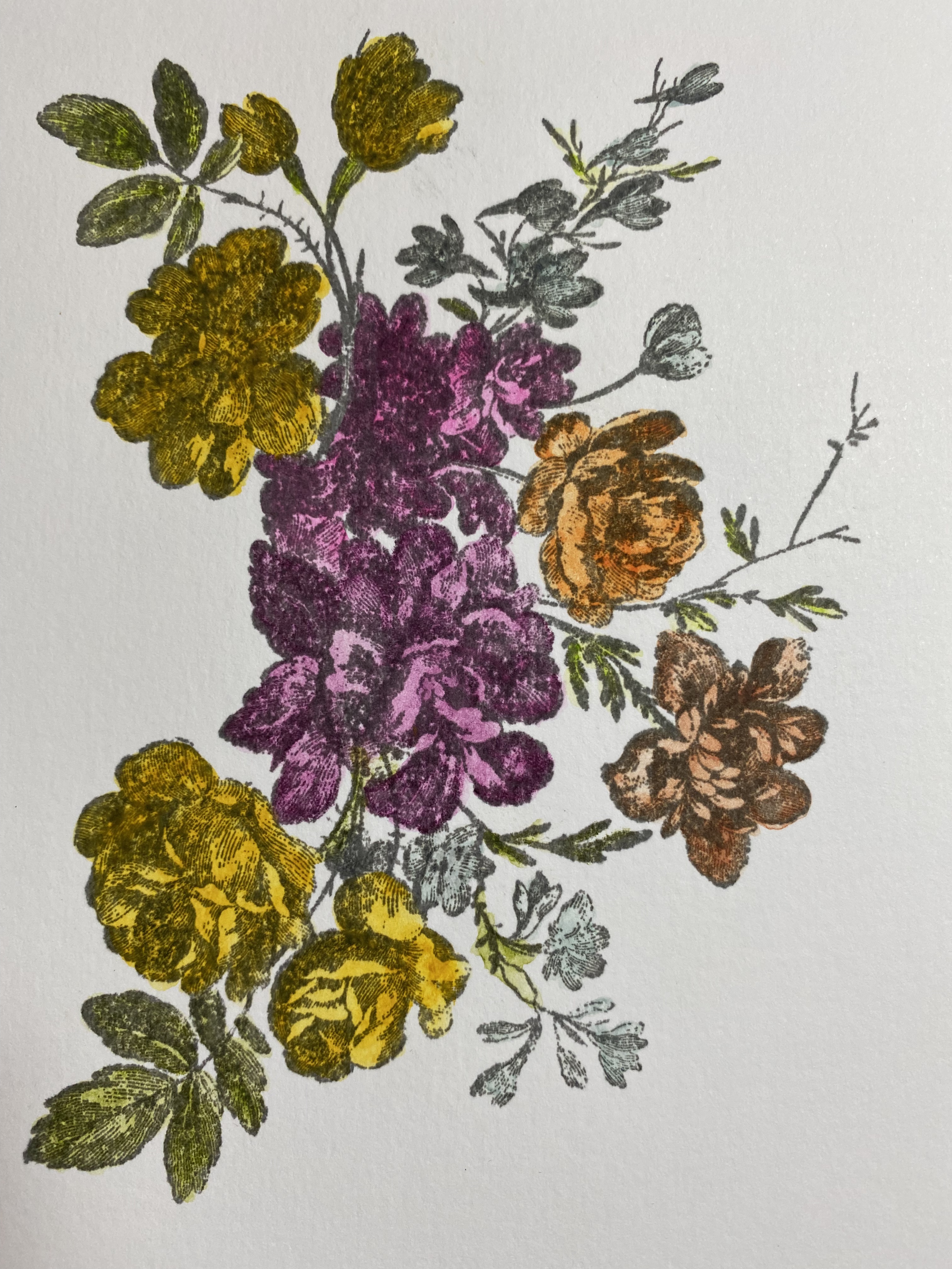
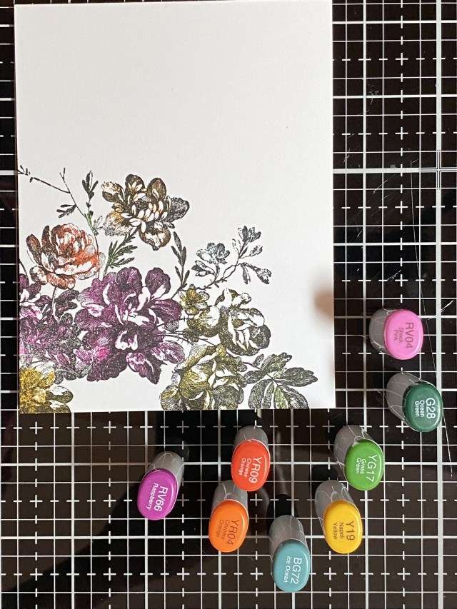
Next was the really fun part… putting together the chocolates! I couldn’t decide what color to use for the wrappers, so I went with something similar to what Tim showed on the packaging. After picking through my brown cardstock, I found pieces that looked the most like milk chocolate and dark chocolate, and then picked a slightly lighter shade for the wrappers. I also found some cream cardstock for the white chocolates, and picked a light pink for a pink confection. I cut out more than what I thought I would use. I think this was a tip from a Jennifer McGuire YouTube video. In hindsight, I might have cut all the circle pieces first, then assembled, so as not to mix things up, and make it easier on myself. I kept seperate piles of each different shape, including the decorations, just to keep things sorted. Once you get the hang of one of the shapes, it seems easier to do all of the same shape at the same time. I put together the wrapper pieces first, then added my chocolates, and finally the decorations. I used Bearly Art glue with a precision tip, but I could see using double sided adhesive sheets before cutting everything out, to make the assembly easier. Tweezers are your friend. What helped a lot for me was to use my Sizzix Sidekick die cutting machine, which I didn’t know I couldn’t live without until I bought one. I had a hard time justifying the expense for a smaller size manual die cutting machine, but I was lucky enough to find one on clearance. It’s perfect for something like this for me. The way my studio is set up, I have to get up from my worktable to get to my BigShot. It was very handy to be able to run a small die through my sidekick if I wanted another dark chocolate, or a different color for the decorations. Amazingly enough, the Sidekick works really well for having such a small footprint. I love having it right on my worktable.

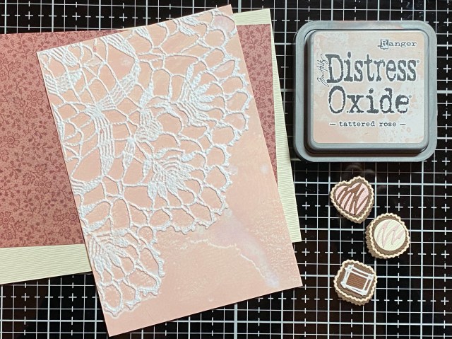
I decided to make a 5×7 card so I could fit everything, and have room for a sentiment. I went through my Christmas Backdrops paper and found one I liked that reminded me of my Mom. I wanted to add some texture, so I embossed a piece of white cardstock with the Doily 3D embossing folder, after applying Tattered Rose Distress Oxide to the “inny” side. I misted the back of my paper, and also the side of the embossing folder with the ink. You can see I was a little heavy handed with the water, as I got a bit of a smear, but I decided to leave it. I don’t mind it, I think it adds a little something. Before I put everything together, I distressed the edges with coordinating inks. I added splatters of Vintage Photo and gold mica spray to the cream cardstock for more interest.

For the sentiment, I used the Crazy Talk stamps and Archival Vintage Photo. While I was straightening up my worktable, I noticed one of the candy embellishments fit around the work “love”, which I thought was pretty cute!

If you have this die or are contemplating purchasing it, I hope you are inspired to give it a try. Make sure you have some real chocolate on hand, because you’ll be craving some for sure! Thank you for stopping by my blog, I appreciate you!

Products used, available at ScrappyShak:
Tim Holtz Sizzix True Love Colorize
Tim Holtz Sizzix Bowtied Colorize
Distress Archival Ink – Vintage Photo
Distress Ink Pads – Tea Dye, Lumberjack Plaid, Vintage Photo
Distress Oxide Ink Pads – Antique Linen, Tattered Rose
Tim Holtz Idea-ology Christmas Backdrops Paper
Tim Holtz Idea-ology Kraft-Stock Metallic Confections
Tim Holtz Idea-ology Kraft-Stock Metallic Classics

Also used:
Nuvo Mica Mist Aspen Gold
Tim Holtz Sizzix 3D Embossing Folder Doily
Tim Holtz Stampers Anonymous Crazy Talk CMS236

ScrappyShak Design Team: Department Store Bells

Hello again crafty friends! I wanted to share this card with you that I made for the ScrappyShak Design Team. The main element was the new Tim Holtz Stamper’s Anonymous Department Store stamp set. I wanted to share my process with you in case you would like to replicate this card. I ended up changing a few colors, so the leaves and the bow are actually layered – distress oxide first, then painted with mica stain.

I think I put too much pressure on. myself with this, because I really wanted to do something different. I had seen a lot of makes by other people on social media, and I wanted to do something different, in my own style, whatever that means. I knew I wanted silver bells. I started playing around with stamping on silver metallic cardstock. I used Archival ink, embossed with clear embossing powder. I liked the bells, but I didn’t like the rest of the stamp on the metallic paper. I wasn’t sure how the inks would work on the metallic paper. I thought about fussy cutting the bell part, and then stamping the bow and leaves on watercolor, and piecing them together. But, I also didn’t want this card to be so complicated that you would say “that’s nice, but too much work”. Everyone is so busy this time of year!

The stamp is beautiful. Very intricate, and very detailed. Trying to keep the beautiful detail of the stamp, I stamped on smooth Neenah Classic Crest Solar White. Because I didn’t use watercolor paper, I knew I’d have to use water or spray stains sparingly. I stamped with Archival Jet Black ink, and embossed with detail clear embossing powder. I though this would help keep the color where I wanted it, and keep the lines of the stamped image clean. It worked well when I was using oxide ink, but it didn’t resist the brushed pewter as well as I wanted it to. It’s still lovely in my opinion!

My first coloring was using Distress oxide ink pads. I smooshed them on my craft mat, and then used my smallest Ranger paint brush to apply the color to the stamped image. I used Lumberjack Plaid and Pine Needles. For the berries and bells, I sprayed a bit of Winterfrost Mica spray stain on my craft mat, and painted it on the berries. I did the same with the Brushed Pewter for the bells. Several thin layers are best with this paper. TIP: If you’re painting on inks or sprays like this, the embossing powder will resist the medium, and sit on top of it. So as not to smear everything, paint one color and one area at a time, then carefully blot the excess off with a clean paper towel before moving to the next section.

I fussy cut the stamped image. Here’s another TIP: If you’re not leaving a white border when cutting out a stamped image, use a marker in the same color as the stamped image around the edge of the paper. This will cover up and imperfections in your cutting, and also give it a more finished look. After I finished (my first round) of coloring, I decided on the background colors. I went for blues to match the berries. I wanted the card to have a lighter blue behind the bells, gradually incerasing in intensity to the edge of the card panel. I used Distress Watercolor cardstock, and started with Tumbled Glass Oxide in the middle of the card panel, applied with a blending brush. Then I switched to Stormy Sky, which I only had in a Distress Ink pad. I would later add Faded Jeans Oxide around the edges. Use what you have! The Inks and Oxides blend well together. I think blending foam would work just as well if you don’t have brushes.

I stamped my sentiment in Archival Jet Black, and embossed with clear embossing powder. I added some splatter with the Winterfrost Mica Spray. To add some texture, I used Snowfall grit paste through the Snowflake stencil, THS050, moving the stencil and placing the snowflakes all over the background. Once I got the background done, I decided I wasn’t really happy with the pine needle coloring on the leaves, so I rummaged through my mica stains, and found Tree Lot Mica Spray from last year’s Christmas collection. I spritzed some on my craft mat, and colored in the leaves. After that, well, the bow just looked like it needed some sparkle too. I used Tart Cranberry over the Lumberjack Plaid. I suppose if you are reproducing this card, you could just use the mica sprays to paint the image, but I’m not sure if it would look exactly the same, since the oxide inks add a base layer underneath the sprays. If I were to make this card again, I would definitely try it with the mica sprays first, and skip the coloring with the oxides first. I just wanted to be clear explaining my process in case your card doesn’t look exactly as you expected. I also wanted to share that as long as the ink is dry, you can change the color by layering something else over the top if you’re not happy, especially if it’s in the same color family.

To visually “anchor” the bells to the card, I used a strip of garland from the Darling Christmas stamp set. You could make a garland out of any small pine stamps you have, or skip this part. I positioned the garland strip in my stamping tool in a curved shape, using the bells to position the garland, and stamped in Archival Jet Black, and then colored by painting on Tree Lot mica stain. I attached my bells to the card using dimensional foam squares. I blended Faded Jeans oxide around the edge of the panel, and added 3 blue Christmas Droplets.

I tried to show the shine of the mica sprays… the photos don’t really do the justice. To finish the card, I layered the panel onto shiny black cardstock and then attached it to an A2 cardbase made with Neenah Solar White Classic Crest 110 lb. cardstock. Thanks for stopping by my blog, and happy making season to you!

Products used, available at ScrappyShak:
Tim Holtz Department Store stamp set
Tim Holtz Darling Christmas stamp set
Distress Oxide Ink – Tumbled Glass, Faded Jeans, Lumberjack Plaid, Pine Needles
Distress Mica Stain – Tart Cranberry, Tree Lot, Winterfrost, Empty Tomb
Distress Spray Stain – Brushed Pewter
Distress Grit Paste – Snowfall
Distress Watercolor Cardstock
Ranger Archival Jet Black ink pad
Idea-ology Droplets – Christmas

Also used:
Tim Holtz Stencil THS050 Snowflakes

ScrappyShak Design Team: Tim Holtz Exquisite Stamp

I know, it’s really fun to get the latest and greatest products, especially if you are a lover of everything Tim Holtz. Along with the new Stamper’s Anonymous Tim Holtz Exquisite stamp set, I was fortunate to have been able to purchase Set 1 and Set 2 of the new Tim Holtz Distress Watercolor Pencils. I also have a small stash of the Distress Crayons which I’ve collected. I wanted to see for myself what the big deal was about the new pencils. Were they really going to be that different than the crayons? I know each of the Distress products were designed for differnet applications, and I wanted to compare these two. I know you can color a rubber stamp (before stamping) with various mediums to achieve different results, so that’s what I decided to do with the pencils and the crayons, and compare the results. While I was at it, I also got out my Copic Sketch markers.

I’m using the new Stampers Anonymous Exquisite set, and my Misti Stamp Positioner stamping platform. I tried to use the same colors in the crayons and pencils, when I had both, and similar colors with my Copic Sketch Markers. I started with the crayons first. I colored the stamp with differnet crayons, and then lightly sprayed the stamp with 3 pumps of water. I wanted to make sure I had the same process with the pencils. After I stamped the first image, I spritzed with 3 pumps of water again, and stamped a second time, without applying any more crayon. This is often referred to as a “second generation” stamping. The second generation stamping came out very light. I decided to overstamp it in Hickory Smoke Archival Ink. First I dried the image with my heat tool, leaving it in my stamp platform. Then I cleaned my stamp really well with water and a scrubber, again, leaving it in place in my stamp positioner platform. I inked the stamp with archival rather than distress ink or oxide, so it wouldn’t react in case the image wasn’t completely dry. Here are my results with the distress crayons:

I really liked both of these. The first stamping will be beautiful as a background, possibly as a sympathy card. The second stamping, with the Hickory Smoke, came out very vintage looking to me. This technique would look really pretty with flowers done in an analogous color scheme (like pinks and reds, or blues and purples). I’m planning on trying this technique on a cream colored paper. You can change up the color you overstamp with. I’d love to see what you try!

Next I cleaned my stamp again really well with Archival Cleaner and then water, and then dried it. Using colors of Distress pencils from Set #1 and Set #2 that were the same as the crayons, or similar, I colored the stamp again. The pencils need to be slightly wet to apply color to the stamp. I spritzed water on my craft mat, and scribbled in the water with the pencils until it started releasing color, then I colored the stamp. I was so excited to get started, I didn’t even think of sharpening the pencils to get a finer tip, but I didn’t have any problems coloring this particular stamp with the pencils right out of the box. From time to time I would have to rewet the pencil if I was coloring a larger flower. As with the crayons, once I was done coloring, I spritzed the stamp 3 times, and then stamped onto Distress watercolor cardstock. Wow! Seedless Preserves! So beautiful! I got a nice impression of the stamp with the first stamping. I then spritzed with water 3 times, and stamped a second generation print onto smooth white cardstock, and then repeated to get a third generation. These pencils have a lot of pigment! My wheels are turning as to how I can use these with the Christmas stamps that I have. What a time saver! Three images from one coloring! I tried a forth generation, and I felt it just wasn’t really recognizable anymore, but I might use it for something else, like die cutting. It turns out at the end of this experiment, my favorite is the second generation on smooth white cardstock. I like the vibrant colors, and I like that you can see some of the details of the stamp, while some of the details are more diffuse. I feel like if I would have used more water on the first stamping, it may have been more vibrant, which is ultimately what I have in mind with all of this! I guess you just have to play with it to get the results you want. Since it was still in my Misti, I could have rewetted and stamped onto the first image again, but then it would have messed up my experiment!

From Left to right, first stamping with Distress Pencils, second stamping (favorite), third (top) and fourth (bottom).

The next process I wanted to try was to stamp the image in Archival ink, color it with pencils, and then overstamp in archival again. I used watercolor paper for this. Again, this has a vintage look to it, to me. I will definitely use this technique again, with different colors. I don’t particularly like the pink flower, and I think there is too much yellow. My color choices began with what Distress Crayons I had! I will definitely crop this one down and make something beautiful I’m sure.

The final experiment was to color the stamp with my alcohol markers. I’m glad I started with only using half of the stamp. This was hard! I should have looked to see if anyone had tips for doing this. I thought I could color the purple flower first, stamp it, and then move on to the next flower. I found that the alcohol markers dried a lot quicker than I thought, and I didn’t know what to rehydrate them with (alcohol?). Maybe watercolor markers would have worked better, but I don’t have any. What I ended up doing was to color part of the purple flower, stamp, color more of the purple flower, stamp, etc. Even then, it was difficult to get the color to transfer from the stamp to the paper. I was just about to toss is in the trash, so I figured, what the heck… try to overstamp in black and see if that helps. I think it did. I think this produced a dramatic image that can be a focal point. It would look nice with a fancy, larger sentiment die in white cardstock with a black shadow.

This was all a great learning experiment for me! For my actual card, I used the technique of coloring the stamp with Distress Pencils, spritzing 4 or 5 times with water. I looked more closely at how much water was on the stamp. If I thought it was just about right, I spritzed one more time! Before I stamped the flowers, I used the other stamps in the set to add some interest to the background. I stamped part of the stamp in opposite corners of the card, using Distress Watercolor paper. I decided to only use the Set #1 pencils for the card, and selected my colored from that package only. Tim talked about how he tried to get a full compliment of colors in each set, so you didn’t have to get them all to have a great selection. I’m very partial to the colors in Set #1 too.

After my stamping was done, I rifled through all of my stuff to try to find a sentiment that worked. This card made me happy, and lifted my spirits. When I was putting it together, the world had just lost Queen Elizabeth II. I was thinking of how her grace and strength will always live on in the hearts of her countrymen and women. In the darkness of grief, there is always hope for the light to come again, with time and healing.

I die cut the hope circle die into my cardfront, added a small gold circle cut from the same die set, and then popped up the cardfront onto a gold metallic kraftstock panel. I added a metallic sentiment strip, and attached the cardfront to a 4 1/4 by 5 1/2 top fold card base, made with Neenah Solar White 110lb cardstock.

Thanks for stopping by. I hope you learned something, or at least were inspired to play with what you have, see what different effects you can produce, and find inspiration to use what you create! Now I have a whole stack of “Exquisite” pieces to use in future projects!

Products used, available at Scrappyshak:
Tim Holtz Stampers Anonymous Exquisite Stamp set
Tim Holtz Distress Pencils, set #1 and #2
Distress Crayons in Seedless Preserves, Festive Berries, Crackling Campfire, Peeled Paint, Rustic Wilderness, Speckled Egg, Fossilized Amber, Rusty Hinge
Misti Stamp Positioner
Foam tape
Distress Sprayer
Distress Oxide Ink Pad Antique Linen
Distress Watercolor Cardstock
Distress Metallic Kraftstock

also used:
Tim Holtz Sizzix CIrcle Words Christmas dies
Copic Sketch Markers
Tim Holtz Idea-ology Metallic Phrases stickers
DMC gold thread
Bearly Art Precision Craft Glue with precision tip
Neenah Classic Crest Solar White cardstock