

Hello crafty friends! Today, I’m sharing this card that I made for the ScrappyShak Design Team. I’m not gonna lie, it took me a couple days or three to finish this, so don’t think I just sit down and this happens! 🙂 There’s lots of try this and maybe that, with some good old prying off foam tape and trying again. I’m pretty happy with how it came out in the end.
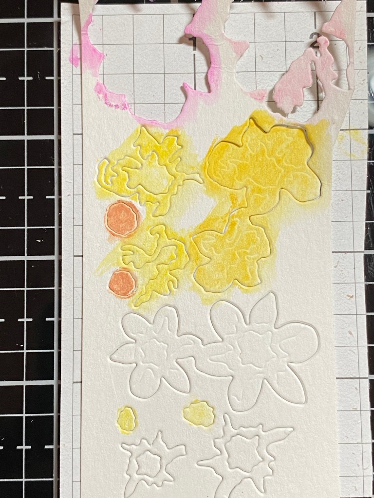
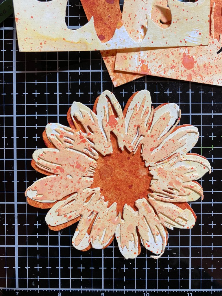
To start off, I planned on using the Tim Holtz Sizzix Blossom Die. I know it’s pretty big, so I was leaning towards a bigger card, like a 5×7. But first, the flower… I picked dried marigold, scattered straw, and antique linen to start. I colored some watercolor paper with those inks, and also inked some paper with mowed lawn and rustic wilderness, which I was planning on using for the leaves. I also did a piece of iced spruce, just to see if it would fit in for the background. After messing around a bit, I decided the flower was going to be too washed out. I colored some paper with rusty hinge, and liked where that was going. It felt better with the colors for the leaves. So for the flower, I was going to use the rusty hinge, scattered straw, then dried marigold. When I cut those layers out, the dried marigold seemed too washed out. I put that piece back in the negative space of the watercolor paper, and blended some spiced marmalade over it. That looked better. Fitting the die back into the negative space helped to keep all the detailed edges from getting out of shape when I blended over it. I colored some scraps with walnut stain ink and gathered twigs oxide for the center of rhe flower.


I really wanted to use that piece of Iced Spruce, but it just wasn’t working in my mind. Maybe too outside the box for me? I decided to try my go-to blue background, Stormy Sky. I colored a piece of watercolor paper, then ran it through my machine with the Dotted embossing folder, and rubbed some lost shadow oxide ink, direct pad to paper, over the raised dots. This showed up better before it dried, but I’mn happy with how the lost shadow just lightly highlighted the dots after it dried.
I got a little stuck with how to finish up the card, but lucky for me, my ScrappyShak order arrived! I had ordered some of the new idea-ology papers and ephemera and stuff! Yippee!! Because I knew this was going to be a blog post eventually, I wanted to be sure that the card would be something you could reproduce. So I kept the stuff I added to the card to just the Backdrops #5, the Ephemera Palette Pack, and the Quote chips, so you don’t have to purchase the whole release like I did!

This is the fun part for me, pulling out things that I like, or just things that are the right color. I picked an orange piece from the Backdrops #5 pack, as well as a darker blue floral piece. I thought I’d layer them for the background. I also used a piece of the dark blue paper to cut a die from the older Crochet set to add some feminity to the card. I used my favorite squiggle from the Media Marks dies to add some more orange. You can use whatever you have, if you don’t have these same sets. The goal was just to add a layer of something interesting with a touch of coordinating color. You could add some small cirles instead. You could even use the center flower dies to cut some circles out of a coordinating color. Use your imagination! Look through what you have! Shop your stash!
I really wanted to use the oval photo of the young girl reading the book that is in the photo above. But, in the end, it just didn’t seem to work with this card. I chose another piece (this moth) from the Palette Ephemera pack. It sort of has that same neutral silvery blue color that iced spruce has, that I had wanted to use in the beginning. I used the new Large Fasteners on the Quote chip, but I actually just used them as a decoration, and used foam squares to attach the quote chip to my card. I wasn’t sure exactly where I wanted to put it, so this way was more flexible. I could wait until the end.

I hope you enjoyed this card, and I hope you can add some of the new idea-ology items to your stash. It’s so much fun to have more color! If you can only add one thing, I’d suggest the Backdrops Volume #5, because you can always cut it up, and get lots of use out of each piece. Easy to say of course, I had a hard time cutting it because I didn’t want to use up all of my favorites! Thank you for stopping by my blog, I appreciate you!
Products used, available at ScrappyShak:
Tim Holtz Sizzix Blossom die
Tim Holtz Sizzix Dotted Embossing Folder
Tim Holtz Idea-ology Backdrops Volume #5
Tim Holtz Idea-ology Ephemera Pack Palette
Tim Holtz Idea-ology Quote Chips
Tim Holtz Idea-ology Large Fasteners
Distress Ink Spray Stains – Rusty Hinge, Scattered Straw, Stormy Sky, Rustic Wilderness, Mowed Lawn
Distress Oxide Spray – Gathered Twigs
Distress Ink Pads – Walnut Stain
Distress Oxide Pads – Spiced Marmalade, Lost Shadow, Dried Marigold
Bearly Arts Glue with precision tip
Also used:
Tim Holtz Sizzix Crochet Dies
Tim Holtz Sizzix Media Marks Dies