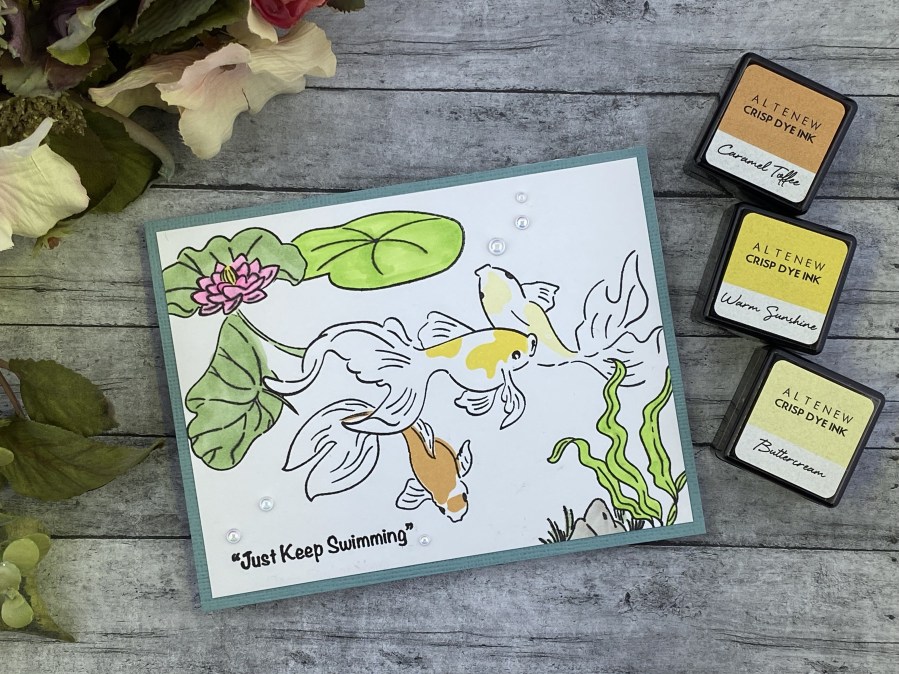
Hello crafty friends! Today I’m sharing a card that I made after participating in Altenew Academy’s Seasonal Scene Building class by Nichol Spohr.
I must say I was slightly intimidated by this class… I mean… Nichol Spohr was the instructor! I’ve admired her work since I started papercrafting again. But I found the sessions very informative, and not intimidating at all. She shared some good tips and helped me to understand her thought process. She’s a great instructor.
There were 6 lessons in this class. I chose to make a card using the masking techniques that Nichol shared in the first lesson. I love this Goldfish Pond set from Altenew. It was the first set I purchased from Altenew. I have a small garden pond of my own, and have always been drawn to water and fish.
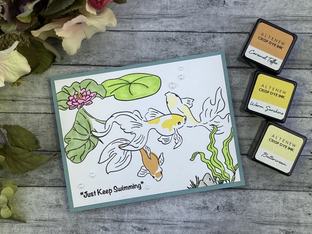
For the first layer, I stamped the center goldfish, the flower, and the underwater plant on the right. I stamped again onto masking paper, cut out the images, and applied the masks. Next I stamped the darker lily pads and the other two fish. I made a mask for the lily pad with the flower, and then finally stamped the last lily pad and the rock/grass cluster.
Before removing the masks, I added the stamps to color the fish, using the Summer Afternoon Crisp Dye Ink Mini cube set. I colored in the rest of the images with Copic markers, using no skill whatsoever! I added a sentiment from the stamp set, masking off part of it. Finally I cut the panel down and added a piece of blue green cardstock as a border, before attaching the panel to an A2 card base. I added some water droplets as bubbles.
I debated making this into a shaker card, but I really wanted to focus on the masking process. We have a saying in our house – “No apologies for food”. This keeps me from being overly critical with myself. “I think there’s too much salt… I should have used a lower temperature… I think the bottom stuck…” I’m adding a new one: “No apologies for cards”, so I won’t be overly critical with my lack of Copic coloring skills, or a misaligned layer, or a couple random smudges. You get what you get and you don’t throw a fit, right?
The course inspired me to practice my masking technique, and to break out my copic markers, two things that I generally avoid at all costs. I enjoyed the lesson on the window cards, as well as the shaker scene. I will definitely use a window in a project very soon. Thanks for stopping by my blog, I appreciate you!
Altenew products used: Goldfish Pond Stamp Set Crisp Dye Ink Mini Cube Set – Summer Afternoon
Hello crafty friends! Today I’m sharing a card that I made after participating in Altenew Academy’s Celebration: Stencil Techniques course by Laurel Beard.
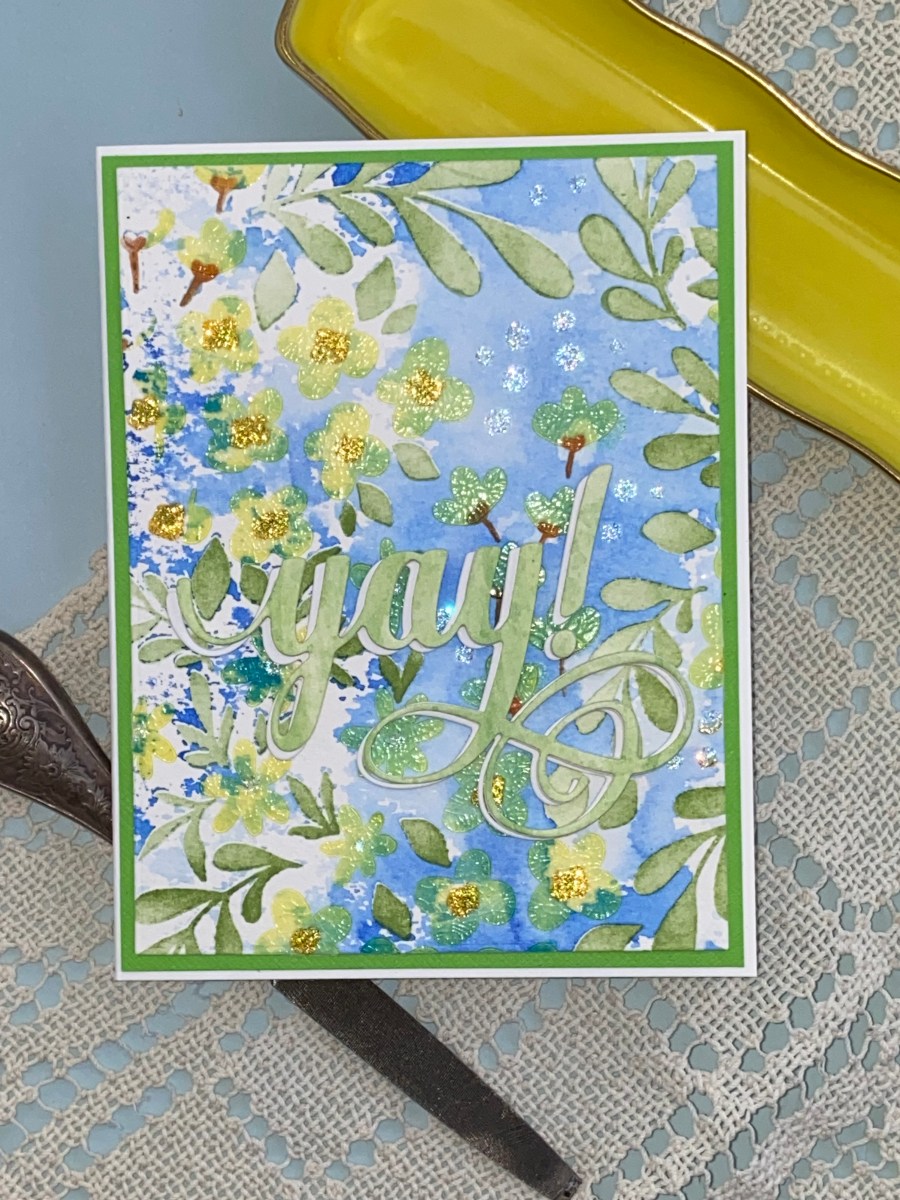
This was a fun class, and I really enjoyed combining several of the techniques discussed during this class into this card. In fact, I absolutely love this card, and it’s probably the first card I’ve made for myself, hence the “yay!” sentiment. I just love the watercolor effect that I was able to achieve with the the Blooming Flower Bed stencil set from Altenew.
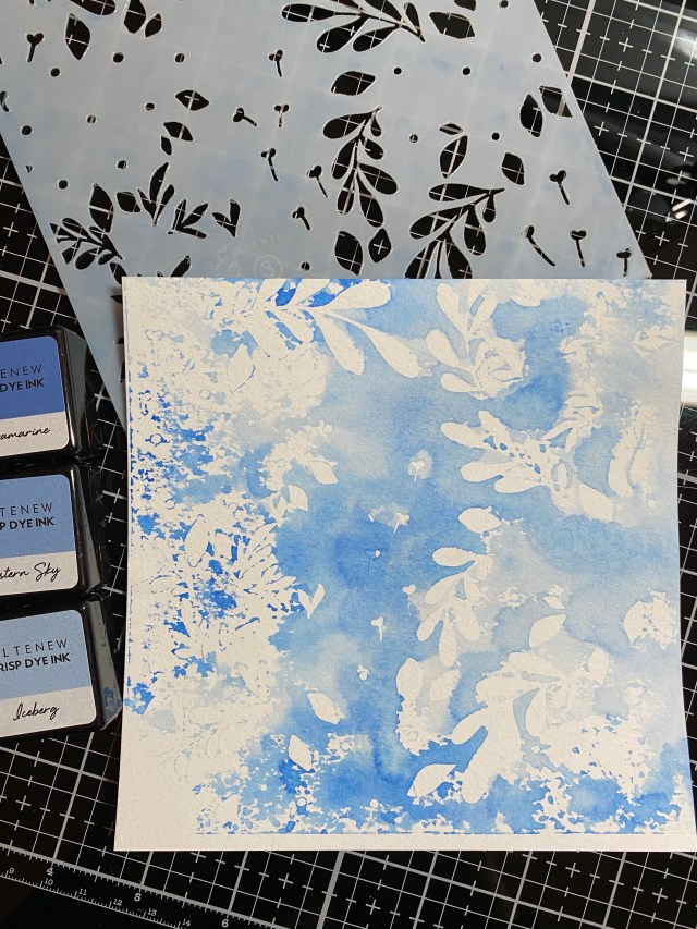
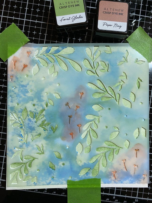
I wanted the background to be blue, so I flipped over the last stencil, nunmber 3, the one with the leaves, and carefully applied 3 different shades of blue from the Lapis Lazuli mini ink cube set. I used the direct method from ink pad to stencil, pressing down to release some ink, but making sure not to catch any of the stencil cutouts on the ink pad. I randomly added Ultra Marine, Eastern Sky, and Iceberg until I felt I had covered the stencil. Then I misted the stencil with water, let the colors flow together, flipped it back over, and laid it on top of a piece of watercolor paper that I had cut to the stencil size (6×6). I put a piece of paper towel over the top, and pressed lightly, to get the ink off of the stencil and on to the paper. I carefully lifted the stencil off the paper, and thought, there’s a hot mess! But, as they say, you get what you get, and you don’t throw a fit! The results are the first photo above. I cleaned off my stencil, and then placed it on the paper again, this time right side up, so I could blend on the leaves and the flower stems. I used Forest Glades green and Paper Bag.
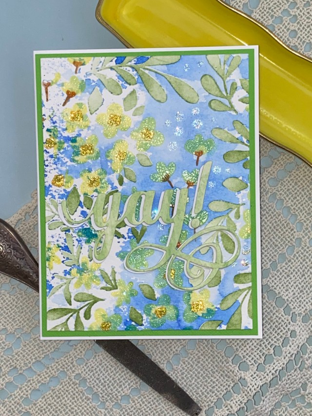
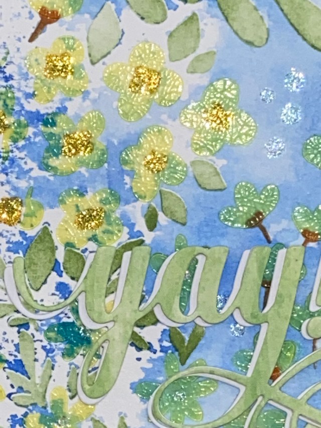
I went back to stencil number 1 to do the flowers. I smooshed some Warm Sunshine ink onto my craft mat, and then added Distress Crackle Paste in Translucent, to color the paste yellow. I applied this through the stencil in a light layer, and then waited for it to dry. For the last stencil layer, I added yellow and clear Stickles glitter glue through the stencil. I picked part of the design, and cut a 4×5.25 inch rectangle for my card front, layered a piece of green cardstock behind it, and attached it to a white A2 card base.
I just loved how this background came out… very loose and almost Monet-esque. I chose the “yay” sentiment, cut from some green patterned paper, layered with 2 white diecut layers, and offset with another white layer.
The course inspired me to use several differnet stencil techniques, including stamping with the stencil to achieve the watercolor background, and using texture paste which I first colored with ink. Thanks for stopping by my blog, I appreciate you!
Altenew products used: Bloomin Flower Bed Stencil Set Fancy Yay Die Crisp Dye Ink Mini Cube Sets – Lapis Lazuli, Green Fields, Summer Afternoon
Also used: Distress Crackle Paste, Translucent Stickles
Hello crafty friends! Today I’m sharing a card that I made after participating in Altenew Academy’s Let it Shine course.
I found this to be an interesting course, and really reminded me of all of the different ways to add shine and sparkle to a card. I may have overdone it on this one, because I used a bunch: hot foiling (hello), silver embossing powder (Sparkle on, Darling), a strip of “glimmer paper”, and finally some highlighting on the flower with a ZIG Wink of Stella brush in clear. I tried to balance all of the sparkle with a matte black card front, a mostly white flower, and the vellum leaves. I’m pretty pleased at how it came out.
Not often do I immediately know what color scheme I want to use with a card, but this one came together in my mind before I even sat down at my desk. For the shine, I wanted to use silver. That made me thing of black paper, with white flowers, to really make it stand out. I wanted to give the flowers a hint of greenish yellow, so I thought of Distress Ink in Shabby Shutters. I’m sure there’s an Altenew ink color that is similar, but it wasn’t in the front of my mind, like the Distress colors are.
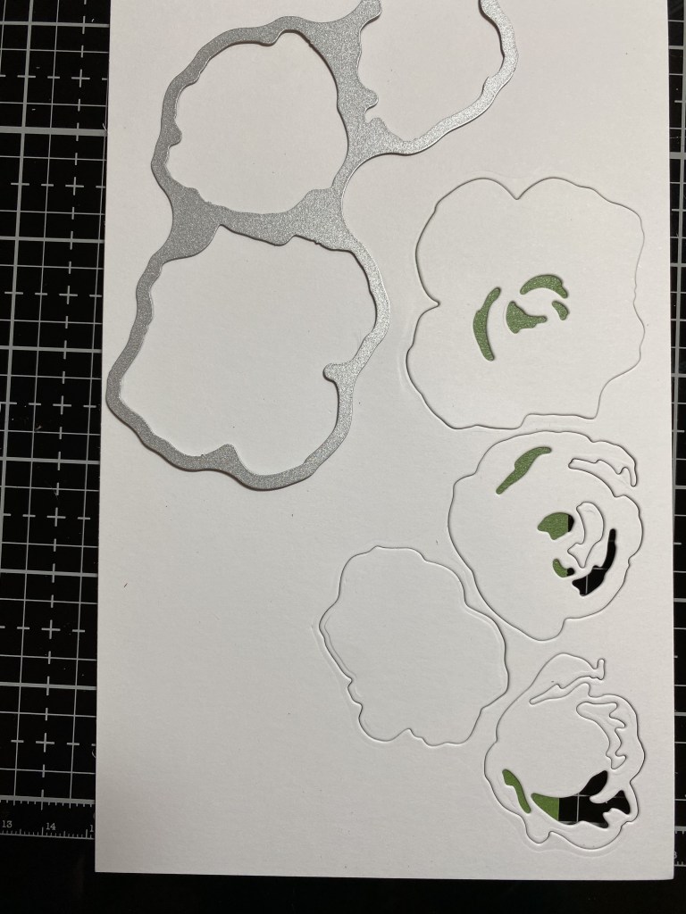
I used the Altenew Craft-A-Flower: Sulfur Cosmos Layering Die Set for the flower and the leaves. The set comes with two flowers. I used the smaller one. I die cut all of the pieces with a piece of watercolor paper first. Then I placed the die cuts back into the negative space to hold them, so I could lightly blend some ink onto them with a mini blending brush, staying mainly in the areas that would become the center of the flower. I also used a foam blending tool to lighly apply color to the edges of the petals. Wanting to keep the card on the “clean and simple” side, I used vellum for the leaves. To finish the card off with just a touch more sparkle, I added clear Wink of Stella brush marker highlights along the die creases in the flower petals.
The course inspired me to use a bunch of shine-producing techniques on the same card, in a hopefully balanced way. I used the rounded corner and strip of glitz down the left side of the card that the course instructor demonstrated. I really love the Craft-A-Flower layering dies from Altenew. They go together very easily, as they have a keyhole cutout in the center that helps you line everything up in the right orientation. It couldn’t be easier! The flowers are gorgeous as well, so you just can’t go wrong. One flower is large enough to create a beautiful focal point for your A2 sized card, or use both for a really impressive look!
Thanks for stopping by my blog, I appreciate you!
Altenew products used: Craft-A-Flower: Sulfur Cosmos Layering Die Set Versatile Greetings Hot Foil Plate Set Sentiment Strips 3 Stamp Set Tim Holtz Distress Ink – Shabby Shutters, Scattered Straw Tim Holtz Distress Heavystock – Black ZIG Wink of Stella Brush II – Clear Deco Foil – Silver Ranger Detail Silver embossing powder
Hello crafty friends, and Happy Saturday! I wanted to share this card that I made for the ScrappyShak Design Team. I made this last week while I was thinking about getting out of the dreary, cold weather here in Virginia. Gladys the flamingo hopped in her sunny yellow car and decided to head out to SoCal for the rest of the winter. She’s stopping to visit her BFFs in Arizona on her way. I used the new Tim Holtz Road Trip Colorize dies for my inspiration.
This is just a quick post to share some of the details in this card, as it’s just basically picking colors and putting the dies together. First I made Gladys using Distress Watercolor Paper. I colored the paper first with Kitsch Flamingo, Picked Raspberry, and Cocktail Party Mica Spray. Her beak is Mustard Seed. I used black and white cardstock for some details. I shopped her legs off so she would fit in the car, but I kept one to make it look like she has a foot steering the car.
The car is mostly made with yellow cardstock. I added some watercolor paper sprayed with Harvest Moon Mica Spray, and some metallic gold paper for the highlights. There are 4 layers to the main passenger compartment of the car. To make it look like Gladys was inside the car, I put her in between the 4 layers. I glued the bottom two layers together, placed her “in” the car, and then put the top two layers on.
For the background, I used Stormy Sky Distress Spray and Tumbled Glass Oxide Spray. I wanted it to be a bit dreary. I used the exhaust puff for grey, overcast clouds. I added Crypt Grit Paste on the bottom of the card for the road. I wanted a bit of green grass to transition from the road to the sky… but I had already colored my whole background piece with the blue sprays. How can I get some green in there? Well, blue and yellow make green. I took some Mustard Seed Spray stain (stain instead of Oxide because I wanted it to be more transluscent) and dabbed it on with a dry brush. It looked green enough for me! The letters and the numbers on the sign are from the Specimen die set. My first thought was to have Gladys driving out of Darlington County, but there wasn’t a “g” in the Specimen set, and Darlington didn’t fit on the sign. (I’m a die hard Bruce fan, and the song kept running through my head).
If you have this die or are contemplating purchasing it, I hope you are inspired to give it a try. Look through your dies to find a different character to put in the car in stead of Gladys! What about a snarky cat? Paper doll? I’m sure you can find something fun. Thank you for stopping by my blog, I appreciate you!
Hello crafty friends! Today I’m sharing a card that I made after participating in Altenew Academy’s For The Guys course.
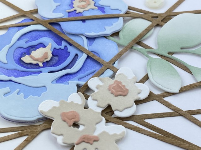
I send cards to guys, and in general I try to pick more “masculine” colors, but not all of the time. I don’t think most cards are gender specific, but I do understand the idea of more of a masculine theme. I had seen and purchased the new Altenew Fresh Dye Inks. When I first saw them together, a blue violet set, brownish pinks, and sage greens, I got a masculine vibe. I also loved how they coordinated together. So, I chose to use all three Fresh Dye Ink mini cube sets for this card. I wanted to use flowers, but incorporate the tips and suggesions that were shared in the course. I was inspired to go with a geometric theme, and used the lovely String Panel cover plate die from Altenew. To add more of a masculine flair, I cut the die out of wood veneer cardstock. I think using lots of texture or different mixed media can help give a card a masculine feel, and this wood veneer cardstock seemed perfect. It’s surprising to me how well it cuts, and how well it stays together, even when using fine detail dies. I cut the die twice, and turned one piece 180 degress to get more of a pattern.
For the flowers, I chose the Jumbo Garden Picks Layering Die Set. I made all of the four flowers, but in the end, decided to use two of them, with one leaf sprig, sticking to the idea of three elements.
I cut the flower pieces out of Neenah Classic Crest Solar White 110 lb. cardstock, as I like to blend on this paper. After I cut the pieces, I placed them back into the paper, and held them in place with low tack tape on the back of the paper (that’s the green). This helped hold the pieces so I could use domed blending foam to apply the ink. It’s very helpful when you are trying to color the smaller pieces especially.
I had the idea of added the sentiment to one of the leaves instead of cutting a strip of paper for it. I think it turned out well. The “BE FEARLESS” sentiment strip in all caps seemed on the masculine side to me. When I was arranging the flowers and leaves on my cardfront, I thought it would look cool to layer some of the String Panel over and under the flowers. I played around with it until I liked it, then applied low tack tape to the top of all of the pieces to hold everything in position, flipped it over, and added glue and foam squares to the back. Then, when I flipped it back over in place onto my card base, everything stayed where I wanted it. After the glue sets, you can carefully peel the tape off the top of your card.
The course inspired me to use geometric elements, color combinations that had a masculine feel, and interesting paper (wood vaneer) to create this card. Thanks for stopping by my blog, I appreciate you!
Altenew products used: Jumbo Garden Picks Layering Die Set String Panel Cover Die Sentiment Strips 3 stamps Fresh Dye Ink mini cube set in Blue Mountains, Woodland Escape, Frosted Foliage Sequins in Satin White
Hello crafty friends! I wanted to share this card that I made for the ScrappyShak Design Team. The inspiration for this card made with the Tim Holtz Sizzix True Love Colorize die set was a box of Valentine’s Day chocolates that I remember from my childhood. What I recall, not that it’s a fact, is that my Dad got my Mom a huge box of chocolates for Valentine’s Day, which was. a big thing, because our family didn’t have the luxury of splurging like that. I remember that it was a huge yellow heart, covered with satin flowers and ribbon. I thought it was the prettiest thing I had ever seen, and hoped that one day I would have someone who loved me enough to do the same for me (which I do). I remember my Mom kept that box for a long time, and kept special treasures in it. I had the most fun putting this die set together, imagining the flavor combinations, and who of my family would enjoy each one the most.
I started by building the chocolate box first. I chose several shades of gold foil kraftstock, including one from the Metallic Confections pad, and a couple from the Metallics Classics Idea-ology pack. Although I remember my Mom’s box being yellow, it seems odd to me now, and I could be wrong… unless the yellow boxes were on sale! After I put it together, I thought the top of the box needed a bow, so I got out my Bowtied Colorize die and made a big red bow. To get three colors I needed, I used two different pieces of red cardstock, and darkened the lighter one with Lumberjack Plaid Distress Ink to get three different shades for the bow. I don’t have a huge collection of colored cardstock, and I often use ink to alter the color that I’m looking for.
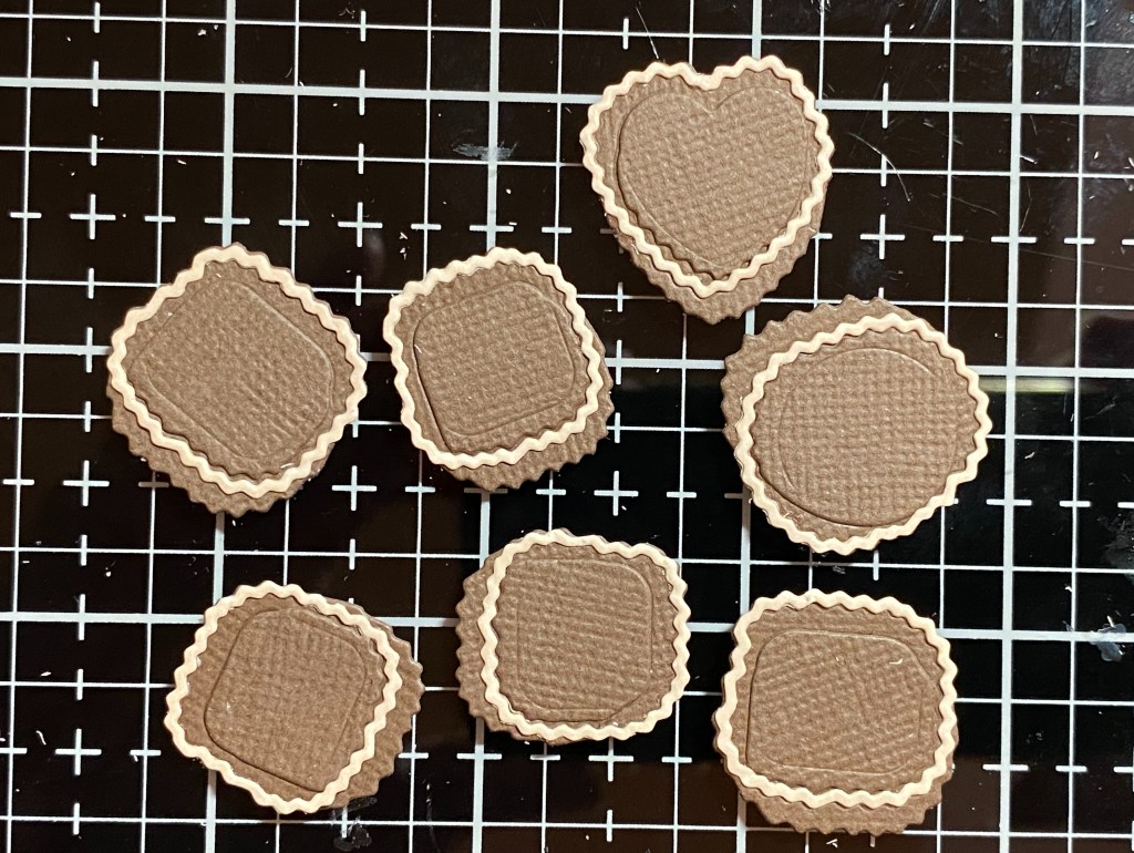
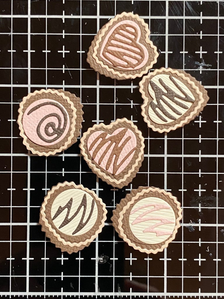
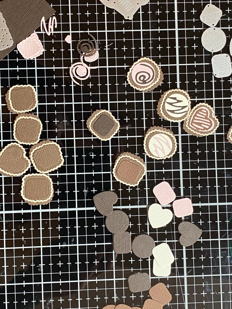
Next was the really fun part… putting together the chocolates! I couldn’t decide what color to use for the wrappers, so I went with something similar to what Tim showed on the packaging. After picking through my brown cardstock, I found pieces that looked the most like milk chocolate and dark chocolate, and then picked a slightly lighter shade for the wrappers. I also found some cream cardstock for the white chocolates, and picked a light pink for a pink confection. I cut out more than what I thought I would use. I think this was a tip from a Jennifer McGuire YouTube video. In hindsight, I might have cut all the circle pieces first, then assembled, so as not to mix things up, and make it easier on myself. I kept seperate piles of each different shape, including the decorations, just to keep things sorted. Once you get the hang of one of the shapes, it seems easier to do all of the same shape at the same time. I put together the wrapper pieces first, then added my chocolates, and finally the decorations. I used Bearly Art glue with a precision tip, but I could see using double sided adhesive sheets before cutting everything out, to make the assembly easier. Tweezers are your friend. What helped a lot for me was to use my Sizzix Sidekick die cutting machine, which I didn’t know I couldn’t live without until I bought one. I had a hard time justifying the expense for a smaller size manual die cutting machine, but I was lucky enough to find one on clearance. It’s perfect for something like this for me. The way my studio is set up, I have to get up from my worktable to get to my BigShot. It was very handy to be able to run a small die through my sidekick if I wanted another dark chocolate, or a different color for the decorations. Amazingly enough, the Sidekick works really well for having such a small footprint. I love having it right on my worktable.
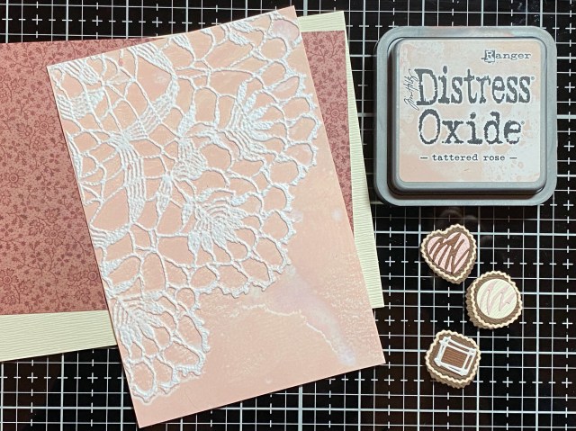
I decided to make a 5×7 card so I could fit everything, and have room for a sentiment. I went through my Christmas Backdrops paper and found one I liked that reminded me of my Mom. I wanted to add some texture, so I embossed a piece of white cardstock with the Doily 3D embossing folder, after applying Tattered Rose Distress Oxide to the “inny” side. I misted the back of my paper, and also the side of the embossing folder with the ink. You can see I was a little heavy handed with the water, as I got a bit of a smear, but I decided to leave it. I don’t mind it, I think it adds a little something. Before I put everything together, I distressed the edges with coordinating inks. I added splatters of Vintage Photo and gold mica spray to the cream cardstock for more interest.
For the sentiment, I used the Crazy Talk stamps and Archival Vintage Photo. While I was straightening up my worktable, I noticed one of the candy embellishments fit around the work “love”, which I thought was pretty cute!
If you have this die or are contemplating purchasing it, I hope you are inspired to give it a try. Make sure you have some real chocolate on hand, because you’ll be craving some for sure! Thank you for stopping by my blog, I appreciate you!
Hello crafty friends! Today I’m sharing a card that I made after participating in Altenew Academy’s Easy Ink Blending Techniques course.
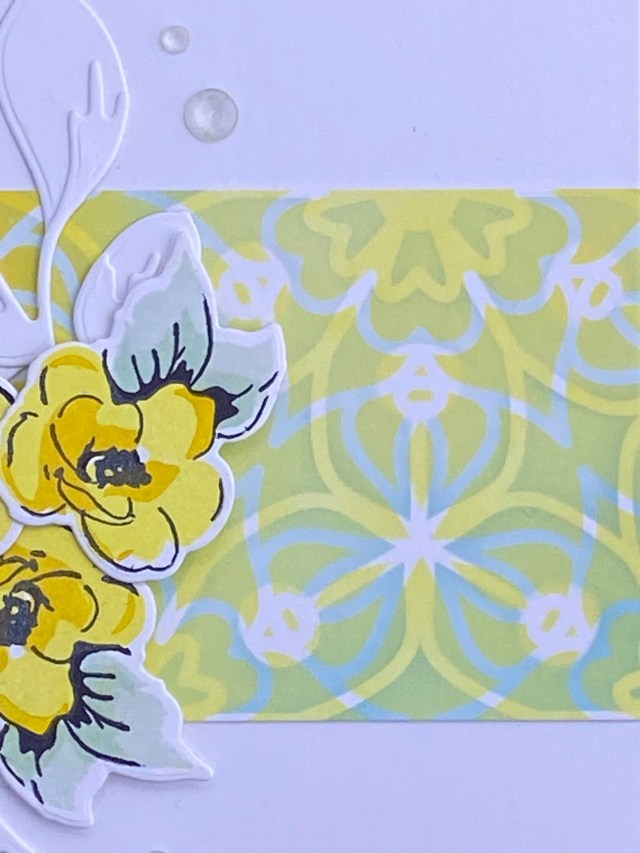
I had just purchased the Layered Medallion Stencil Set from Altenew, and wanted to try it out. This is a nice larger stencil, 6×6 inches. I thought I would only use a small portion of it on my card, but I went ahead and blended the whole stencil (almost) on a half sheet of Neenah Classic Crest Solar White cardstock. This is my go-to white cardstock for doing anything other than watercolor techniques. I wanted to use some lighter color inks for blending, as there are two stencils in this set that layer on top of each other. Parts of the layers will blend together; some parts will show either the top or bottom color, or the cardstock color. I picked a Tim Holtz Distress Oxide ink pad in Speckled Egg to start with. I only have Altenew inks in the mini cubes, and I find it easier to fill my brush with color from a larger ink pad. I also wanted a break from Christmas and winter colors! I chose to use blending brushes, because they’re more precise when working with a stencil than using a foam applicator. As I began blending the Speckled Egg through the first stencil layer, I thought it was a little lighter than what I wanted. I wanted to make sure there would be nice contrast, so I decided to blend Salvaged Patina on the other half of the first stencil layer, gradually blending the colors together in the middle.
For the second layer, I went with yellows, knowing the places where they overlap will become green. I used two Distress Oxide yellows: Squeezed Lemonade and Mustard Seed. I blended them 90 degrees different than the blues. For example, I blended the blues from lighter to darker, right to left, and then I blended the yellows from lighter to darker, top to bottom, This gave me lots of options for the piece I wanted to use on my card.
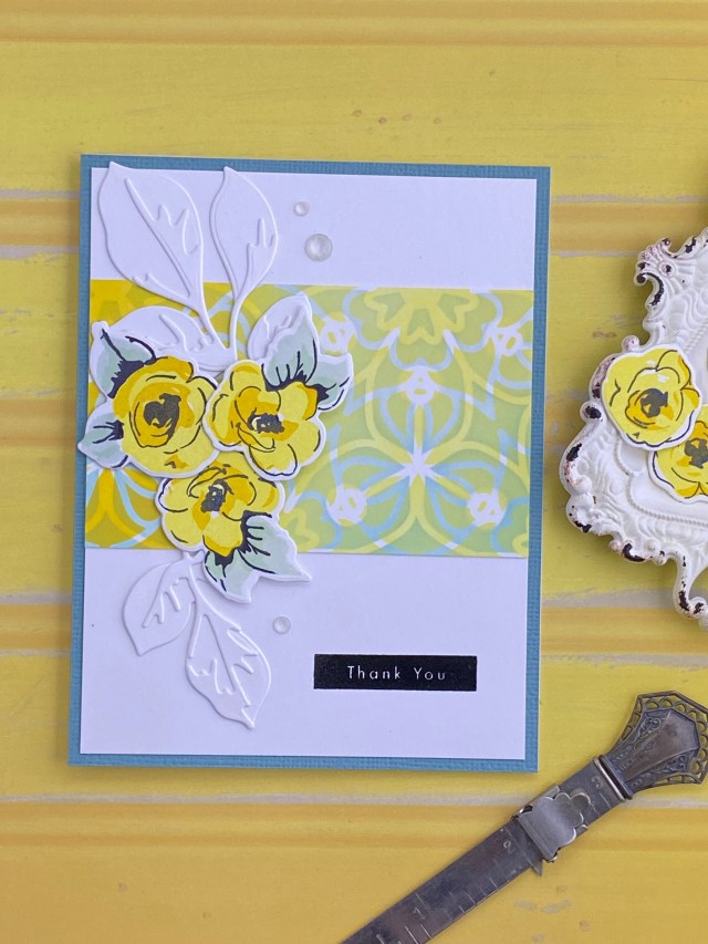
For the focal point, I stamped some yellow flowers using the Painted Flowers stamp set. For the flower leaves, I used the new Fresh Dye Ink Mini Cube ink pad set in Frosted Foliage. I thought these colors complimented the green colors in my blended piece. I wanted the flowers to stand out a little more against the stenciled background, so I used some tone on tone white leaves that I cut from the Jumbo Garden Picks die set. The sentiment is from the Best Setiments stamp set. This was stamped in black ink directly on the card front, and then embossed in detail clear embossing powder. I used a tape runner to attach the stenciled strip to the card front, glued down the leaves, and used foam dimentional squares behind the flowers. The card front was mounted onto a teal blue panel to compliment, and a few clear faceted gems were added for interest.
The course inspired me to really take my time while I was doing my ink blending. It also inspired me to experiment with layering colors while blending, and to try something different with my color combinations. I also was more aware of how the ink blending looks different after it has a chance to dry. In my experience, it did look quiet a bit better. This is a great reason to take your time, use many lighter layers of ink, and have patience when blending.
Altenew products used: Painted Flowers stamps and coordinating dies Best Sentiments stamps Jumbo Garden Picks Layering Die Set Layered Medallion Layering & Background Stencil Set Fresh Dye Ink mini cube set in Frosted Foliage
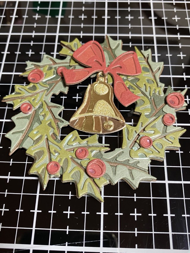
Hello crafty friends! I wanted to share this card that I made for the ScrappyShak Design Team. The inspiration was the Yuletide colorize thinlit die, and also the Christmas Backdrops paper pack.
This card ended up nothing like I had originally planned! I wanted to make a wreath featuring colors that my son and his partner were using to decorate their home for the holidays – pink, silver, and sage green. My plan was to color watercolor paper using distress inks and sprays, and then assemble the wreath. When I started to look at the dies, I wasn’t sure exactly which colors I wanted to use for the different layers. I figured I had better assemble the wreath with cardstock first, so I could decide how I wanted to color my watercolor paper for the differnt layers. I also thought that I would use a coordinating paper from the Christmas Backdrops papers for the background. That got me going in a whole different direction!
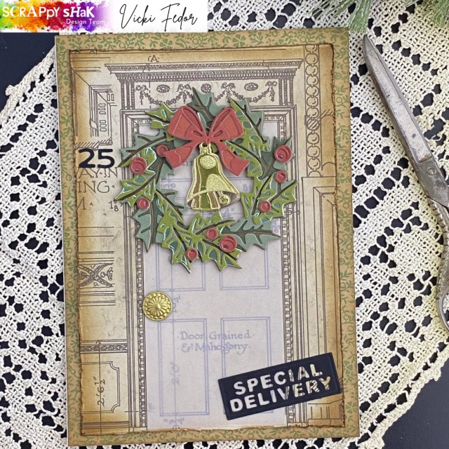
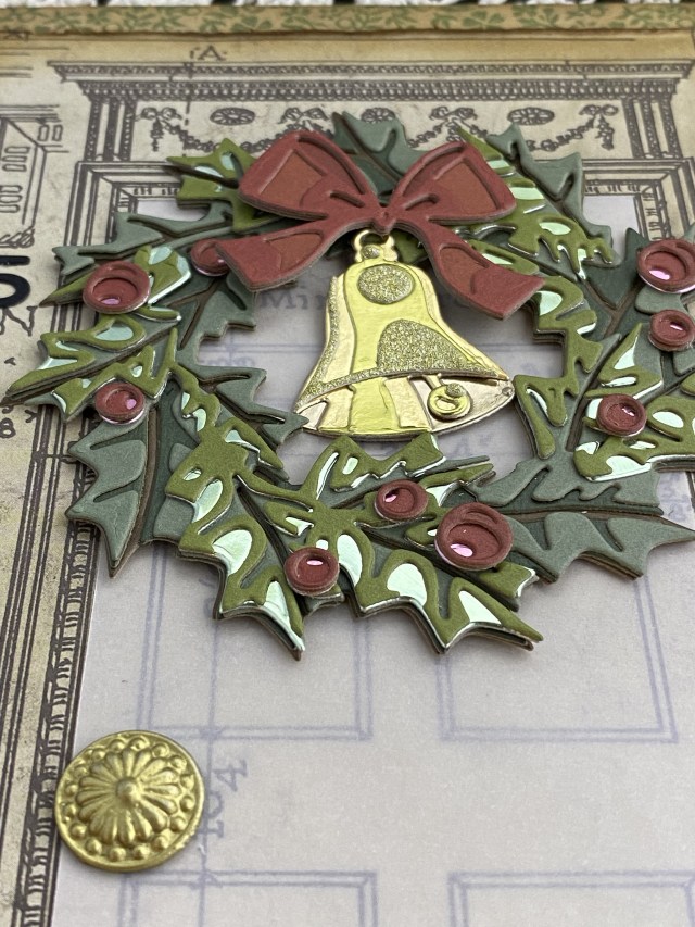
I found the Backdrops paper that looked like an architectural drawing of the front of a home with a door that was pretty much exactly the right size for the wreath. I didn’t think the pink and sage wreath would go the best with this background paper. Looking through my stash, I was drawn to the Idea-ology Kraft stock paper stacks. The coordinate so well together. I pulled out some greens and reds, and decided to use them instead. The pink and sage green wreath would have to wait for another day!
Then I had the thought – wouldn’t it be neat to use only the papers in the idea-ology line? I needed 4 different greens to make the wreath, but there were only two that I thought went together in the Cool paper stack. I ended up using a dark brown from the Neutral paper stack for the base, and added in a metallic green from the Metallic Confections pad. I used three different reds from the Warm paper stack for the bow, and added a metallic pink from the Confections pad for the base layer of the berries. For the bell, I used two gold colors from the Metallic Confections pad, a gold from the silver and gold metallic paper pad, and the gold from the Christmas Deco sheets.
TIP: You don’t have to be a hero and figure out this die on your own! Go to Sizzix.com and check out the video for this die. Otherwise you might start to have a panic attack, like I did! I honestly almost gave up before I watched the video (several times). It is easier than it looks, once you get the hang of it.
The tricky part is the third layer of the wreath. The fourth layer goes right on top of the third in the same orientation. It really is gorgeous in real life, and certainly worth the effort. Photos do not do it justice. I found the berries to be somewhat frustrating, because they are so small, and I absolutely hate glue oozing out of the teeny tiny pieces. Next time I will definitely use double sided adhesive on the back of my paper before I die cut the berries. I’ve also seen many people using sequins, droplets, or other round embeliishments as a replacement for the paper berries, and they look fabulous as well.
To make the door stand out a little more, I cut a piece of vellum to fit over it, so you could still see the details on the door. I found an old brad that I wanted to use as a door knob, but it was silver, so I colored it with Distress Foundry Wax in Gilded, and heat set it. Another TIP: If you heatset something metal it will get VERY HOT! Use something to hold the item, and then don’t touch it to see if it’s dry (speaking from experience)!
I distressed the edges of the Backdrops paper, and added Vintage Photo Distress Ink. I layered this on top of another piece of the Backdrops paper, and then attached them to a 5×7 card base.
I wanted to add a house number and a sentiment. I found the right size numbers in the Postale die set, and decided to use the “Special Delivery” as the sentiment. Both of those were cut out of black alcohol ink cardstock, my favorite black paper. They need to make the black alcohol ink paper in “regulation size” sheets instead of the 5×7 size!
If you have this die, I hope you are inspired to give it a try. I’d love to see what you make, especially if it’s pink and sage green! Thank you for stopping by my blog, I appreciate you!
Hello crafty friends! This course was a challenge for me – Clean and Simple…. I never know when enough is enough! This is also the first time I’ve tried foiling. I haven’t yet made the plunge into getting a hot foil machine, like the Glimmer from Spellbinders, but I’m hoping I was very good this year, and Santa helps me out. I did not know you could foil without a hot foiling machine or laminator by just using the Deco Foil Transfer Gel Duo, but you can! All you need is your die cutting machine to apply pressure. It worked like a charm, and opened up a whole new realm of possibilities!
I used Deco Foil Transfer Gel Duo through the Fairy Wings stencil from Picket Fence. Once the paste was dry, I used the “no heat” method of applying the Opal foil using my die cutting machine. I was completely amazed at how easy it was, and how well it came out!
I was inspired to make this card by the colors in the Opal foil. It’s hard to see in the photos, but there is a really pretty light shade of pink. I decided to keep the laves the same color as the background for the “clean and simple”. I used the large flower from the Golden Days stamp set, and the Cherry Blossom Crisp Dye Ink mini cubes to color the layers and the outline stamps. The course inspired me to use the foil that someone had given me, and which was collecting dust in my craft room! It also inspired me to use the clean and simple style of card design. I did add dimensional foam tape to the flower, but I could have just adhered the flower to the card front without dimension to keep in line with the clean and simple design.
Altenew products used: Golden Days stamps Crisp Dye Ink mini cube set in Cherry Blossom
Hello crafty friends, and Happy Thanksgiving! I hope you all have plenty of things to be thankful for today… the love of family and friends, good food to share, a warm and safe place to call home, or simply being given another day to be alive and do something that makes you happy!
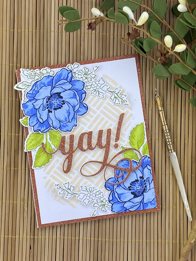
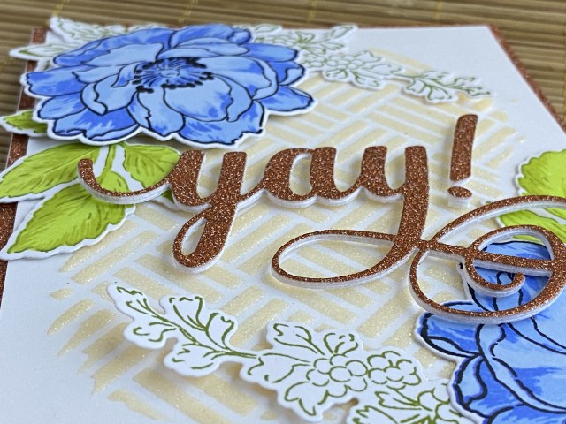
I created this card after participating in Altenew Academy’s All About Layering 4 course. To create the background, I colored transparent matte texture paste with Caramel Toffee Crisp Dye Ink, and applied it through the Altenew square weave pattern stencil. I then sprinkled the wet texture paste with Ranger holographic embossing powder, and let dry before heat embossing the powder. For the flowers. I used the Beautiful Day stamp set with the Crisp Dye mini ink cubes in Lapus Lazuli and Jet Black. I used the Tropical Forest mini ink cube set for the leaves and the floral sprigs.
For the sentiment, I used a piece of glitter paper from the Tim Holtz Halloween Deco Sheets, adhered to a piece of heavyweight cardstock. I diecut the sentiment, and stacked it on top of two more layers to give it dimension. I also decided to use the Deco Sheet glitter paper as a layer under the main card front, to tie the card together.
I was inspired by the sample in the class that used two large blue flowers, and had them mirror each other on the top and bottom of the card. Some of the techniques that I used from this course were to stack diecuts for the sentiment to add dimension, texture paste, mirroring, and using a bold sentiment for the focal point. The flower on the top left is popped up with dimensional foam squares, while the one on the bottom right is glued down flat to the card so the sentiment sits on top of it. I made a second card using flowers from the Peony Bouquet stamp set, and creating the card with a different orientation.
Altenew products used: Beautiful Day stamps and dies Square Weave Pattern stencil Fancy Yay die Crisp Dye Ink mini cube set in Lapis Lazuli, Summer Afternoon, and Tropical Forest