ScrappyShak Design Team: Holiday Brushstroke #3

Hello fellow makers! Today I’m sharing a card I created for the ScrappyShak Design Team with the new Tim Holtz Holiday Brushstroke #3 die set. I know… how many poinsettia dies do I need? Well, whatever you already have plus one more! I love the artsy brushstroke design of this one, and it goes together so easily. The greens that are included are beautiful. You don’t even have to use the layering pieces if you are short on time or want to simplify your card. Just start with an interesting piece of paper colored with multiple inks, and that will give you a beautiful result as well as the layers will.

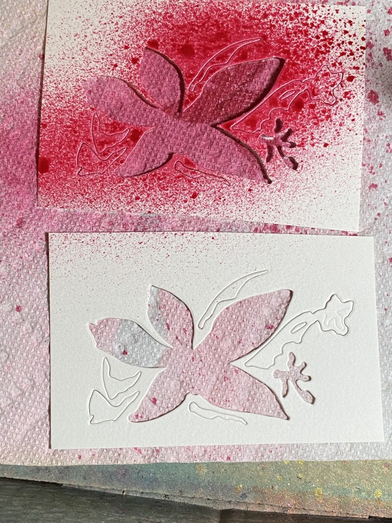
I started by coloring my flowers. At first I thought about going with more subdued pinks. I die cut the flower die out of watercolor paper, and colored the base of the flower with Distress Oxide Spray in Spun Sugar. Then I saw my new Mica Sprays… so much for a subdued color scheme! Cocktail Party Mica Stain spray was calling to me! It’s such a pretty, sparkly pink! All of the layering pieces were still left in my cardstock piece that I had die cut, so I popped out the center flower piece (which would be sprayed with Harvest Moon Mica Spray) and sprayed the little layering pieces while they were still in the piece of cardstock I ran through my machine. This held them in place while I sprayed (see photo) and dried them with my heat tool. I popped them out when they were mostly dry, and layered them onto the flower base. I then splattered my flower (without the yellow center) with more Cocktail Party.
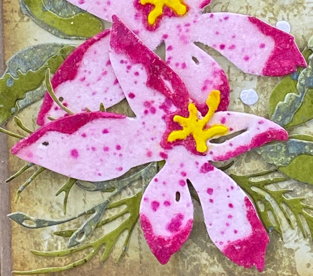
Do you ever get into “the zone” when you’re making? I can get so focused on what I’m doing, I lose track of time, what’s going on around me, and what I’m supposed to be doing… like taking photos of my process! Sorry! As I said, this flower is an easy one to put together, so the photos wouldn’t have been super interesting anyways! The one thing that I did play around with was how to get some sparkle on my flower. First I experimented with Distress Glitter, but I didn’t like the mess. I tried some on a scrap piece of paper, using collage medium to adhere the glitter. I thought about using clear embossing powder over that, but again, thought through the mess and decided not to. My next thought was to use some transparent texture paste, and mix in some glitter. Then I realized I already had a product just like that – the Distress Snowfall Grit Paste! Okay, problem solved. I added a light coat of the snowfall grit paste over the top of my flower with a palette knife, and set it aside to dry. I also used my fingers to move it around a little, and then used my die pick to get it out of the holes in the petals.

TIP: One thing to be aware of is that the Distress Inks, Oxides, and Mica Sprays will react when they get wet, even with the grit paste. You need to be careful how you apply the grit paste so that you don’t make your colors run together. I got a little yellow from the flower center onto the pink, and vice versa, but I was able to mostly wipe it away and fix it. It’s not a bad look, just not what I was going for.

Now on to the foliage… I picked some greens that I thought went together and complimented the pinks… Forest Moss and Bundled Sage Distress Inks, and Fresh Balsam Mica Stain. I colored different pieces of watercolor cardstock with each one of them, and splattered the Mica Stain on the Bundled Sage and Forest Moss pieces. I diecut the leaves out of the Fresh Balsam and Bundled Sage. I used the Forest Moss piece for the evergreen looking dies. I found a small piece of white textured paper in my stash that I thought would be prefect for the little berries. By the way, there’s no real guide as to where to place the berries on the die cut that is shown on the packaging. There aren’t any score lines or anything. Just wing it. I even scattered some of the berries on my final card front.

I went with tone on tone for the background. I started by coloring a piece of watercolor paper with Distress Ink in Old Paper. I smooshed some ink onto my craft mat, spritzed with water, swiped, dried, pounced, dried, etc. They I used two of the large stamps from the Stamper’s Anonymous Festive Collage set. I put them both in my Misti, side by side, and stamped at one time onto my background. You could of course use any combination of stamps to achieve the same look. I just wanted some more interest for the background. I cut the background down to 4 x 5.25 inches, and applied a bit of Vintage Photo around the edges.

After playing with my arrangement for what seemed like HOURS, I was happy enough with it to start finishing my card. Before I glued anything down, I added a sentiment from Stamper’s Anonymous Holiday Sketchbook, using Forest Moss Distress Ink. I wanted to emboss the sentiment, but I didn’t have an Oxide ink pad in Forest Moss. Instead, I used my Misti, stamping first in Forest Moss Distress Ink, then cleaned the stamp and stamped in VersaMark so the clear embossing powder would stick. I used some foam behind the Poinsettias, and added some of the small berries around my floral arrangement. Lastly, I attached my card front to an A2 sized base made from Distress Kraft Heavystock.

I hope you enjoyed my card, and that you got some ideas or learned something. Thanks for stopping by my blog! Please head on over to ScrappyShak to pick up your supplies!

Products used, available at ScrappyShak:
Tim Holtz Sizzix Holiday Brushstroke #3 dies
Tim Holtz Stampers Anonymous Festive Collage Stamps
Tim Holtz Stampers Anonymous Holiday Sketchbook Stamps
Distress Ink Pads – Bundled Sage, Forest Moss, Old Paper
Distress Oxide Spray – Spun Sugar
Distress Mica Stain Spray – Cocktail Party Holiday Set 4, Harvest Moon Halloween Set 3, Fresh Balsam Holiday Set 3
Distress Grit Paste Snowfall
Misti Stamping Tool
ScrappyShak Design Team: Harvey

Hello my crafty friend! Thank you for joining me today. I’m sharing my process of assembling the new Tim Holtz Harvey colorize die. I hope you see that it’s not as intimidating as it looks, as long as you have good eyes (or glasses, maybe a microscope) tweezers, and a fine tip bottle of glue! He’s just so darn cute!

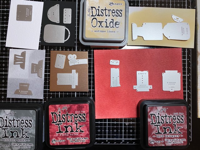
WIth many of the colorize dies, I think, I don’t have 4 different papers of the same color, and then I get stuck. They’re not the right shade of … whatever. Analysis paralysis as they say! I came up with an idea that I’ll hope you try. If you want to make a red Harvey, you’ll need 3 different shades of red for his top, and 3 different shades of gray for his pants. What I did was to start with white watercolor cardstock, two different red inks, and one gray, and simply use a blending tool to get the colors I needed.

For the red, I started blending the lighter red on one end of the paper, and the darker on the other end. In the middle, I overlapped them until I got a medium shade between the two. I used Fired Brick Distress Ink, and Aged Mahogany. You could even go with a lighter red, like Festive Berries to get more of a contrast. The point is that you only need two different colors of red ink pads to make this work, a lighter one and a darker one, and then blend them together for the middle shade.

It’s kind of hard to tell in this photo, and clearer to see with the gray. I only have one gray ink, Hickory Smoke, so I just applied it to the cardstock lightly, darker, and darkest, to get the three shades I needed for his pants. Some of the colorize dies need 4 different shades of the same color family. I have a bit of a paper stash, but I just never seem to have the “right” colors. Starting with white paper and making my own shades seemed to make it a bit easier for me. I used black alcohol ink paper for his boots, and gold metallic kraftstock for some of the accents. I didn’t really have any skin color tone paper at all, so I just used Antique Linen.

Once I had all of the pieces diecut, I played around with different color choices for the cuffs and shoulders. I had to cut more cuffs and shoulders out of white. It seems like Harvey goes together better with either the cross piece OR the shoulder pieces. But I wanted to use both, so I did! You could use the shoulder pieces and the belt. I just glued the shoulders on where I wanted them, even though they don’t sit flat.

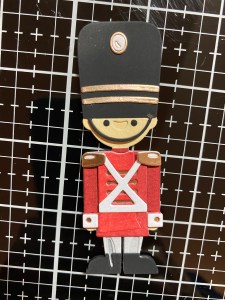
I was going for more of a toy soldier look, so I didn’t use some of the pieces, like the feather plume, and I really am not a fan of facial hair, even on my cards, so no mustache on this guy!

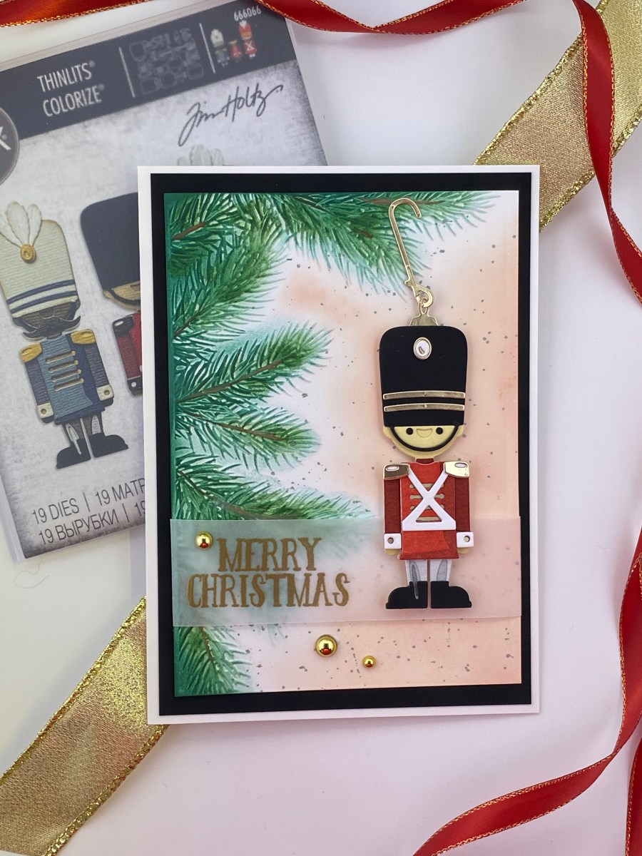
Here’s Harvey! All put together. Since he’s so thick, I went around the edges of his boots and hat with a black Copic marker. Yes, there’s a glue smudge or two. I’m hoping it’s less noticable on the final card!

There’s a helpful video on sizzix.com as to the order to assemble him. They start with the pants, which I did as well. When you get to the shirt, you’ll see that it overlaps the top of the pants, so the shirt doesn’t sit flat on his body. This wasn’t clear in the video, but that’s the only way it fits. I convinced myself that was the way it was supposed to be, but it bothered me a little. I guess he’s more of an “untucked” guy!

I knew I wanted to use the Pine Branches 3-D embossing folder. I embossed a piece of white Neenah Classic Crest 110lb Solar White cardstock with the folder, spritzing the back of the paper, and running it through my die cut machine 3 times. I colored the raised branches with Pine Needles Distress Ink and a domed foam blending tool. I then added a little Rustic Wilderness, and went over the branch parts with a Vintage Photo Distress Pencil. A marker would work just as well, or you could skip that part.

I wanted the rest of the background to be something light, like Antique Linen, but it had to be different, because I used Antique Linen for his face. I applied Tattered Rose (which I happened to have in an Oxide ink pad) with a blending brush, and then added some splatters of Iced Spruce.

Now what to do with Harvey? Is he just going to be standing under the tree? Should he have something else around him, like presents? Toys? Santa? This card had the potential to get really complicated! I decided to make him into an ornament. I used the ornament top and hanger from an older die set, Circle Words Christmas. You could easily shape a little piece of wire, or (I just thought of this now) use a real ornament hanger! To have it look right, I had to use a 5×7 cardbase so he would fit with the hanger.

For the sentiment, I stamped and embossed Merry Christmas from an older stamp set I had in my stash on a piece of vellum, and wrapped that around the card front. I attached Harvey to the card with foam squares for dimension. I layered that onto black alcohol ink paper (I love that stuff), and added some metallic droplets to complete the card. I really wanted Harvey to stand out on this card, and I think I accoplished that. Thank you for stopping by my blog. Please leave a comment if you are so inclined. I love answering your questions and hearing your feedback and comments!

Products used, available at ScrappyShak:
Tim Holtz Harvey Colorize die set
Tim Holtz Pine Branches 3-D Texture Fades Embossing Folder
Idea-ology Black Alcohol Ink cardstock
Distress Watercolor Cardstock
Metallic Kraft Cardstock
Idea-ology Metallic Droplets
Distress Ink Pads (Aged Mahogany, Fired Brick, Hickory Smoke, Pine Needles, Rustic Wilderness, Antique Linen, Iced Spruce)
Distress Oxide Ink Pads (Tattered Rose)
Distress Watercolor Pencils

Also used:
Tim Holtz Sizzix Circle Words, Christmas #664205

ScrappyShak Design Team: Maker Forte Ink Pads

Hello fellow paper lovers! Today I’m sharing a card I made while playing with some fabulous new (to me) ink pads by Maker Forte, all of which are available here at ScrappyShak! Not to be overly dramatic, but I really love these ink pads! I have been considering adding a new set of ink pads to my craftroom, and I think I’ve found just what I was looking for with the Maker Forte ink pads. These pads are so inky, and the colors are vibrant and crisp. They are dye based, so they clean up easily with water. Full disclosure: the red stained my fingernails, but I shouldn’t have gotten so messy! Since getting back into cardmaking after a 15 year (or so) hiatus, I have been focusing on collecting the Tim Holtz Distress inks and oxides. But occassionally, I want something that is not “distressed”. As I prepare to get ready for Christmas card making, I wanted to decide upon a new ink line to have on hand. Coincidentally, ScrappyShak just started carrying the full line of Maker Forte Color Hive ink pads. It’s a match made in crafty heaven for me! They are also the same width as the Distress ink pads, so they’ll fit nicely into my homemade storage shelves! I started with the basics: red (Telephone Box), yellow (English Mustard), and blue (Blue Raspberry), and added a pine green (Everglades), orangy red (Grand Canyon) and a neutral (Frappe). Of course I can blend the 3 primary colors to get the secondary colors, and that’s what I did here.

I had no idea where I was going to go with this, but I knew I wanted to blend some fall colors. I started with watercolor paper, and started blending with the Telephone Box red using a foam applicator and blending tool. Maybe I was too heavy handed, or maybe that’s just not the right tool to use with these ink silicone ink pads, because there was SO MUCH INK! The more I tried to blend it out, the more the watercolor paper just sucked it up! I was never going to get it to blend into orange by adding yellow, so I set that aside, and switched to plan B. I used Neenah Classic Crest Solar White 110lb cardstock, and a blending brush. More importantly, I started with a really light application of ink, and then added a little at a time. For me, I found the blending brushes much easier to use with these ink pads. If you only have the foam applicators, I would suggest to just start with a very light application of ink onto the foam, and do more layers until you reach the coverage that you desire. I mostly used the blending brushes now with all of my Distress ink, but still use the foam at times, like for adding shadows to edges of backgrounds or dies.

Here I show blending the red, blue, and then adding yellow to make orange and green. This ink is also water reactive, and I decided to spritz my background with a bit of water. I kind of wish I hadn’t, because I don’t really like the splotches on the finished card. But that was before I had really figured out what the finished card would be!

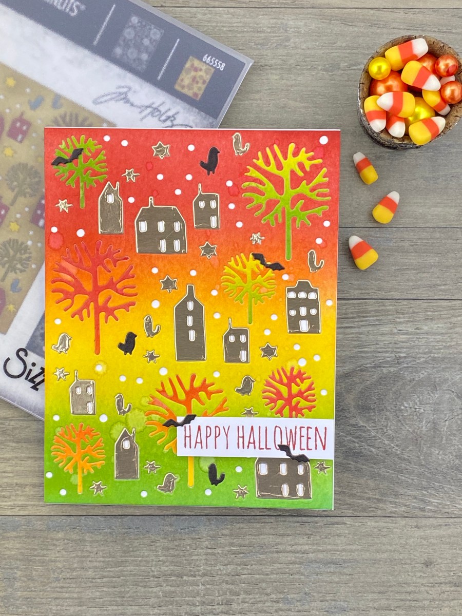
As the ink dried, the colors appeared to blend into each other better. Now that I had this beautiful background, I looked through my dies to see what I had that was kind of fall-like. I picked the Tim Holtz Sizzix Countryside Die that I had just picked up on clearance. The Countryside die is the same size as an A2 cardfront. There are lots of other dies out there that you could use instead. Nordic Winter by Tim Holtz is similar. The new Tim Holtz Layered Plaid would be fun to try, or the Sizzix Botanic Scene by Lisa Jones. There are other Tim Holtz dies that are A2 sized, like Leafy Twigs, Arctic, Bouquet, Doodle Art #1 and #2, and Folk Flowers.

I ran the Countryside die through my die cutting machine with my blended background. Before I poked out all of the pieces, I thought about leaving some in place, like maybe the trees. While I was poking out the houses, I realized some of them looked the same. I put them back in a different place, and thought it looked pretty cool. I wonder if the trees work like that? Yes, they do! So I poked out the trees, and then popped them back in to a different spot. How cool is that?!?! Moving them around made them appear to stay more in the background, but definitely let them stand out and be seen as trees. Now I’m having fun!

Before I started gluing the pieces in, I glued the background onto a piece of white cardstock, so I could start gluing in the pieces. I decided to leave the little circle holes empty, showing the white cardstock that I mounted the background on. You could of course use a color if you prefer to not piece back in some of the cutouts, like the birds or the stars.

I figured the houses should stand out a little more than the trees, but I didn’t want to add another color, so I went with gold metallic paper, to go with the warmer fall colors. I punched the windows and doors out of the houses, so the white behind would show through as well. As I was piecing everything back in to the background, in the gold, I was thinking of making the card more Halloween-y, and thinking of adding bats.

That gave me the idea to make some of the birds into black crows. Crows are creepy, in my opinion. I cut out the die again with black paper. I had to use my embellishment wand to pick up the tiny pieces and fit them into the background. I also used my Bearly Arts glue, with the precision tip, which has become my favorite glue.

The sentiment is from an acrylic Tim Holtz set I got at Joann Fabrics. It’s the one with the pumpkins from a few years back. I loved how the Telephone Box Maker Forte ink stamped so crisp and clean with just one impression. I attached the sentiment to the card with foam mounting squares, and used a couple more tiny bats to embellish it. I mounted the front panel onto an A2 card base made with Neenah Solar White cardstock.

I hope you like my Halloween card. This design can also be used for a fall card, minus the bats maybe. It was so fun to put together. I am definitely using a similar design to make some Christmas cards this year, probably with different, more wintery colors, but definitely with the Maker Forte ink pads! Thanks for stopping by my blog! Have a happy, crafty day!

Products used, available at ScrappyShak:
Maker Forte Color Hive ink pads (Telephone Box, English Mustard, Blue Raspberry)
Blending tool with foam
Idea-ology Kraft Stack cardstock paper – Metallic Classics

Also used:
Blending brushes
Tim Holtz Gate Keeper dies (bats)
Neenah Classic Crest Solar White 110lb cardstock

ScrappyShak Design Team: Playing with Pencils

My Great Great Grandfather James Somerville was an artist. I… am not! Fun facts: He worked mostly in watercolors, designed the back of a Canadian bank note, and hardly ever painted people in his work. Although he did his self-portrait in oils. I am lucky to have a few of his paintings. I am unlucky in that I did not inherit any of his artistic genes! However, these new Distress Watercolor Pencils by Tim Holtz and Ranger, along with a stamp from Stampers Anonymous, let me express my own version of art. I wonder what Grandpa Somerville would have thought of these pencils? I’m sure he would have been amazed at the advancement in watercolor pencil technology! The pigment in these pencils is unreal. My takeaway message is that a little goes a long way, and that several lighter layers are better.

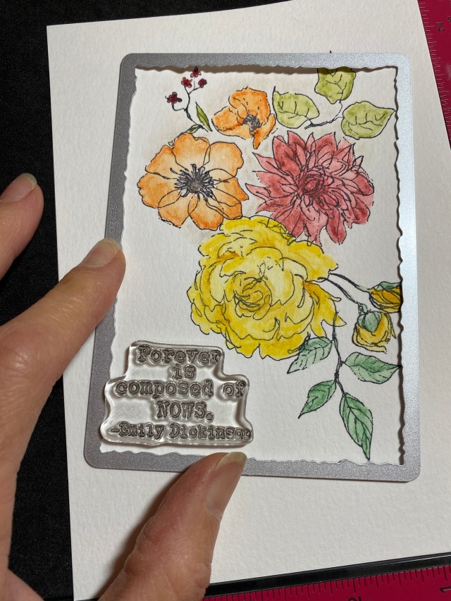
I chose the Floral Elements stamp set from Stampers Anonymous, because the flowers and greenery had a lot of open space that I could apply color to. The elements are separate, allowing you to create your own bouquet. I wasn’t quite sure what the final card was going to look like, or even if it would end up being a card. I started with a large (5×7) piece of watercolor paper to give myself more options, and laid out a rough arrangement of the stamps in the center of the paper, before I began stamping with Jet Black Archival ink.

After I got the main flowers arranged, I added some leaves. For my pencils, I picked fall colors. Coincidentally, at this point, I got a text from my son who said he was going to call shortly. So I just grabbed my pencils, a waterbrush, and my stamped image, and relocated to the kitchen so my husband could be on the call as well. No boys allowed in the craftroom! So easy and portable! I colored while we were on the phone. I can definitely see these pencils traveling well. Working with the pencils, I think the one thing I discovered is that it’s better to start with a light layer of color and add more. The pigment moves really easily with a little bit of water and the waterbrush, so I found it easy to push it where I wanted it.

When I had finished coloring, I decided to cut the panel down with the largest Tim Holtz Sizzix Stacked Deckle Die. I ended up changing the orientation of how I thought I wanted it, so every time I look at the finished card, I feel like it’s upside down! But I’m glad I started with a larger piece of paper so I could make the decision of how to crop it after it was done. Before I die cut, I chose a sentiment to add, and made sure it would fit. This sentiment is from Catherine Pooler’s Notable and Quotable Sentiment Stamp set. I diecut the panel, then stamped the image in Jet Black Archival ink, and embossed with detail clear embossing powder.

To finish up the card, I splattered with Picket Fence and Antique Linen Spray Stains, and distressed around the panel with Old Paper Distress ink. I layered this onto a piece of kraft stock from the neutral Kraft Stock Stack, and then layered that onto a Peeled Paint background I had leftover from another project. I tied some string on to balance the sentiment.

These Distress Watercolor Pencils are super easy to use, and produce great results. It almost looks like I knew what I was doing! All you need is a waterbrush, or even just a regular paint brush (the waterbrush is easier). If you have a Santa in your life, or are looking for a special gift to give to yourself, put these pencils on your list. You’ll be happy you did! Please consider supporting my Design Team sponsor, Melanie at ScrappyShak! She’s a wonderful woman, stands behind her company, and truly cares about each and every customer. Most of the products I used are available at ScrappyShak!

Products used, available at ScrappyShak:
Tim Holtz Distress Watercolor Pencils
Stampers Anonymous Floral Elements 2 Stamp Set
Idea-ology Kraft Stock Stack – neutrals
Distress Spray Stains – Peeled Paint, Antique Linen, Picket Fence
Distress Ink Pad – Old Paper

Also used:
Sizzix Stacked Deckle Dies, or use Deckle Trimmer
Catherine Pooler Noteable and Quotable Sentiments Stamp Set

Thank you for stopping by my blog, and have a beautiful day!

ScrappyShak Design Team: Tim Holtz Exquisite Stamp

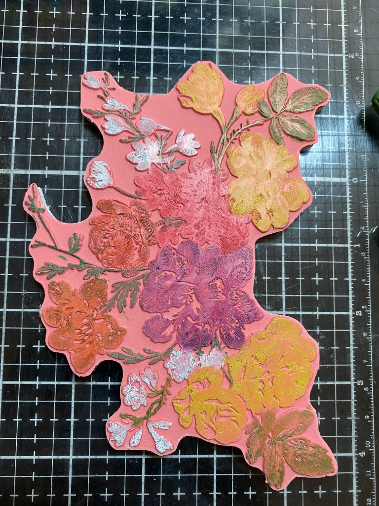
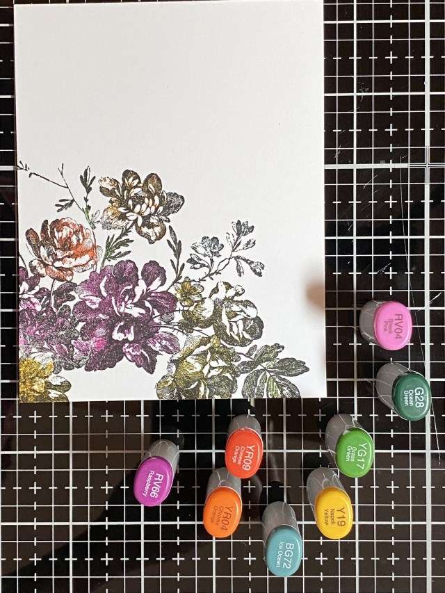
I know, it’s really fun to get the latest and greatest products, especially if you are a lover of everything Tim Holtz. Along with the new Stamper’s Anonymous Tim Holtz Exquisite stamp set, I was fortunate to have been able to purchase Set 1 and Set 2 of the new Tim Holtz Distress Watercolor Pencils. I also have a small stash of the Distress Crayons which I’ve collected. I wanted to see for myself what the big deal was about the new pencils. Were they really going to be that different than the crayons? I know each of the Distress products were designed for differnet applications, and I wanted to compare these two. I know you can color a rubber stamp (before stamping) with various mediums to achieve different results, so that’s what I decided to do with the pencils and the crayons, and compare the results. While I was at it, I also got out my Copic Sketch markers.

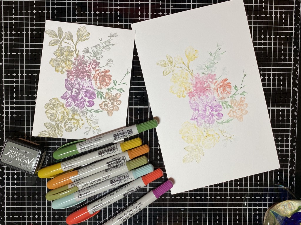
I’m using the new Stampers Anonymous Exquisite set, and my Misti Stamp Positioner stamping platform. I tried to use the same colors in the crayons and pencils, when I had both, and similar colors with my Copic Sketch Markers. I started with the crayons first. I colored the stamp with differnet crayons, and then lightly sprayed the stamp with 3 pumps of water. I wanted to make sure I had the same process with the pencils. After I stamped the first image, I spritzed with 3 pumps of water again, and stamped a second time, without applying any more crayon. This is often referred to as a “second generation” stamping. The second generation stamping came out very light. I decided to overstamp it in Hickory Smoke Archival Ink. First I dried the image with my heat tool, leaving it in my stamp platform. Then I cleaned my stamp really well with water and a scrubber, again, leaving it in place in my stamp positioner platform. I inked the stamp with archival rather than distress ink or oxide, so it wouldn’t react in case the image wasn’t completely dry. Here are my results with the distress crayons:

I really liked both of these. The first stamping will be beautiful as a background, possibly as a sympathy card. The second stamping, with the Hickory Smoke, came out very vintage looking to me. This technique would look really pretty with flowers done in an analogous color scheme (like pinks and reds, or blues and purples). I’m planning on trying this technique on a cream colored paper. You can change up the color you overstamp with. I’d love to see what you try!

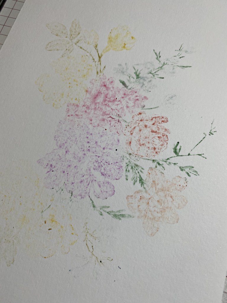
Next I cleaned my stamp again really well with Archival Cleaner and then water, and then dried it. Using colors of Distress pencils from Set #1 and Set #2 that were the same as the crayons, or similar, I colored the stamp again. The pencils need to be slightly wet to apply color to the stamp. I spritzed water on my craft mat, and scribbled in the water with the pencils until it started releasing color, then I colored the stamp. I was so excited to get started, I didn’t even think of sharpening the pencils to get a finer tip, but I didn’t have any problems coloring this particular stamp with the pencils right out of the box. From time to time I would have to rewet the pencil if I was coloring a larger flower. As with the crayons, once I was done coloring, I spritzed the stamp 3 times, and then stamped onto Distress watercolor cardstock. Wow! Seedless Preserves! So beautiful! I got a nice impression of the stamp with the first stamping. I then spritzed with water 3 times, and stamped a second generation print onto smooth white cardstock, and then repeated to get a third generation. These pencils have a lot of pigment! My wheels are turning as to how I can use these with the Christmas stamps that I have. What a time saver! Three images from one coloring! I tried a forth generation, and I felt it just wasn’t really recognizable anymore, but I might use it for something else, like die cutting. It turns out at the end of this experiment, my favorite is the second generation on smooth white cardstock. I like the vibrant colors, and I like that you can see some of the details of the stamp, while some of the details are more diffuse. I feel like if I would have used more water on the first stamping, it may have been more vibrant, which is ultimately what I have in mind with all of this! I guess you just have to play with it to get the results you want. Since it was still in my Misti, I could have rewetted and stamped onto the first image again, but then it would have messed up my experiment!

From Left to right, first stamping with Distress Pencils, second stamping (favorite), third (top) and fourth (bottom).

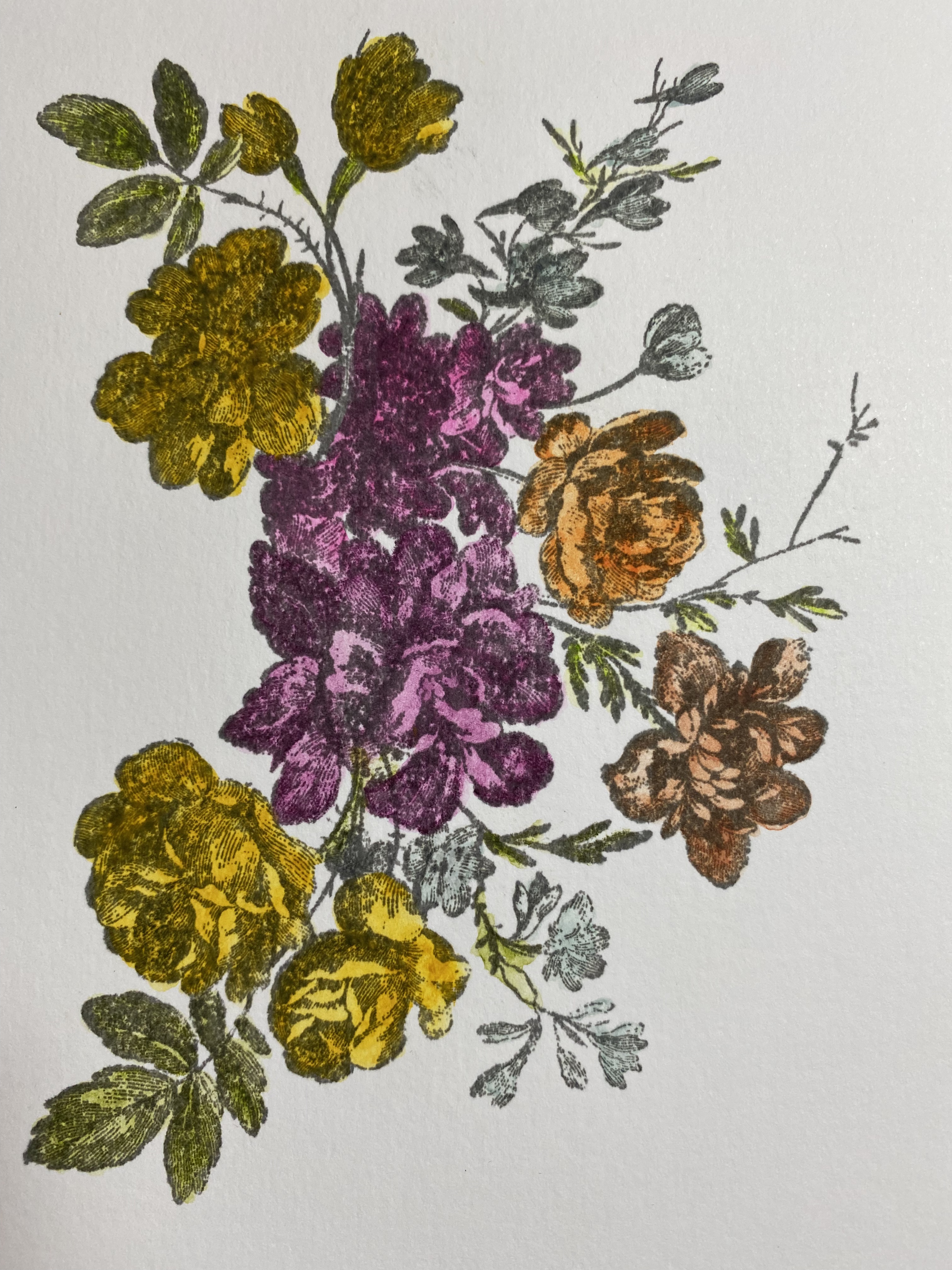
The next process I wanted to try was to stamp the image in Archival ink, color it with pencils, and then overstamp in archival again. I used watercolor paper for this. Again, this has a vintage look to it, to me. I will definitely use this technique again, with different colors. I don’t particularly like the pink flower, and I think there is too much yellow. My color choices began with what Distress Crayons I had! I will definitely crop this one down and make something beautiful I’m sure.

The final experiment was to color the stamp with my alcohol markers. I’m glad I started with only using half of the stamp. This was hard! I should have looked to see if anyone had tips for doing this. I thought I could color the purple flower first, stamp it, and then move on to the next flower. I found that the alcohol markers dried a lot quicker than I thought, and I didn’t know what to rehydrate them with (alcohol?). Maybe watercolor markers would have worked better, but I don’t have any. What I ended up doing was to color part of the purple flower, stamp, color more of the purple flower, stamp, etc. Even then, it was difficult to get the color to transfer from the stamp to the paper. I was just about to toss is in the trash, so I figured, what the heck… try to overstamp in black and see if that helps. I think it did. I think this produced a dramatic image that can be a focal point. It would look nice with a fancy, larger sentiment die in white cardstock with a black shadow.

This was all a great learning experiment for me! For my actual card, I used the technique of coloring the stamp with Distress Pencils, spritzing 4 or 5 times with water. I looked more closely at how much water was on the stamp. If I thought it was just about right, I spritzed one more time! Before I stamped the flowers, I used the other stamps in the set to add some interest to the background. I stamped part of the stamp in opposite corners of the card, using Distress Watercolor paper. I decided to only use the Set #1 pencils for the card, and selected my colored from that package only. Tim talked about how he tried to get a full compliment of colors in each set, so you didn’t have to get them all to have a great selection. I’m very partial to the colors in Set #1 too.

After my stamping was done, I rifled through all of my stuff to try to find a sentiment that worked. This card made me happy, and lifted my spirits. When I was putting it together, the world had just lost Queen Elizabeth II. I was thinking of how her grace and strength will always live on in the hearts of her countrymen and women. In the darkness of grief, there is always hope for the light to come again, with time and healing.

I die cut the hope circle die into my cardfront, added a small gold circle cut from the same die set, and then popped up the cardfront onto a gold metallic kraftstock panel. I added a metallic sentiment strip, and attached the cardfront to a 4 1/4 by 5 1/2 top fold card base, made with Neenah Solar White 110lb cardstock.

Thanks for stopping by. I hope you learned something, or at least were inspired to play with what you have, see what different effects you can produce, and find inspiration to use what you create! Now I have a whole stack of “Exquisite” pieces to use in future projects!

Products used, available at Scrappyshak:
Tim Holtz Stampers Anonymous Exquisite Stamp set
Tim Holtz Distress Pencils, set #1 and #2
Distress Crayons in Seedless Preserves, Festive Berries, Crackling Campfire, Peeled Paint, Rustic Wilderness, Speckled Egg, Fossilized Amber, Rusty Hinge
Misti Stamp Positioner
Foam tape
Distress Sprayer
Distress Oxide Ink Pad Antique Linen
Distress Watercolor Cardstock
Distress Metallic Kraftstock

also used:
Tim Holtz Sizzix CIrcle Words Christmas dies
Copic Sketch Markers
Tim Holtz Idea-ology Metallic Phrases stickers
DMC gold thread
Bearly Art Precision Craft Glue with precision tip
Neenah Classic Crest Solar White cardstock

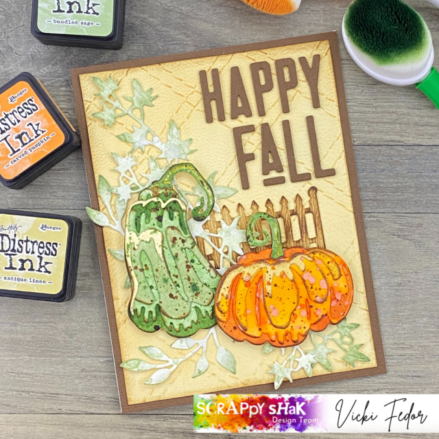
Scrappy Shak Design Team: Happy Fall Pumpkin Duo

Me: Does this look like a gourd?
Him: No.
Me: (tries yet another color combo) Does this look like a gourd?
Him: Well… that’s better…
Me: (finishes card)
Him: Now that looks like a gourd.

I had a bit of a time trying to get the colors “right” for the green gourd/pumpkin. I wanted to make one of those cool blueish green gourds you see at the pumpkin patches. I was thinking a hazy, blue green, grey… I didn’t quite accomplish that, but I think I’m okay with my green gourd, which may not exist in real life, but that looks good next to my orange pumpkin!

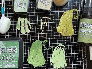
The colors I settled on were Rustic Wilderness and Bundled Sage. To get the four different paper colors for the colorize pumpkin die, I ink blended Rustic Wilderness on watercolor paper, using a heavy hand, and then did another piece using a light touch. I used Bundled Sage on another piece of paper, and Antique Linen for the small diecut on top which will be the highlight piece. After blending, I flicked water on all of the pieces, and dried. Then I splattered with Antique Linen, Rustic Wilderness, and Vintage Photo.

The pumpkin colors were much easier for me to choose: Crackling Campfire, Carved Pumpkin (surprise!) and Spiced Marmalade. I flicked and splattered again with the same colors I used for blending. I used Carved Pumpkin distress oxide spray for splattering, which gave a different look, but that was just a “use what you have”, not a planned happening. I like how it came out. By the way, when I splatter, I go from the lightest color to the darkest, and dry between layers. If I want tiny splatters, I will use a #4 fan brush. If I want small splatters, the distress splatter brush works for me. Otherwise, and if I’m being lazy, I’ll just splatter with the tube of the sprayer from the bottle of spray stain. Then I’ll curse myself for being lazy, because the splatters are too big!

The only part of the base layer dies (labeled A-Green-1 and B-Green-1) that you’ll see is the middle part of the stem. The rest of it gets covered up by the pumpkin, and the small accent stem pieces. I used spray stain in Peeled Paint for this. I used Rustic Wilderness to color the paper to use for the small stem accents.

After I finished my pumpkins, I worked on the background. I was thinking blue, so I blended Tumbled Glass and Prize Ribbon on watercolor paper, then flicked on some water, and dried. While I thought the intensity of the background matched the pumpkins, I decided it was too distracting, as I wanted the pumpkins to be the focal point. So the blue background went into my “use for something else” pile. Something else in my “use for something else” pile was a piece of tan paper that I had embossed with the Quilted embossing folder. But now, it looked better with the pumpkins. I’m glad I have that pile! I colored a piece of watercolor paper with Bundled Sage, and used it to cut out some leaves from the Garden Greens die set that kinda sorta could pass for squash leaves.

When I assembled everything on the card base, it seemed like the pumpkins needed a little more… grounding… so I cut a piece of picket fence from my Village Cottage Bigz die, using the Tim Holtz white wood grain paper. I blended Antique Linen onto the wood grain paper, then added Vintage Photo. I used Bearly Art glue with a precision tip to stick everything down, except for the pumpkin. For those, I used Scrapbook Adhesive Foam Squares: thin for the green one, regular thickness for the orange one.

For the sentiment, I used the new Alphanumeric Theory dies. I cut the sentiment out of brown textured paper from Sizzix, and then cut two more of each letter from kraftstock. I’m not sure how anyone with porkchop fingers can manage those little pieces, but I was able to glue the three layers together, to give it more dimension. It was difficult lining them up on the card, even using a T-square ruler. Too much caffeine for me I guess! Sometimes I will apply double sided adhesive to the back of the paper before I cut it, but with something this small, I knew I wanted to use liquid glue so I would have some “wiggle time” to line them up.

Happy Fall y’all, and thanks for stopping by!

Products available from ScrappyShak include:
Tim Holtz Sizzix Pumpkin Duo dies
Tim Holtz Sizzix Quilted embossing folder
Tim Holtz Sizzix Alphanumeric Theory dies
Distress Ink Pads
Distress Spray Stains
Tim Holtz Wood Grain cardstock
Tim Holtz watercolor paper
Tim Holtz Distress Splatter brush

Simon Says Stamp: STAMPtember!

Oh my, a month-long stamping party! Yes, please! The fabulous online retailer, Simon Says Stamp, created this celebration wonderful event that features special products, inspiration, and collaborations all month long. STAMPtember started early this year, when they made a call out on social media, looking for people to help promote their event. They gave out a super secret previously unreleased stamp set for free to the first 100 people to respond. Talk about generous! I was lucky enough to see the offer and get in on it. I received my stamp set a couple days ago, and have been playing with it every since. We promised to not put our projects out until the release at 12:01am ET September 1st. There will be special events all month long, so you want to be sure to follow their blog at www.simonsaysstampblog.com. Most of the special collaboration products get posted on this site at midnight, and in the past some have sold out before most of us are awake in the morning! So if you see something you like, don’t hesitate to purchase it. When it’s gone, it’s gone! Remember, there’s no crying in cardmaking!

So, without any further ado, here it is!

Simon Says Stamp Printmaking Birds, sss202550c

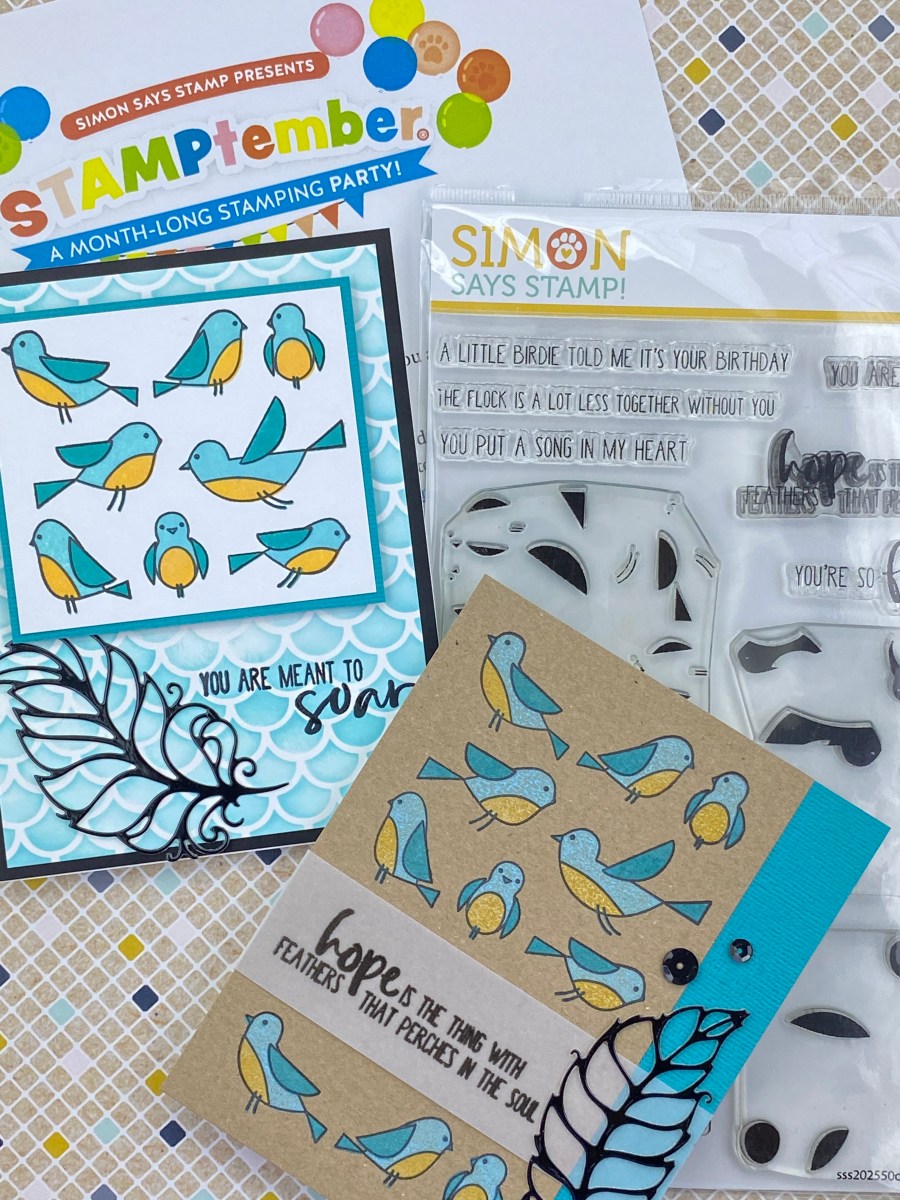
This set is so cute! It’s a group of 8 little birds. There’s an outline stamp that stamps the set of birds. There are 3 layering stamps which add the body, the wings, and the belly, all in one shot for all of the birds. It comes with a few sentiments, including birthday, miss you, and encouragement verses. I especially love “hope is the thing with feathers…”, as I love that lyric by Emily Dickinson. I immediately thought of bluebirds (of happiness) and feathers of course.

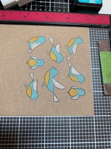
I used Tim Holtz kraft cardstock, for kind of a “folk art” look. I played around with some blue oxide inks, and decided on Salvaged Patina for the body of the bird. I tried Uncharted Mariner for the wings, as well as a few browns, and didn’t love any of them. I don’t have Peacock Feathers in the Oxide formula, but I thought that would look the best. I just didn’t like the way the Distress Ink looked on the kraft stock. I thought “use what you have”, and I know that the oxides have white pigment in them, which my Distress Ink pad was missing. What I did was to understamp white Picket Fence Ink, and then stamp the Peacock Feathers on top of it. That gave me the look I wanted. I tried a few colors for the belly, and settled on Wild Honey.

It would have been much more difficult to do this without my stamping platform. I planned to stamp the outline so I could see where the fill in stamps go, and then stamp the outline again at the end to get a crisp outline. To do that with my stamping platform (regulation size), I was able the use half of the platform with the outline, and leave it there in the same position on the cover, and then use the other half of my platform to add the other layers.

I added a sentiment on vellum, and added a strip of cardstock to match to fill out the rest of the cardfront. I really wanted to add a feather, and I had just gotten the fabulous die set from Gina K Designs, Fancy Feathers. It still looked like it needed something, so I added a few black sequins.

I really liked the colors that I used for the birds, and wanted to make a similar card on white cardstock. For the second card, I used a stencil by Picket Fence called Mermaid Scales, SC-171. I purposefully blended Salvaged Patina Distress Oxide with a blending brush to be inconsistent, with some darker areas and some lighter. I thought it would add the appearance of texture. I stamped the sentiment in Versafine black ink, and embossed it with detail clear embossing powder.

Which one is your favorite? I hope you got some ideas for your own projects with this fun set. And guess what? There are coordinating dies available!! How cute will it be to sprinkle these cute little birds all over the place! Thanks for looking. Be sure to check out all the fabulous fun Simon Says Stamp has in store for us this STAMPtember!

Products featured:
Simon Says Stamp Printmaking Birds

Gina K Designs Fancy Feathers

Picket Fence Mermaid Scales

Misti Stamping Tool

ScrappyShak Design Team: Feathery Suspect

Hello crafty friends! I was so excited to get two of my new Tim Holtz Sizzix Chapter 3 dies, I wanted to use them both at the same time! I ordered Feathery and Specimen. I love birds, and have been searching for the older Sizzix Bigz feather die that has been retired for a while, so I was very happy that Tim released these new thinlit feather dies. I can see them being used for all kinds of different occasions and holidays, as well as Home Dec projects. I also had to get the Specimen dies, because they seemed like a staple that I would be using time and again, especially when I think about mixed media projects. So there I was… feathers… and files…. what to do? I could make a bunch of feathers, and put them in a file folder, like someone was collecting them to… do what? Then it hit me – evidence! Evidence of something, done by… a Snarky Cat! I have those stamps! Then it all came together.

The words that come with the Specimen set are things like “files”, “series”, “archive”, etc. I figured if I had enough patience, I could cut the teeny tiny letters out and make my own word, “evidence”. It worked, and it fit perfectly on the file folder in the specimen set.

I started by using my Distress Spray stains to color watercolor paper. I used two colors for each different color of feathers, drying in between each color. The colors were Aged Mahogany, Barn Door, Black Soot, Villainous Potion, Salvaged Patina, Antique Linen, Vintage Photo, and Gathered Twigs. After I die cut the feathers, I outlined each one with Vintage Photo and a sponge applicator. I tend to be a little lazy at times, but here’s where you shouldn’t skip a cleaning step. Even if your watercolor paper looks dry, I find some of the color stays on the die after cutting, so I always take time to rinse and dry my dies. Otherwise it might rub off the next time I use it, speaking from experience!

After getting my feathers cut, I cut my file folder. I have some neat paper I got a long time ago. It’s manilla colored, heavier, and has some wrinkles in it. I got it in a cardmaker’s paper pack, so I have no idea what brand it is. You can certainly use whatever you have. I grunged up the edges of this with Vintage Photo as well, and added my “Evidence” word.

Next I stamped my Snarky Cat onto Neenah Classic Crest Solar White cardstock with VersaFine ink in Onyx Black, using my Misti Stamp platform. The speciman die set comes with a die that will cut it out perfectly to fit into the slide cutout. I wanted it to look like a mug shot, so I used a darker yellow paper to layer behind my cutout numbers.

The Specimen set has the right size dies to make the black label, and a smaller die to fit behind it (in yellow). You have to be careful to save the circle in the middle of the letter “o”, and the number “0”, when you die cut “No. 3074”. The negative inside of the “4” was just too tiny to try to save, so I used a fine tip marker to draw in a small triangle so that it would look like a number. Hard to explain, but you’ll understand when you try it. You could of course leave those little pieces out, but I thought they were needed. I cut the slide again from black paper, just to get the little negative circles to pop in the corners of my slide. I’ve seen people use small brads, but I didn’t have any. I used Scrapbook.com’s Pops of Color in black first, but I smeared one before it was completely dry, so I had to start all over again! If you get a chance, watch Tim’s Youtube for this set. Lots of great ideas! The paper for the slide was from Tim’s kraftstock newer paper packs.

When I was ready to put the card together, I made a 5×7 base from Neenah Dessert Storm cardstock, and picked a piece of paper from the Backdrops paper pack that I thought would pull it together. I thought the file folder needed something else, like a sentiment. I felt there was too nuch white space. I chose one from the Noteworthy stamp set and used VersaFine ink. Poor Snarky Cat. Don’t lose hope! Maybe there isn’t enough evidence for a conviction! Ha ha. I positioned everything the way I wanted it before I glued the folder to the card front, added the feathers (with liquid glue), and then added a tiny clip embellishment. The Snarky Cat slide was popped up with dimensional foam and attached to the card.

I hope this inspires you to play with the Specimen and Feathery sets! It was lots of fun creating this!

Products used, available at Scrappyshak.com

Tim Holtz Sizzix Specimen thinlit dies
Tim Holtz Sizzix Feathery thinlit dies
Tim Holtz Stampers Anonymous Snarky Cats stamps
Tim Holtz Distress Spray Stains
Misti Stamp platform

ScrappyShak Design Team: Happy Birthday Shaker

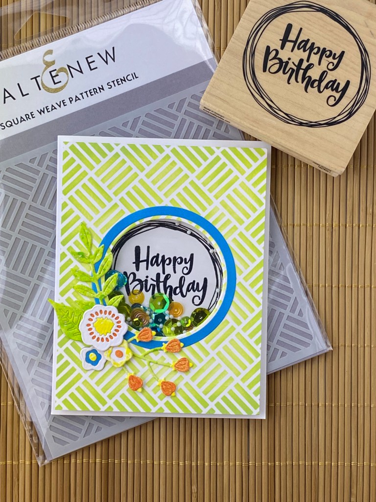
Hey paper people! Here’s another shaker card I made using the super simple Sizzix Shaker Panes with coordinating framelit circle dies. You can read my previous post to see more details on how easily these shaker cards go together. Here I used Altenew Square Weave stencil and Spellbinder’s Simply Perfect Layered Blooms dies to add some interest. By the way, these dies are currently on sale at ScrappyShak.com! The stamp is from Stampabilities. The challenge I had with this card was trying to use the acrylic circle that comes with the Sizzix Shaker Panes.

The package insert states that the shaker pane cover is heat resistent, so you are able to stamp on it, use embossing powder, and melt the powder. I had to foresight to do a test run on a sheet of clear acetate that I had in my stash. If you try this, be careful not to apply too much heat, as the acetate will warp and melt, unlike the piece that’s included with the shaker pane kit. I first had a problem trying to get good coverage of ink that would take the embossing powder. I tried using Memento, and then Versafine black ink pads. I like to stamp in black and then emboss in clear. That way, if there is any stray embossing powder, you don’t really see it. I usually do this, rather than stamping in clear embossing ink (like VersaMark) and using black embossing powder. It usually works great on paper. Also, to add complexity to the task, the image that I wanted to use was on a wood mounted rubber stamp. I’ve really gotten used to using a stamping platform (Misti) where you can stamp again if you miss a spot. With a wood block, you only get one chance at a perfect stamping!

Next I tried StayzOn black ink with detail black embossing powder. I used my embossing powder duster first to make sure the embossing powder didn’t cling where it wasn’t supposed to. This is my favorite smelling ink pad for sure! It is an older pad, and I didn’t have a reinker, so the image was too light and dried too fast to get the embossing powder to stick. I then tried VersaMark embossing ink with detail black embossing powder. This gave me the best results in my test run. I was ready to try it on the one piece that comes with the shaker panes. It came out okay, but I am the ultimate perfectionist! I made sure my ink pad was refilled, and nice and juicy… maybe too juicy. The image was a little blurred. I’ll warn you that I find stamping on acetate or anything shiny reminds me of trying to sew slippery fabric. It will move. It’s inevitable! Don’t expect perfection! But do your best to expect movement when you’re stamping liquid ink onto a slippery paper. Use a stamping platform if you can. Be deliberate with your stamping. Make sure your stamp has good ink coverage, but not too much, before you stamp.

The Happy Birthday shaker pane cover was pretty good, so I was going to use it. When I put some sequins in the shaker, I decided that you couldn’t really see the impecfections, but also, you couldn’t really see the sentiment anymore! I changed my mind about my design. I got a piece of white cardstock, stamped in black Versafine ink, embossed in detail clear embossing power, and put it behind the shaker pane. That’s better! That looks good to me!

I turned this quick shaker card, made incredibly easy by the Sizzix Shaker Panes, into a long, drawn out learning experience! But hey, that’s what it’s about some times. You need to experiment to see what works for you, in your environment, with your products. I’ll definitely pick up a StayzOn reinker, and more clear acetate to practice on. I also will get some cling stamp backing foam so I can replace the wood block for this stamp, and turn it into a cling stamp. This will let me use it with my Misti stamping platform.

Thanks for stopping by my blog. Stay crafty!

Scrappy Shak products used:
Spellbinders Simply Perfect Layered Blooms
Sizzix Shaker Panes – Circle
Sizzix Framelits Circle Frames

Color Challenge Get Well Card

The inspiration for this card was a color challenge on a Facebook group I belong to. Someone posted a picture of a cream and black building with a red, orange a yellow logo. When I started thinking about what direction to go with this card, the colors took me to flowers. But most everything takes me to flowers! I also wanted to incorporate the industrial feeling of the building. I also needed a Get Well card!

I had just seen an amazing looking embossing folder, again on social media, and ordered one. It’s from Stampin’ Up, and called Painted Texture. It is even more fantastic in real life! I’m so glad I got it. I really like the whole mixed media aspect of card making, and this folder makes it super easy to get great texture. I haven’t played around yet with adding color to it, but I really just like it as is. I’m going to use this as the background for my card. In hindsight I should have made a larger card, because I hated having to cut this down and lose some of the character.

I chose some colors to work with: Mustard Seed, Orange Marmalade, and Festive Berries in the Distress Oxide ink pads. I blended them on a scrap piece of paper, and decided I wanted a more orangy red, so I picked Barn Door. I only have that in the Distress Ink pad, but it won’t matter much because I plan on using my blending brushes to apply color to my cardstock. For this card, I’m using Canson XL watercolor paper, even though I’m not using water. I like the weight of it, and that it is not as bright white as the Tim Holtz watercolor cardstock. Plus, I think it’s less expensive. I used it when I’m not using a lot of water to move the ink around.

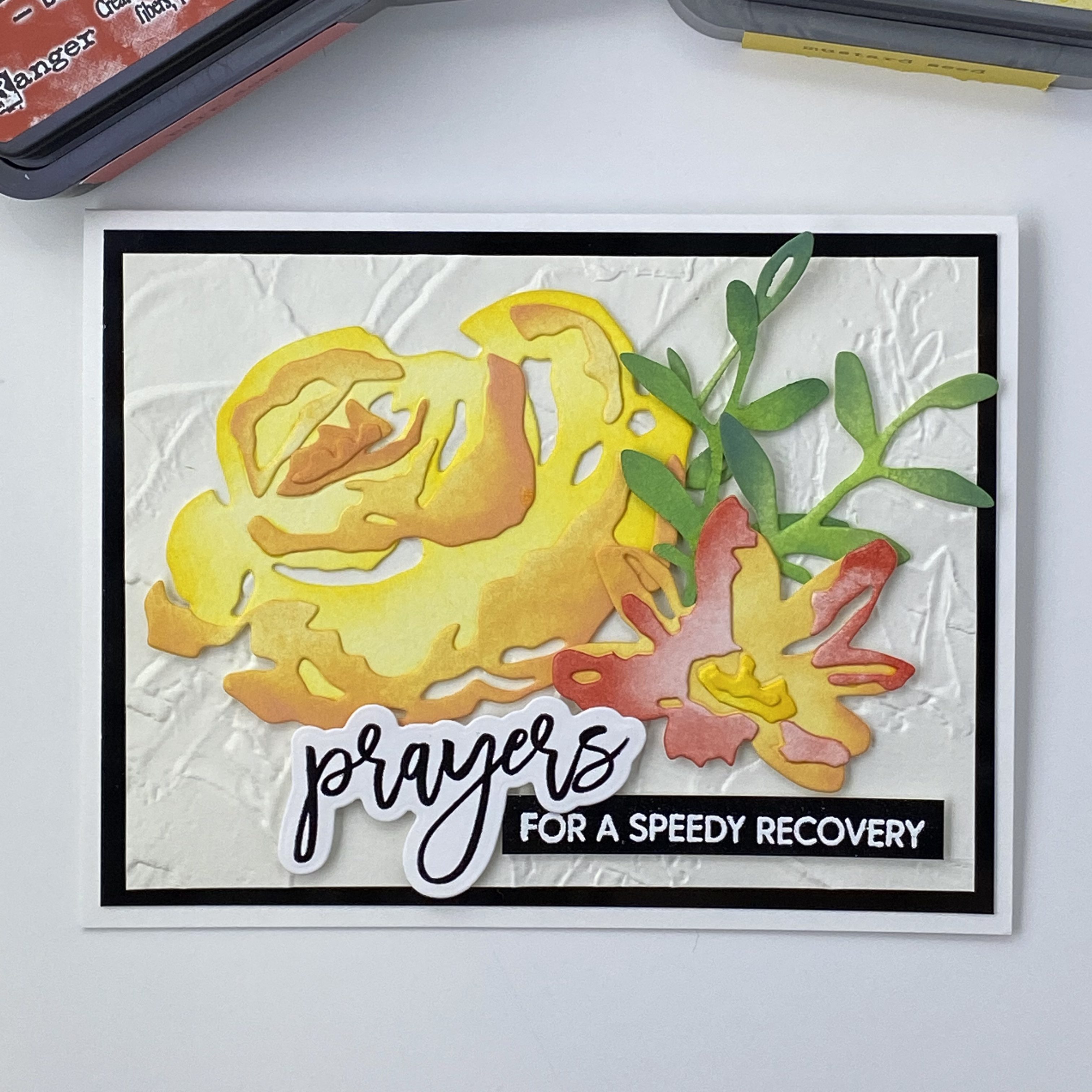
I used the Tim Holtz Brushstroke Flowers #4 dies, cutting them out of the Canson watercolor cardstock. I thought it would be more interesting to blend the colors from lighter to darker on each flower layers, keeping the center of the flower lighter, and having more color towards the outside of the flowers. I used the packaging photo to help decide how to color the layers before gluing them together.

I chose to go with an A2 sized card. After trimming the background, I decided to add a layer of black behind my embossed background layer. This will help to connect the sentiment. The sentiment and sub sentiment are from Waffle Flower, Oversized Prayers. I used the smaller script prayers stamp, embossed with black, and cut out with the coordinating die. The sub sentiment was embossed with white on glossy black card stock. After I got all of my pieces ready and started to lay out the design, I decided I needed a bit more foliage, so I cut another stem and blended it with Mowed Lawn and Rustic WIlderness, like the others. I applied the yellow flower and greens directly to the background with liquid glue, and used thin and thick foam squares for the orange-red flower and sentiments.

I really like how this card came out. I hope it brings lots of good healing energy to the recipient! Thanks for stopping by!